Our Office
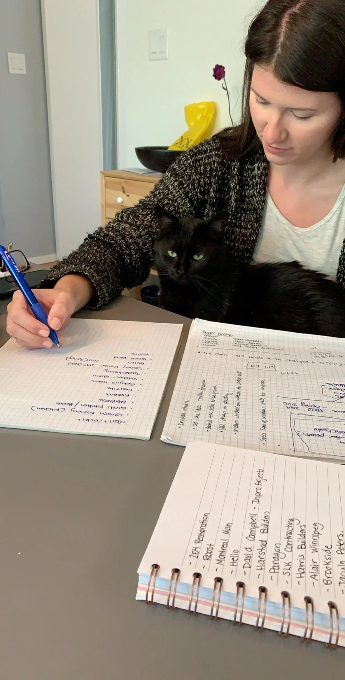
It may not shock you to hear that we didn’t always have the office we do now! It took us a few years to grow to where we are and we’ve savoured every second of the process! Just like many companies starting out, our very first “office" was at Robyn’s house at the dining room table. We tried to work at local Winnipeg coffee shops, but it didn’t work long-term for some of the tasks we needed to get done.
Our First Digs:
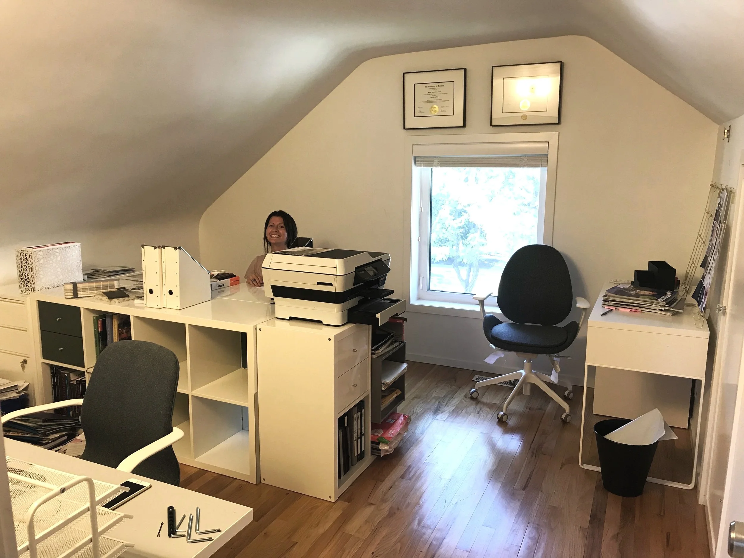
While Emily was in Montreal, Robyn surprised her by making a spare room in her house into re:Design’s very own little dedicated office space (complete with Mona, our team mascot at the time). We made that work for a while, but as we started to grow, so did all the samples we needed and it began to take over the whole house! We made the decision that it was time to move on out after 2 years and the timing couldn’t have been more perfect, we got an opportunity to convert an office space within a builder’s office and we decided it was the right move for us at the time.
Waverley Office :
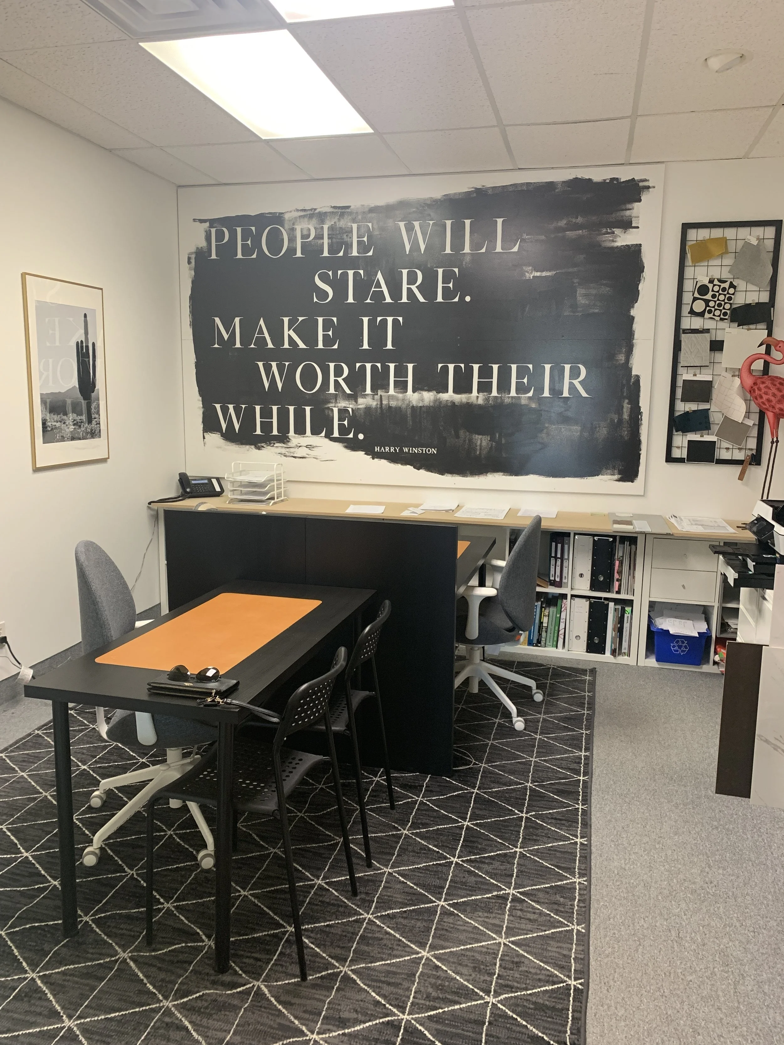
Welcome to our first official office space. Yes, it was a room in a builders office but it was a huge leap in getting our own space! Knowing who we are - we of course had to make it our own! We added a fresh coat of paint, patterned rug, some wall decor, and had a custom sign made that we designed to be able to take with us wherever we went! We decked the space out with Ikea to be budget friendly and really transformed the space into our very own. And yes, we put all of the furniture together ourselves!
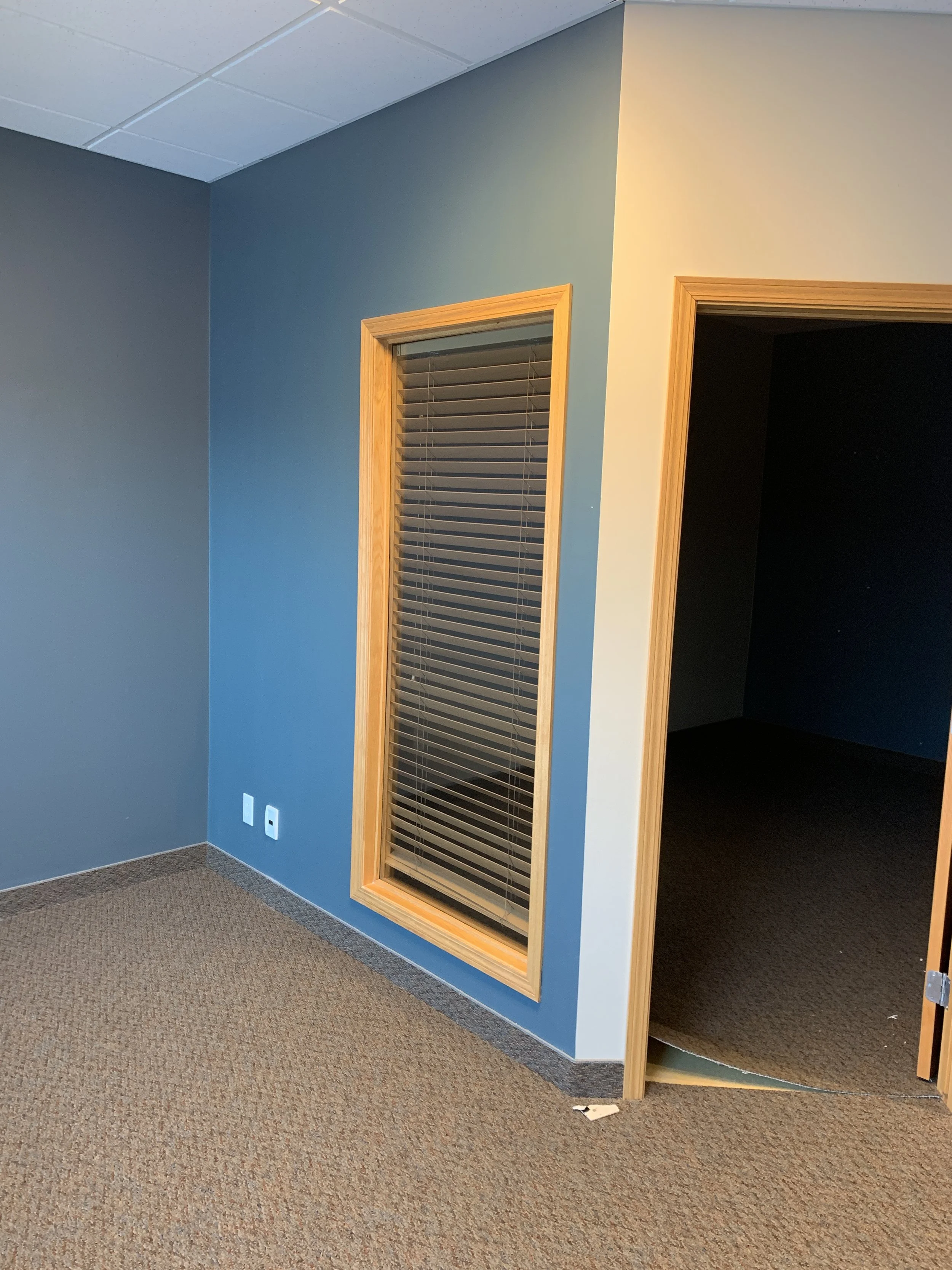
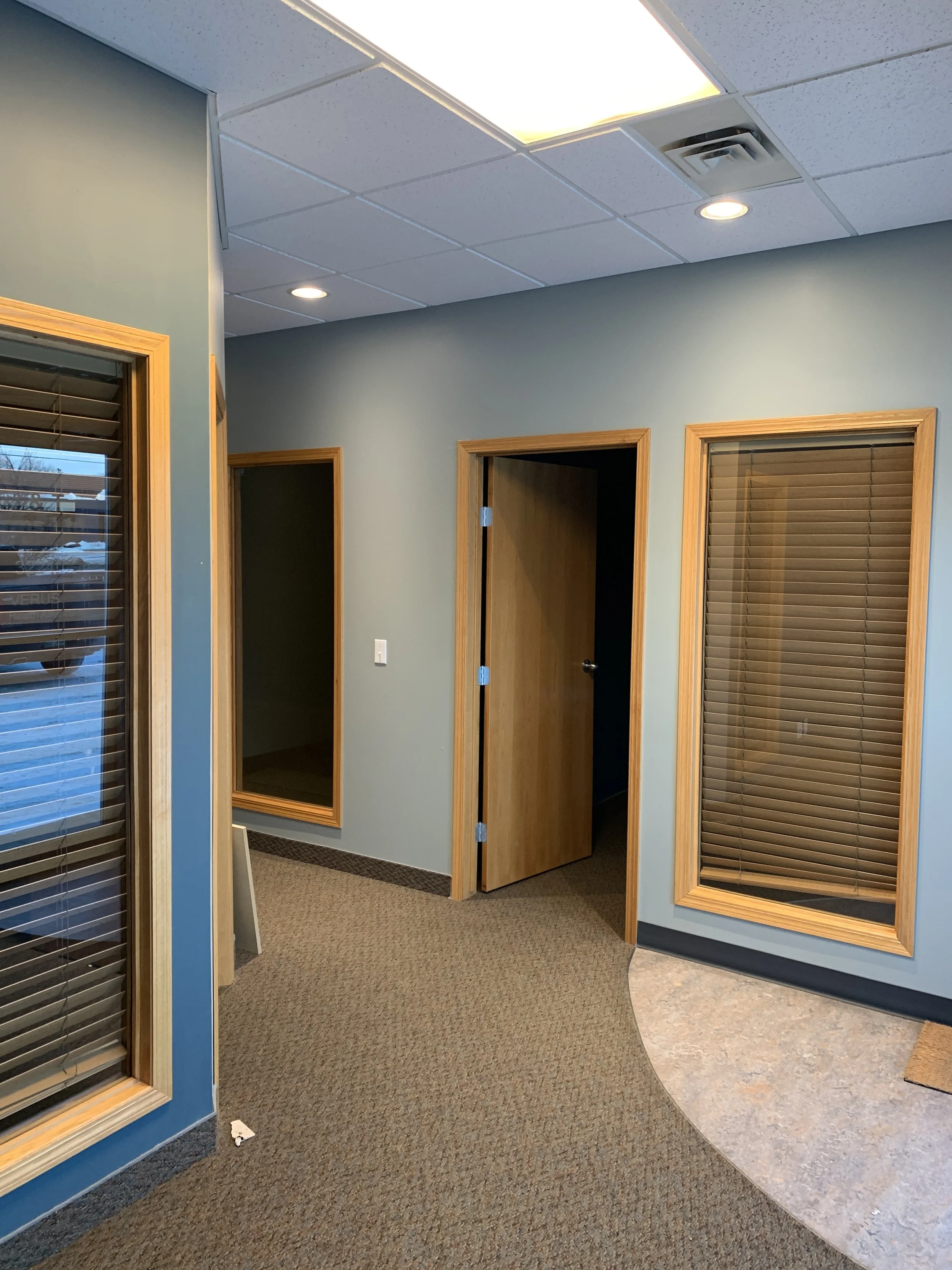
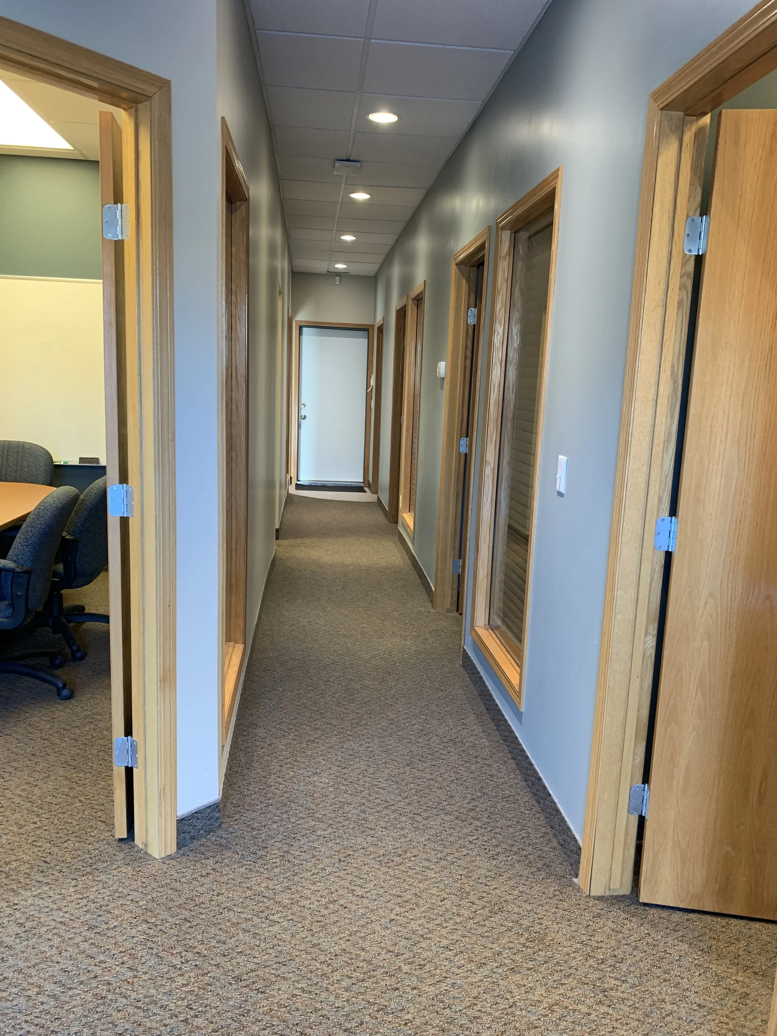
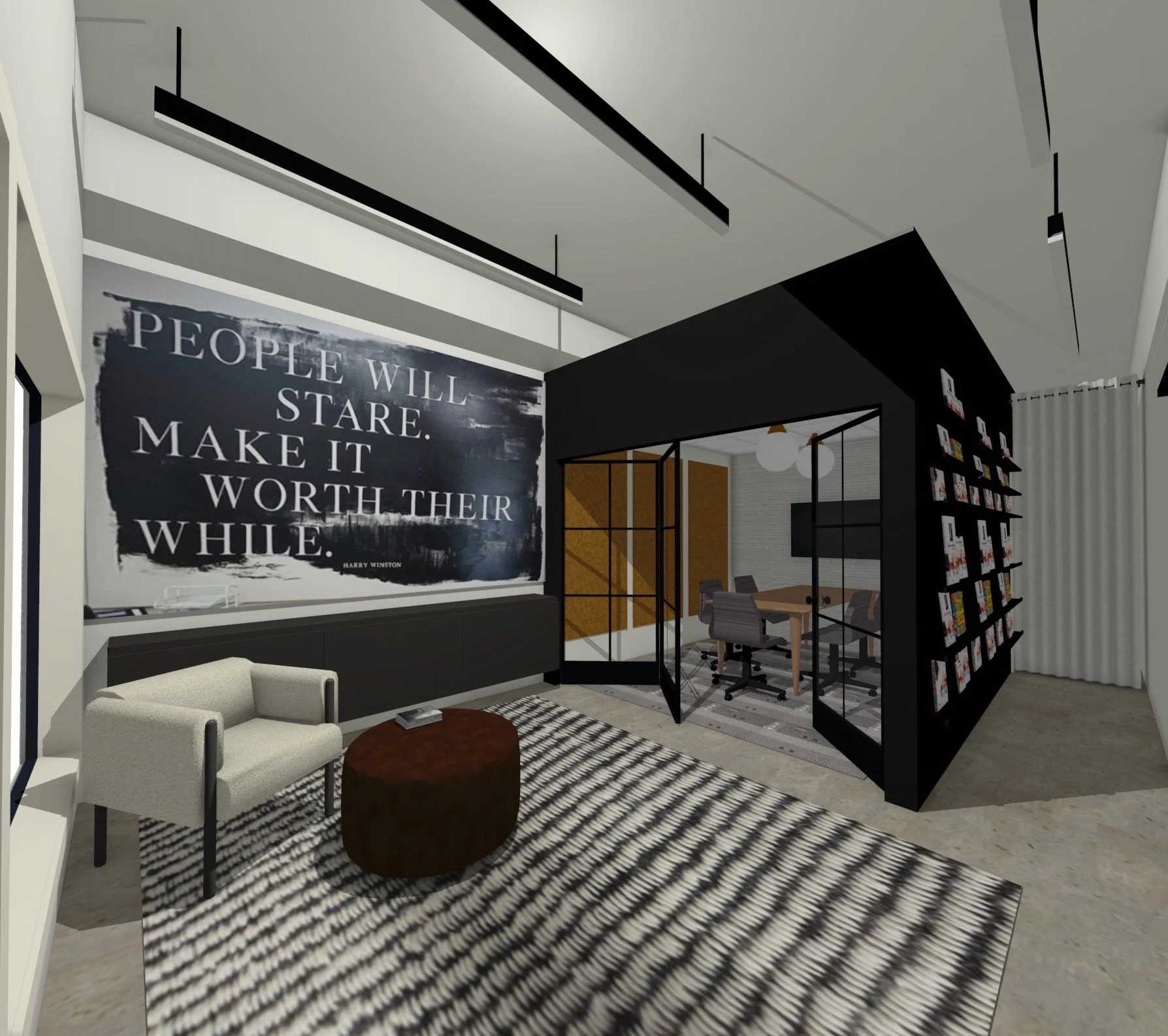
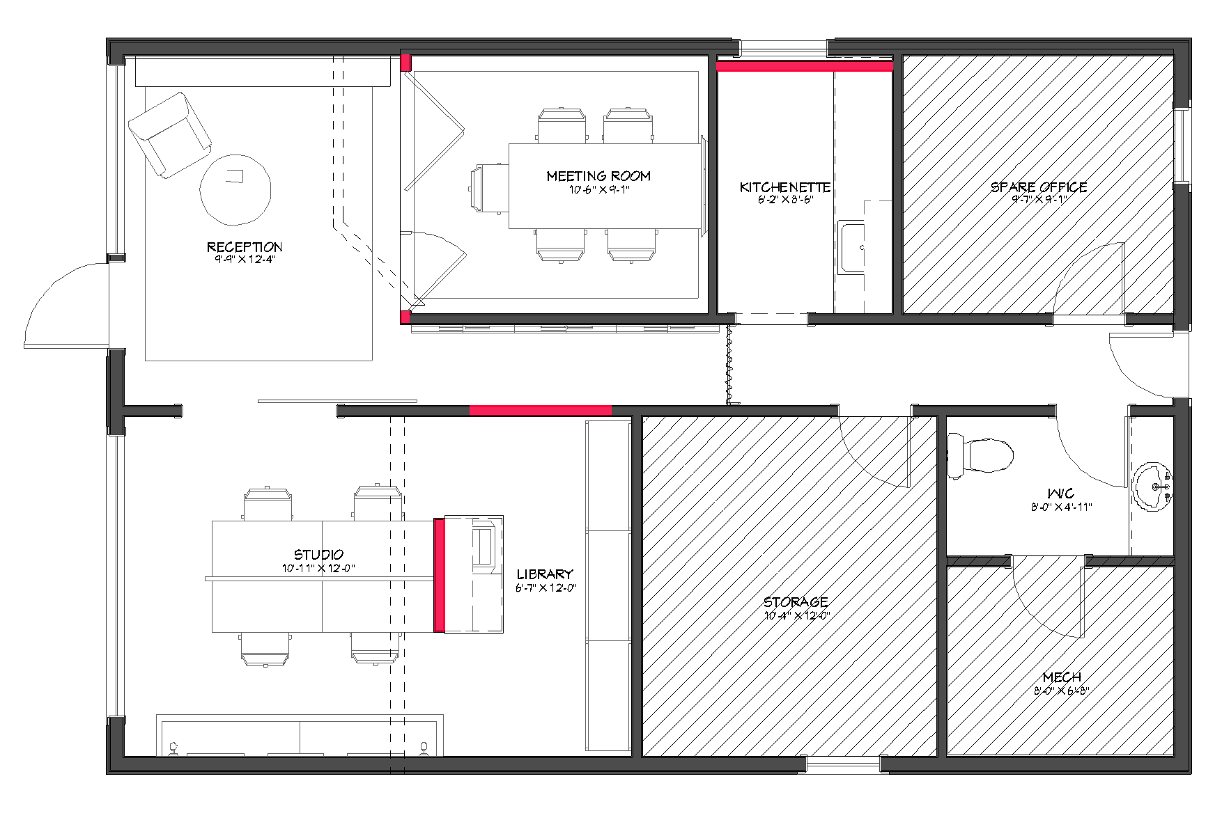
A short year later, we quickly outgrew that space and felt it was time to have an office of our own so we could express who we really are! We began to scout locations and look at what was available. When we caught wind that our current space was going to be available we jumped at the opportunity! We saw the potential and it was the right size for us (which is actually really hard to find in commercial real estate)! We quickly did some space planning and 3D renderings to make sure it was a fit! Check out the office before with our concept renders below!
re:Design Headquarters:
Make it stand out
Whatever it is, the way you tell your story online can make all the difference.
Not that we are biased or anything, but this has been one of our favourite transformations! If you haven’t yet, take a look at our instagram highlight titled “our office” to see the progress. Although we aren’t always at the office - sometimes we work remotely or are running around to different showrooms and sites - it truly is the best place to come work! It is a space that feels like us!
Let’s chat about how we planned our space. Our main focus was creating 3 areas: the meeting room, a casual seating area and of course the studio.
The Meeting Room:
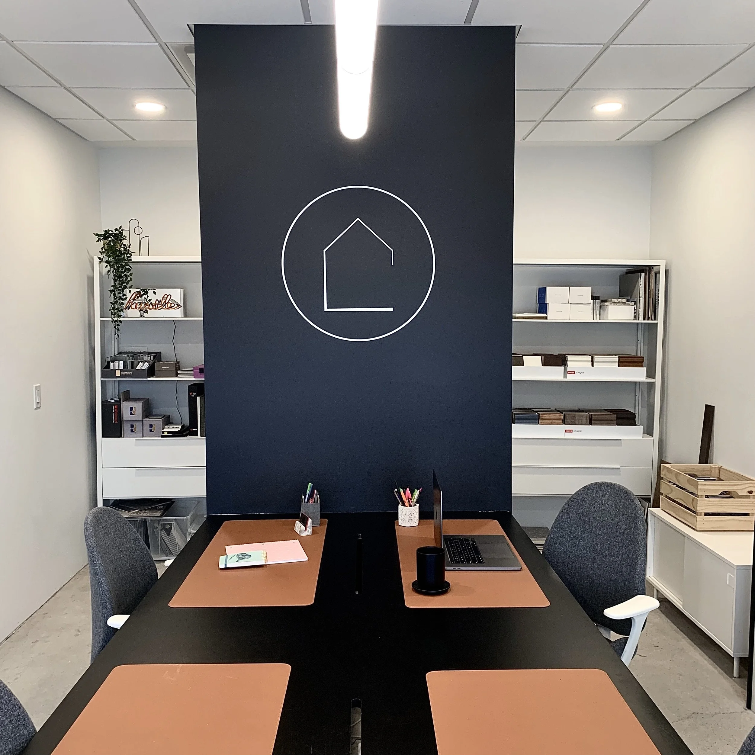
This was a critical space to plan. It’s the place most of our meetings take place and also visually connected with the entry. We wanted to highlight this space as something special so we created the “black box”. By lowering the walls so they’re not connected to the exposed ceiling, it reads as its own unit! We made it visually standout by painting it black (Benjamin Moore Black Beauty 2128-10)! We used a carpet tile to help with the acoustics in the space and layered the lighting. It’s important when looking at samples to have clean, bright light, but we wanted to also use the space to entertain. We added in the decorative fixture that helps set the mood! Finally, we added in the wall paneling because we felt the room needed some visual weight. We love the texture it brings and we opted for a deep sage green (Benjamin Moore Fatigue Green 2140-10) to contrast the warmer tones and white walls (Benjamin Moore Oxford White OC-30)!
Fun fact about our meeting room: the table is actually a door that we added some cast iron legs we found on Etsy! We wanted something unique and got to put our own twist on the design!
Part of the whole concept of this space is that we could open the meeting room into the casual seating area. This all hinged - no pun intended - on the fabulous doors. It was a challenge finding someone who could make these for us, but our pals at Yarrow Sash and Door embraced the concept and created the show piece of our office!
Causal Seating:
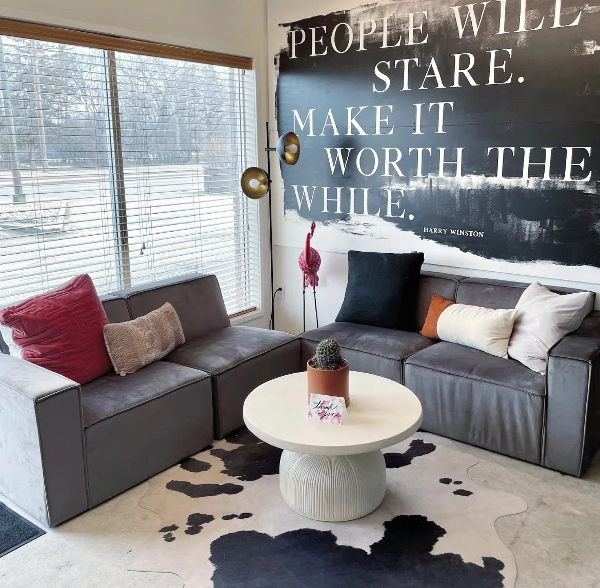
Part of brand is casual (yet professional). You may notice this when you walk in and we have hoodies and baseball hats on! Who doesn’t want to be comfortable while working? We wanted to translate this feeling into our office, so we created a space when you walk in that reflected just that. We incorporated comfy seating for our visitors and us! This is likely where you’ll find Chelsea working and where we have our happy hours! And you know we just had to work in our custom sign. We’re biased, but we think it’s pretty great!
You can see that we kept our base tones very neutral. We brought in the colour and texture with decor! We love our flamingo, Frank, and our office plant courtesy of one of our clients! You can never go wrong with working in unique pieces that make your space you!
Fun fact about our casual seating: in the COVID world, available furniture was very hard to come by. We were conducting interviews and wanted to have a completed space so we popped over to HomeSense and found our sectional! It was a great find without a big price tag - win!
The Studio:
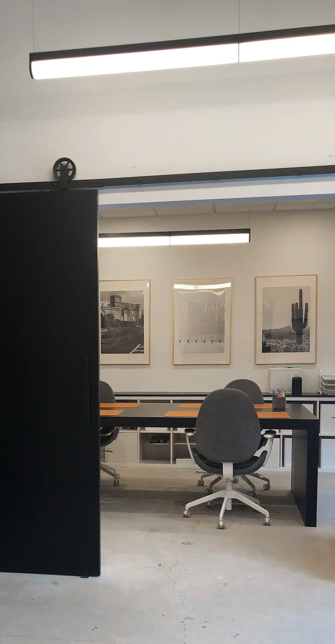
This is where all the creative magic happens! Our work space, where we plant our butts the majority of our time in the office. Planning, drafting, designing - you name it. We work collaboratively so we wanted a space that supported this! To maximize the space we opted for one oversized work surface that we had custom made! We also wanted to be able to close the space off so we worked in a matching oversized barn door!
From a functional standpoint, we needed to incorporate lots of storage. We reused most of our Ikea storage and added to it! Having a sample library is critical for the type of work we do and keeping it organized is key! We wanted to visually separate the space so we worked in a partial wall. This helped to hide the clutter of the library, but also provided a very needed print station and power wall for our computers.
Fun fact about our studio: We had to replace all the millwork almost immediately after moving in. Truthfully, we cheaped out. It was a very good, yet annoying, lesson in practice what you preach - invest in your space and make sure to use good quality products that will last through the abuse you put it all through!
One of our favourite phrases is “teamwork makes the dream work”. We truly wouldn’t have been able to do all this without the help of some wonderful people. Let us shout them out shall we?
Chippy Contracting - most of our interior renos
0812 Building Solutions - wainscotting detail
Power Driven Electric - our electrical contractors
Legacy Originals - our awesome millwork and barn door
Yarrow Sash & Door - our awesome meeting room door
Best Price Painting - as you would expect - all the paint work
Axis Lighting - our feature lighting
Travelling Sign Painters - custom sign
Fast Sings - all of our office signage
Ikea - lots of our storage and our office chairs
HomeSense - our sectional and flamingo
Wayfair - some of our lighting and accessories
Urban Barn - our coffee table
Sunpan - meeting room chairs
Renwil - our accent lighting and pillows
Surya - our faux cowhide
FLOR - our carpet tiles
Etsy - feature table legs and corner “closet” rod
Well there you have it, three spaces coming together and creating our own little home away from home! But really, don’t be shy, come say hello and take a peek! For those of you who want to know more about the products and finishes used just let us know!


