Our First Project
These last four years have been a crazy ride, and it made us think back to our very first project we did as re:Design! Join us as we go down memory lane and look back at our first project as a brand new design studio!
The Project:
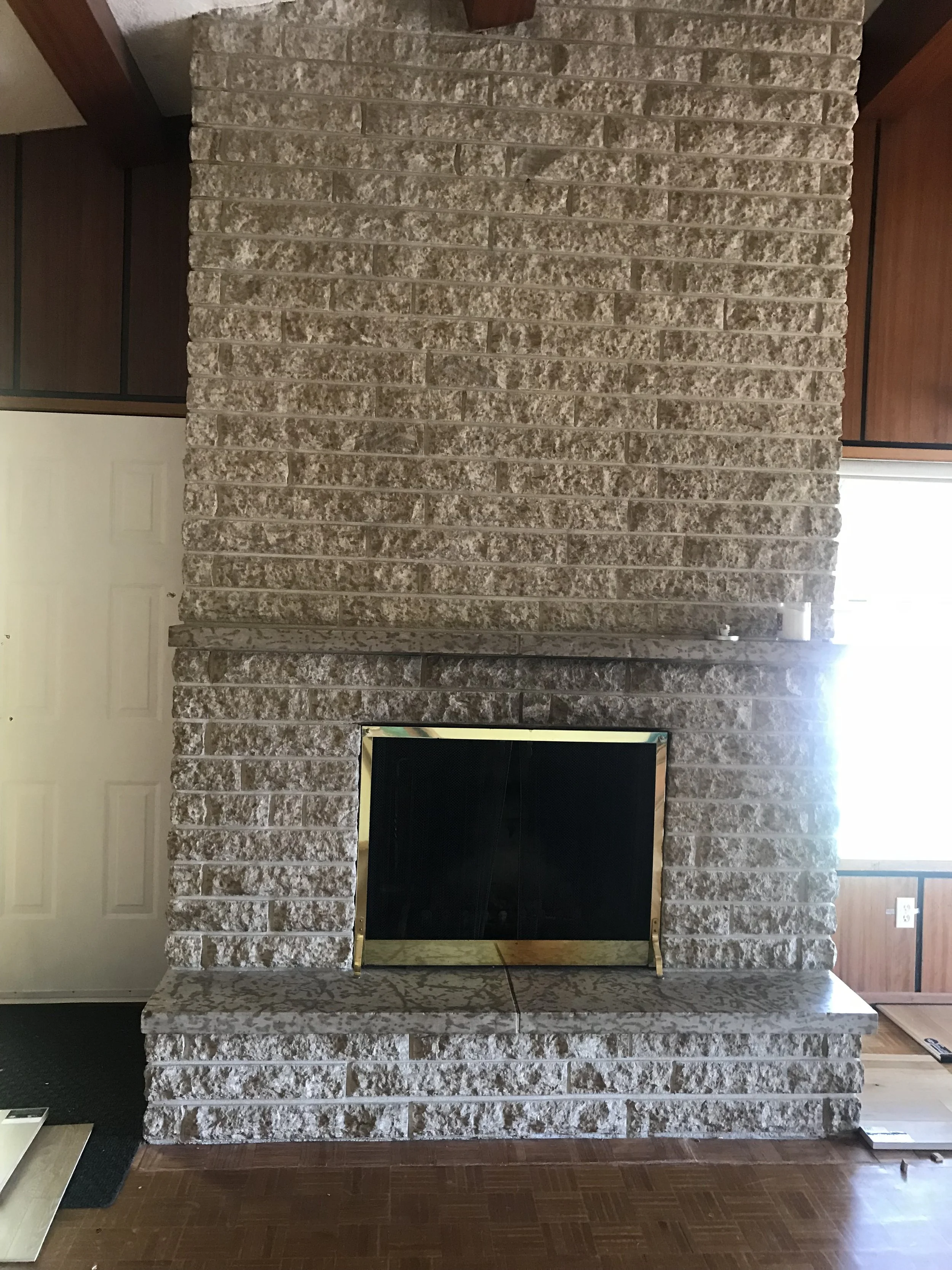
This was primarily a main floor renovation - focusing on the kitchen, entry, living room and dining room. The home was already a beautiful mid-century style and the clients wanted to maintain lots of the design aesthetic and details. The first goal was to open up the kitchen to the living space. The original fireplace is located right next to the entry and that made it hard to maintain circulation space and include seating, especially because it made the living space too long and narrow. It ultimately was an unusable space with a great feature fireplace.
The Kitchen:
We opened up a wall to make it an open concept kitchen and created a bar space that tied into the fireplace area. This gave the space a purpose and created a great feature when you walk into the house.
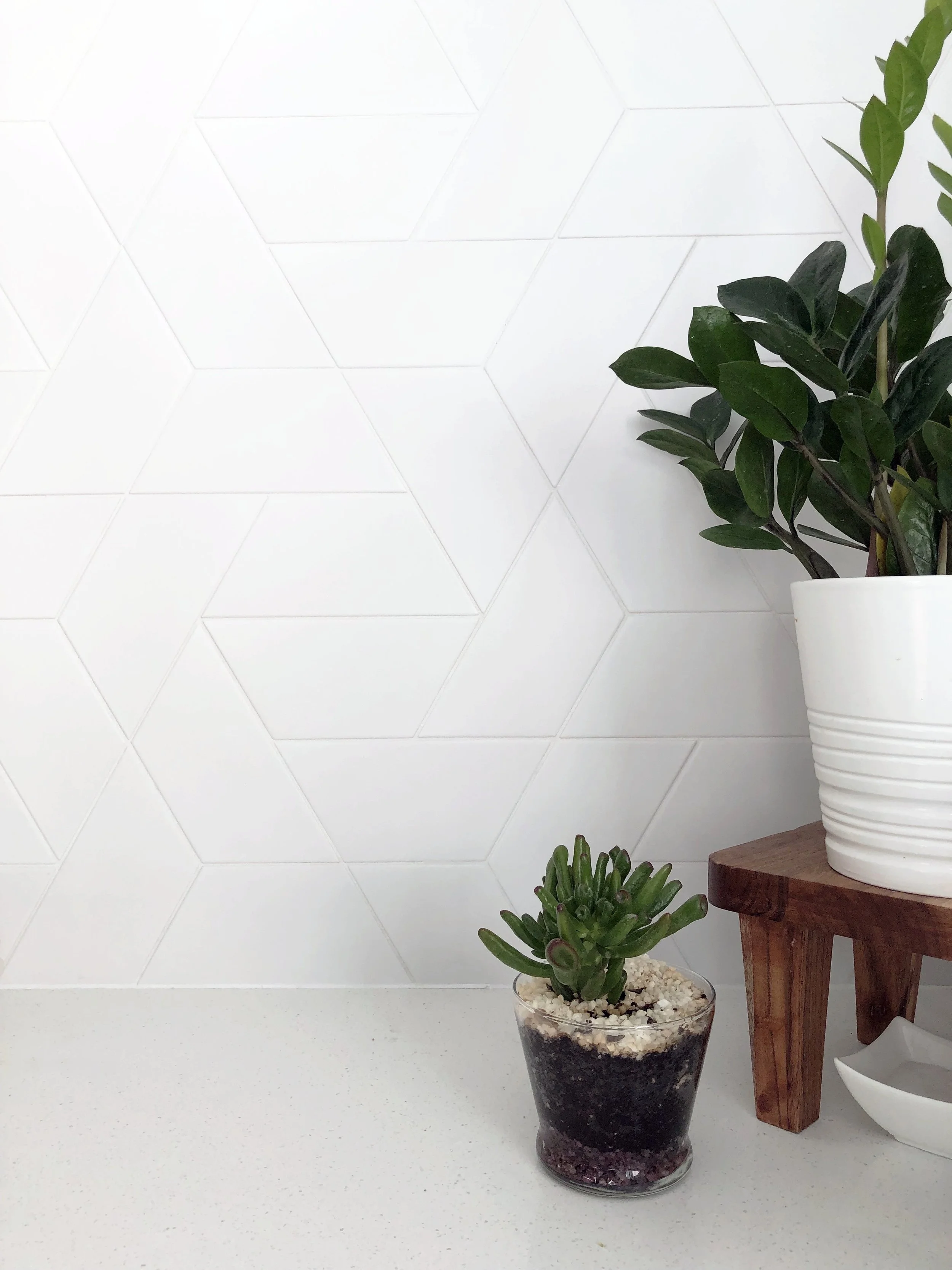
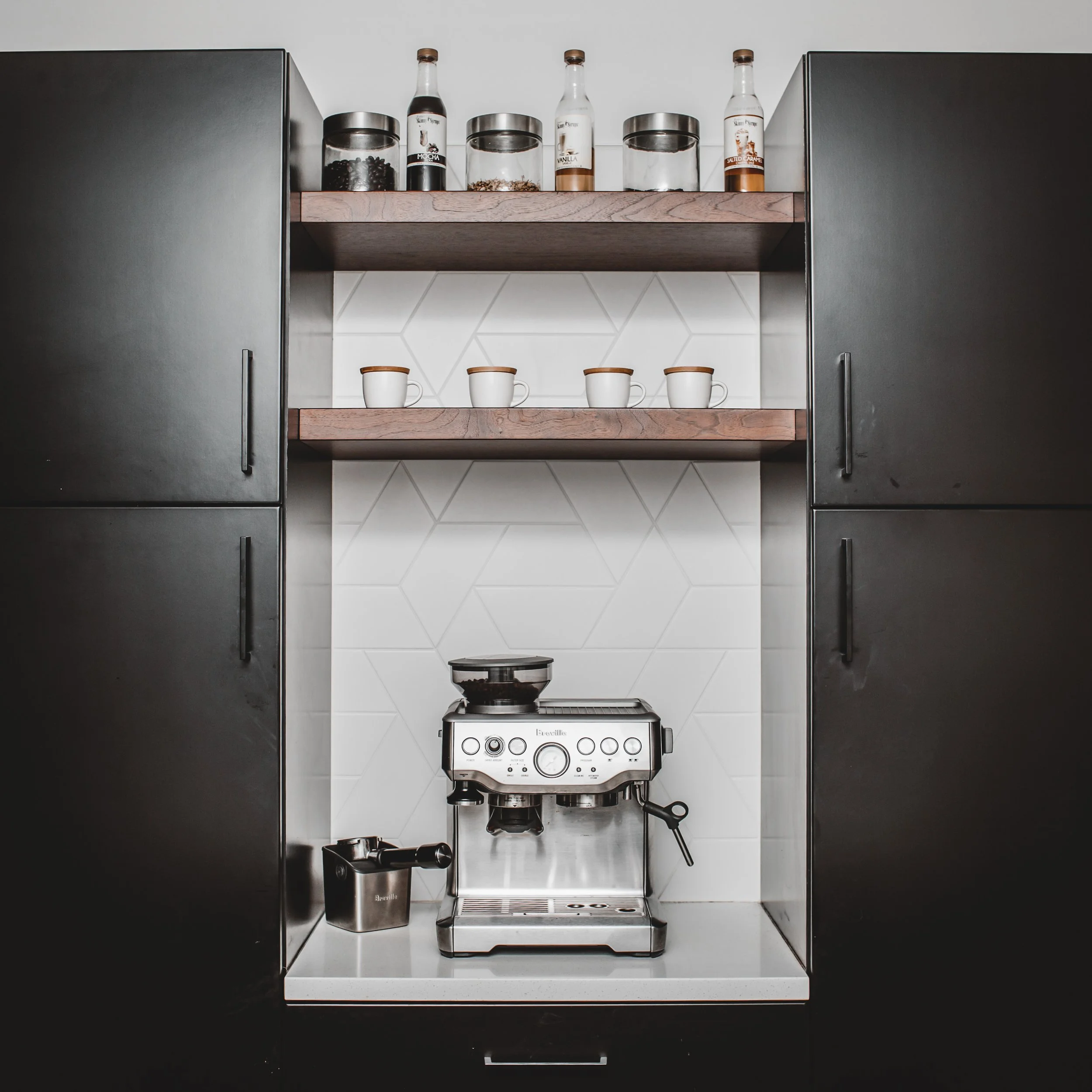
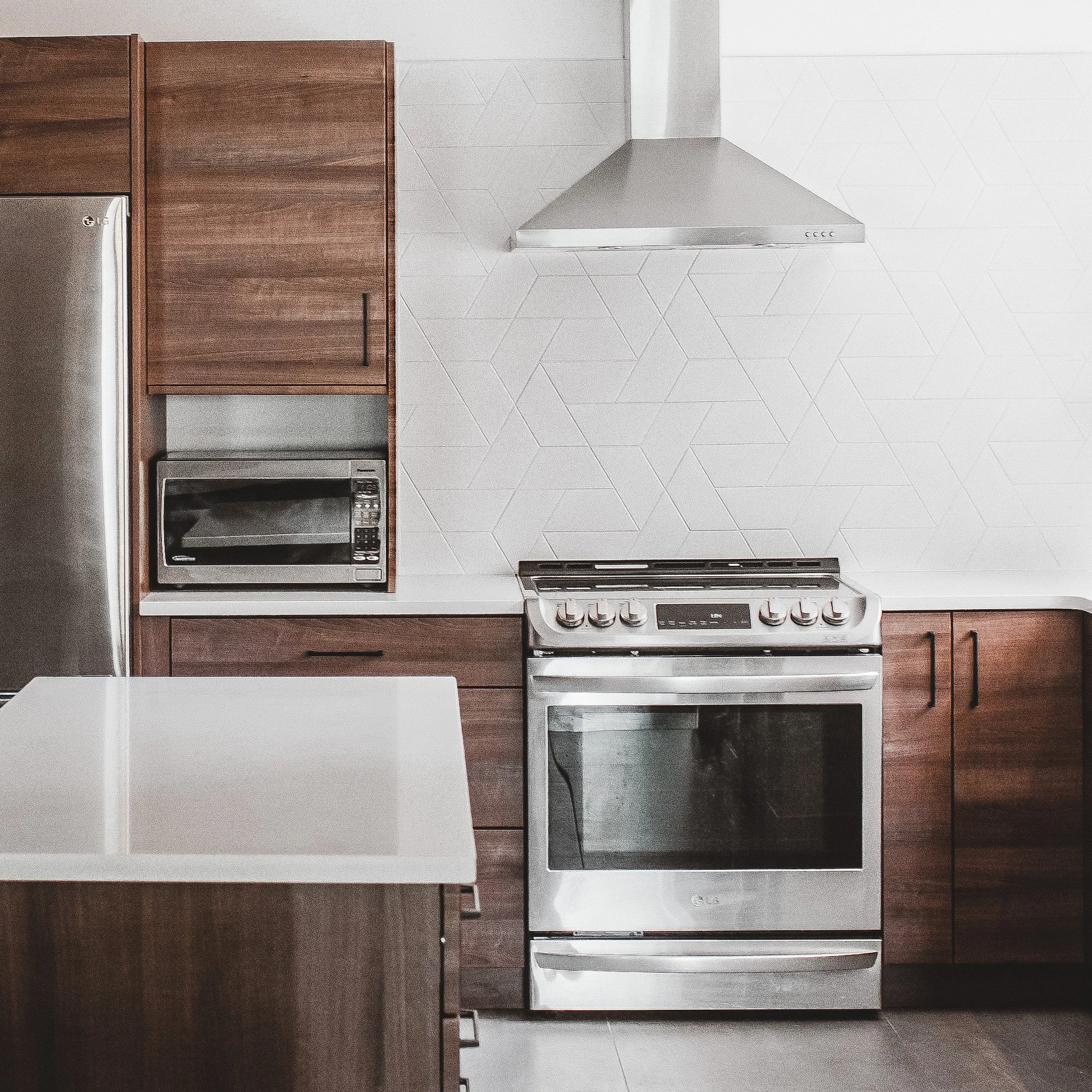
Part of what was critical to the clients was to work in an island and coffee bar to the existing footprint of the kitchen. We used warm wood tones to stay true to the mid century vibes and tied in some moody black millwork to modernize the design. We didn’t want to over complicate the finishes in the space so we went with white backslash tiles, but in a fun pattern to add something special!
The Entry:
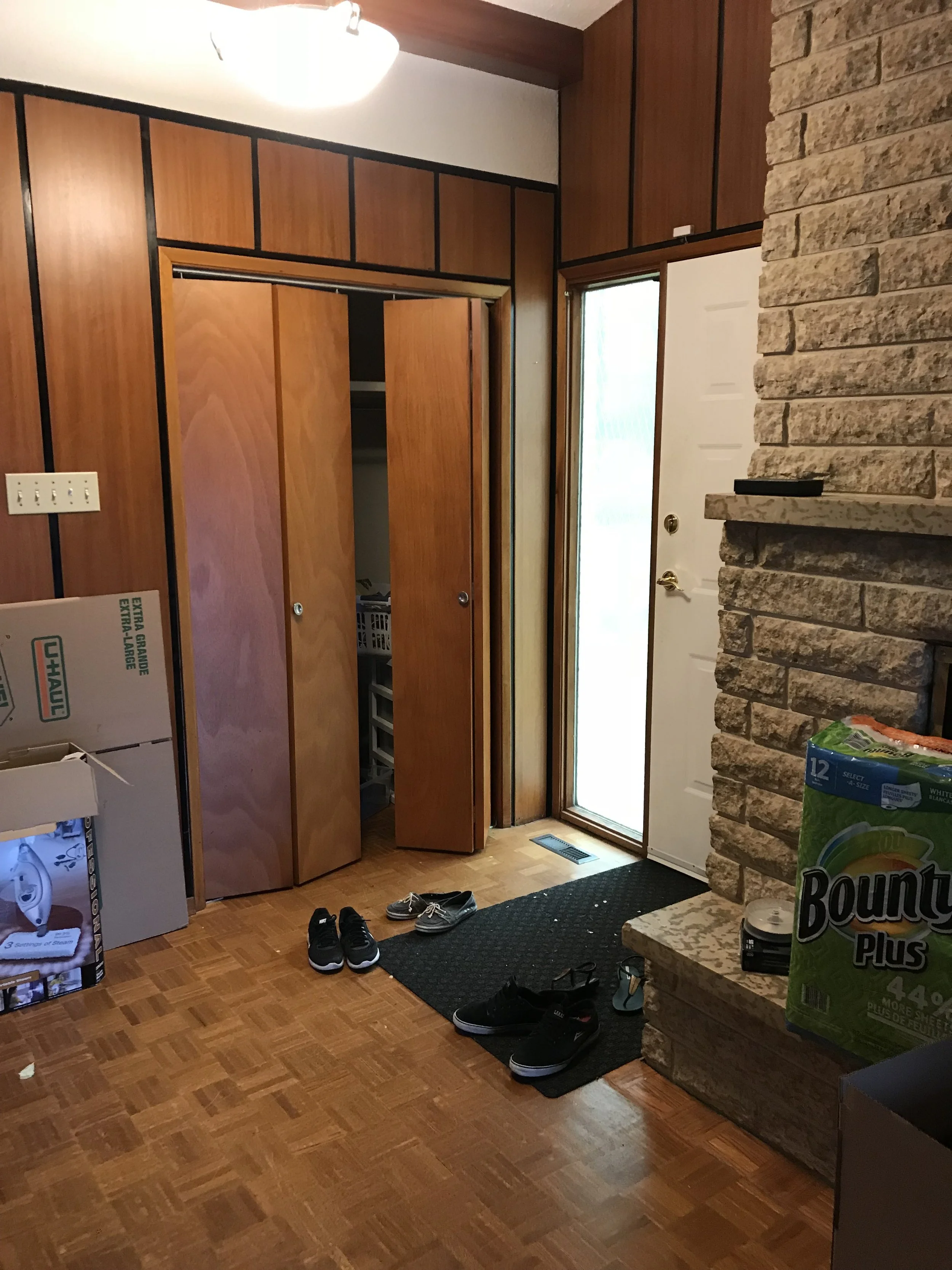
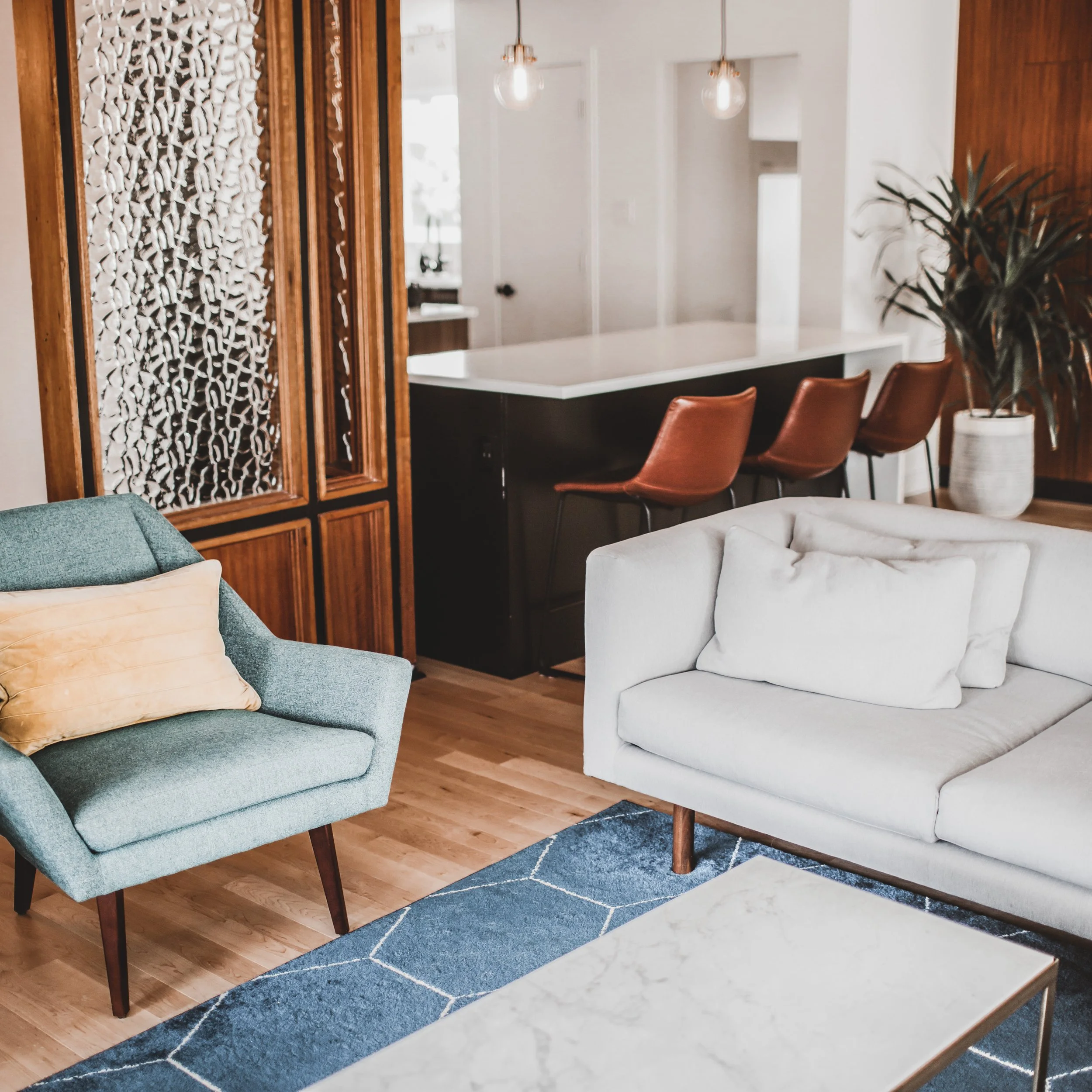
Here is an original detail (left) that got a modern twist! The client loved the wall panels and wanted to keep them! So the panels were actually taken off the walls, cut down, and reused/repurposed. A modern update on a classic detail. You can see the new spacing and pattern orientation of the panels in the photo below! (right)
The Living Room:
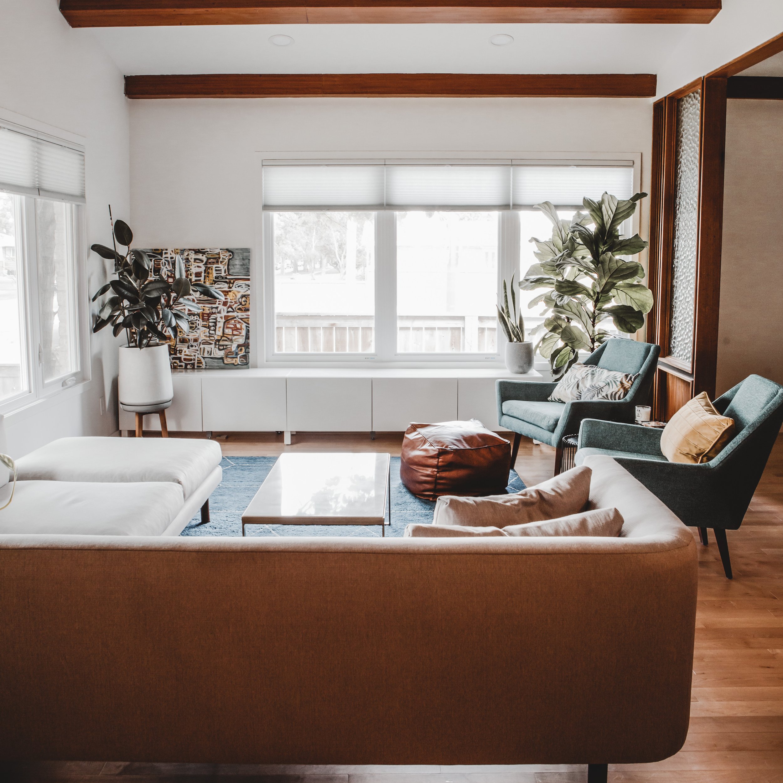
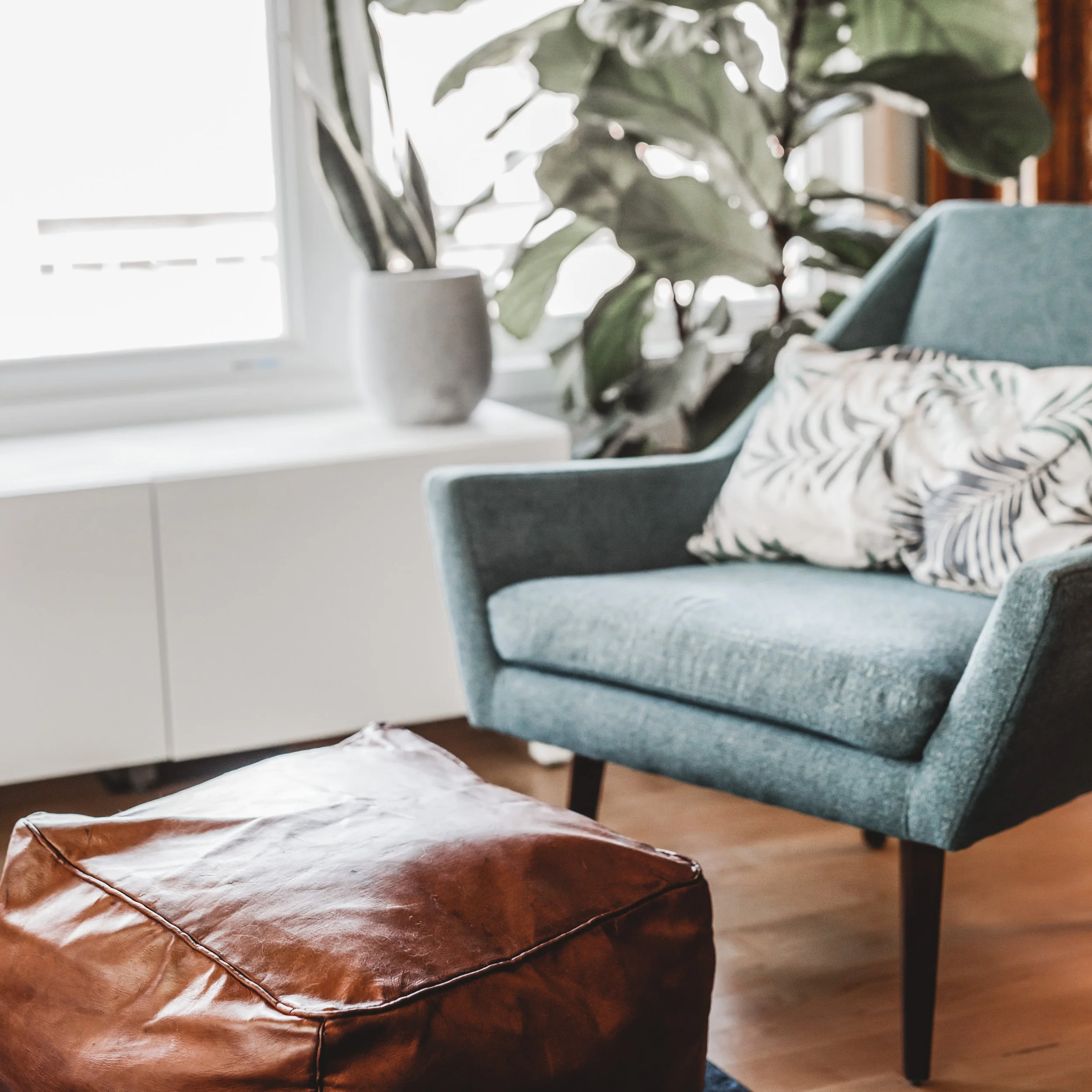
The clients wanted to work in a “Palm Springs” mid century vibe - which we did with bright pops of colour throughout the furniture and decor choices. The furniture was a large component of this project when it came to tying all of the design elements together. We were able to curate the look and the clients put it all together!
The Dining Room:
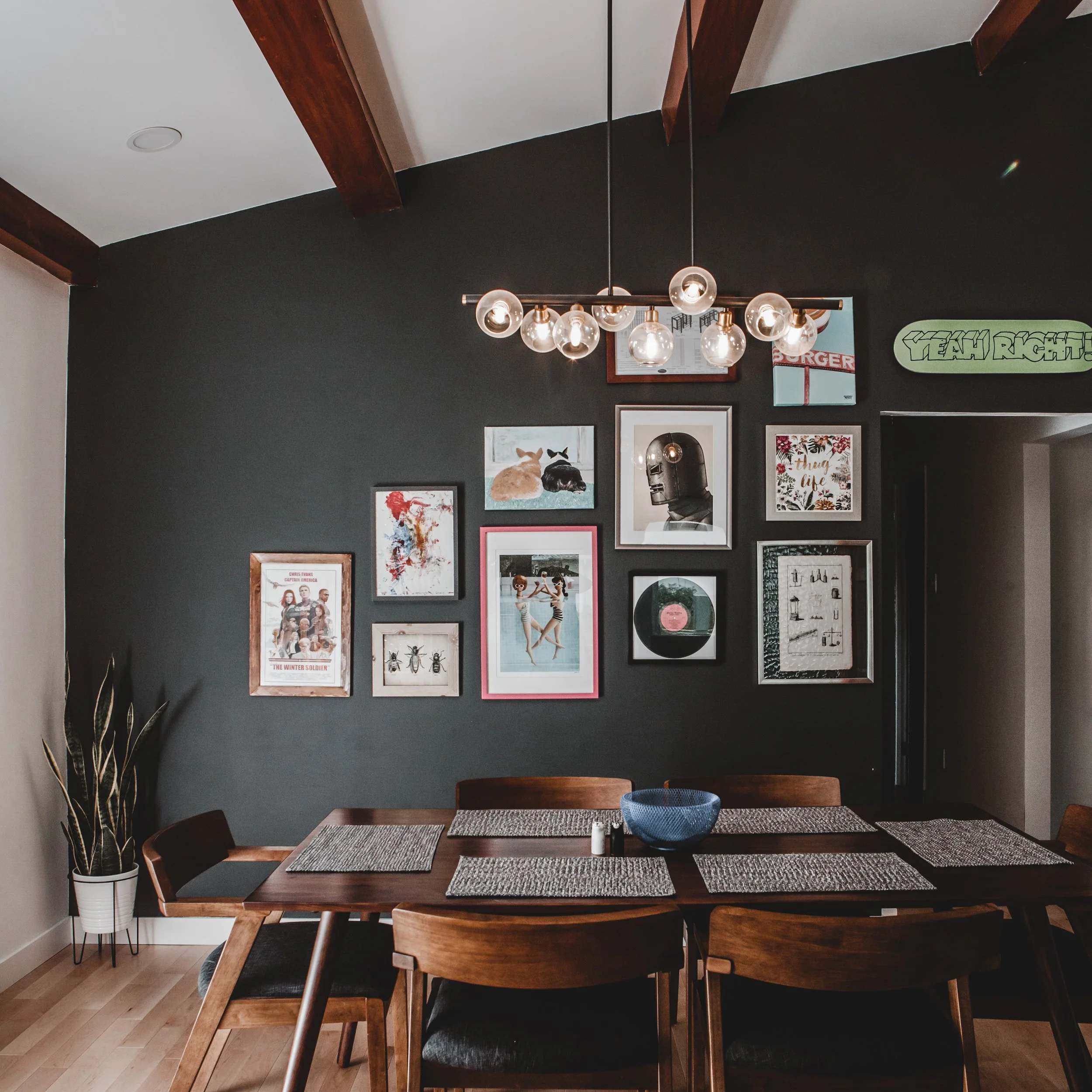
Last, but not least, is the dining room. We salvaged the original glass detail and added a powerful feature wall that is truly unique to the clients! The dark bold wall provided the perfect backdrop for the clients to create their gallery wall! We couldn’t love how this space came together more!
It’s so gratifying to say this renovation was a success! We still share photos of this project because it really is one of our favourites! Of course there are always challenges anytime you start something new and we learned a ton on this project! Our clients knew they were our guinea pigs and they embraced all of the learning with us! They were very involved and we truly found out how much we loved to collaborate with clients. This is why to this day, we keep our clients needs and wants in the forefront and focus on collaboration throughout all of our services!


