Who Needs A Designer Anyway?
What’s the point in hiring a designer? Especially in a world where you can go online and gather a bunch of great ideas and read some helpful DIY blogs to create a design on your own. Not even going to get into this new world of AI. There are so many ways to “cut costs” when it comes to building or renovating and to be perfectly honest, working with a designer or architect may not be for everyone! It really comes down to what you value. The simplest way we can describe a designers value within the building process is we are trained to think creatively and understand how to work with people to execute the design - even if that means pushing less creative consultants or trades to think outside the box (cough engineers cough cough).
But, this is not going to be the typical “designers actually save you time + money” speech. Instead, we are going to walk you through a project that came to us already “designed” and show you how we transformed it - using some of that creativity - into what it is today. This is the best way we think we can show you what a designer brings to a project and you can decide for yourselves if we made it better!
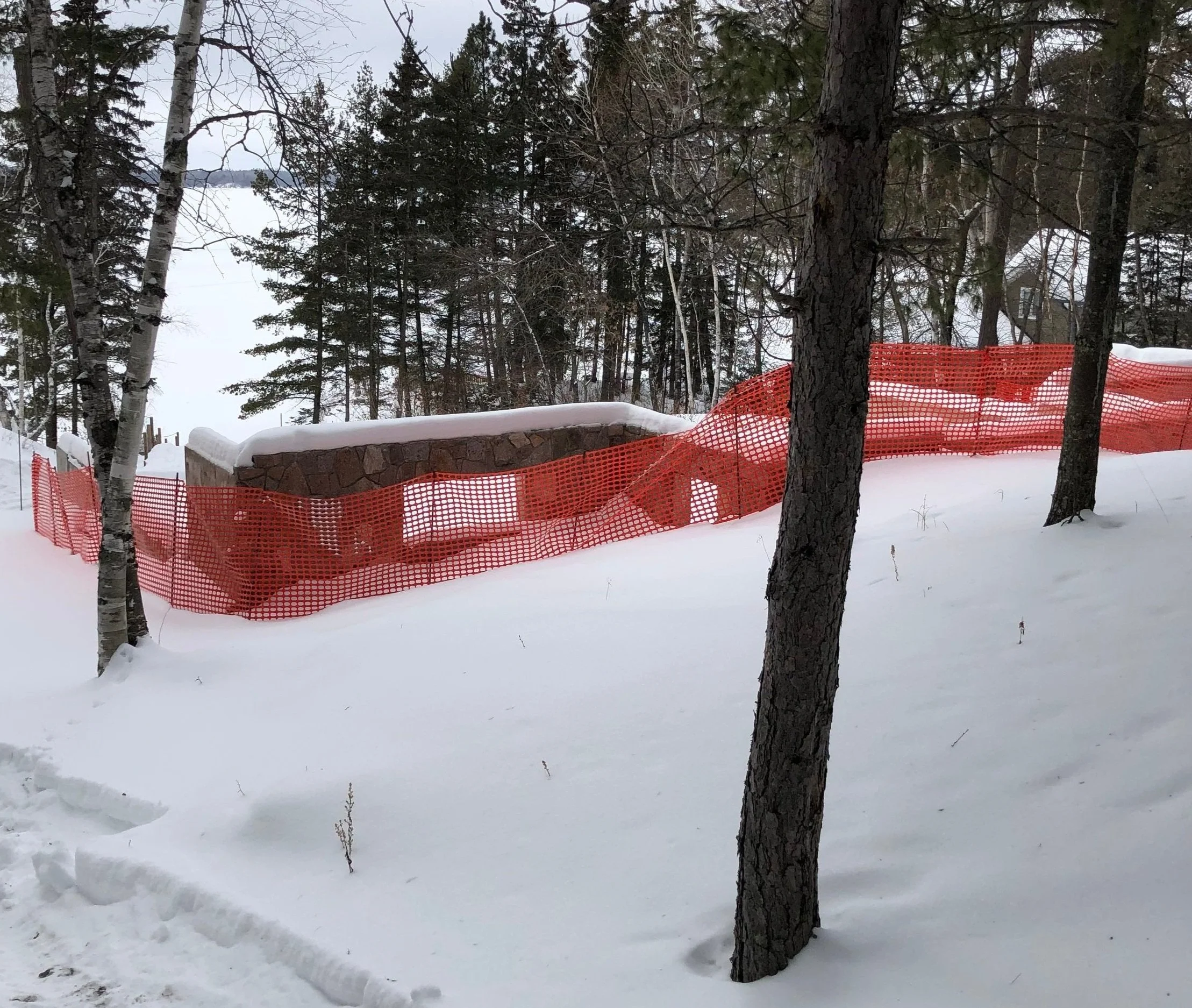
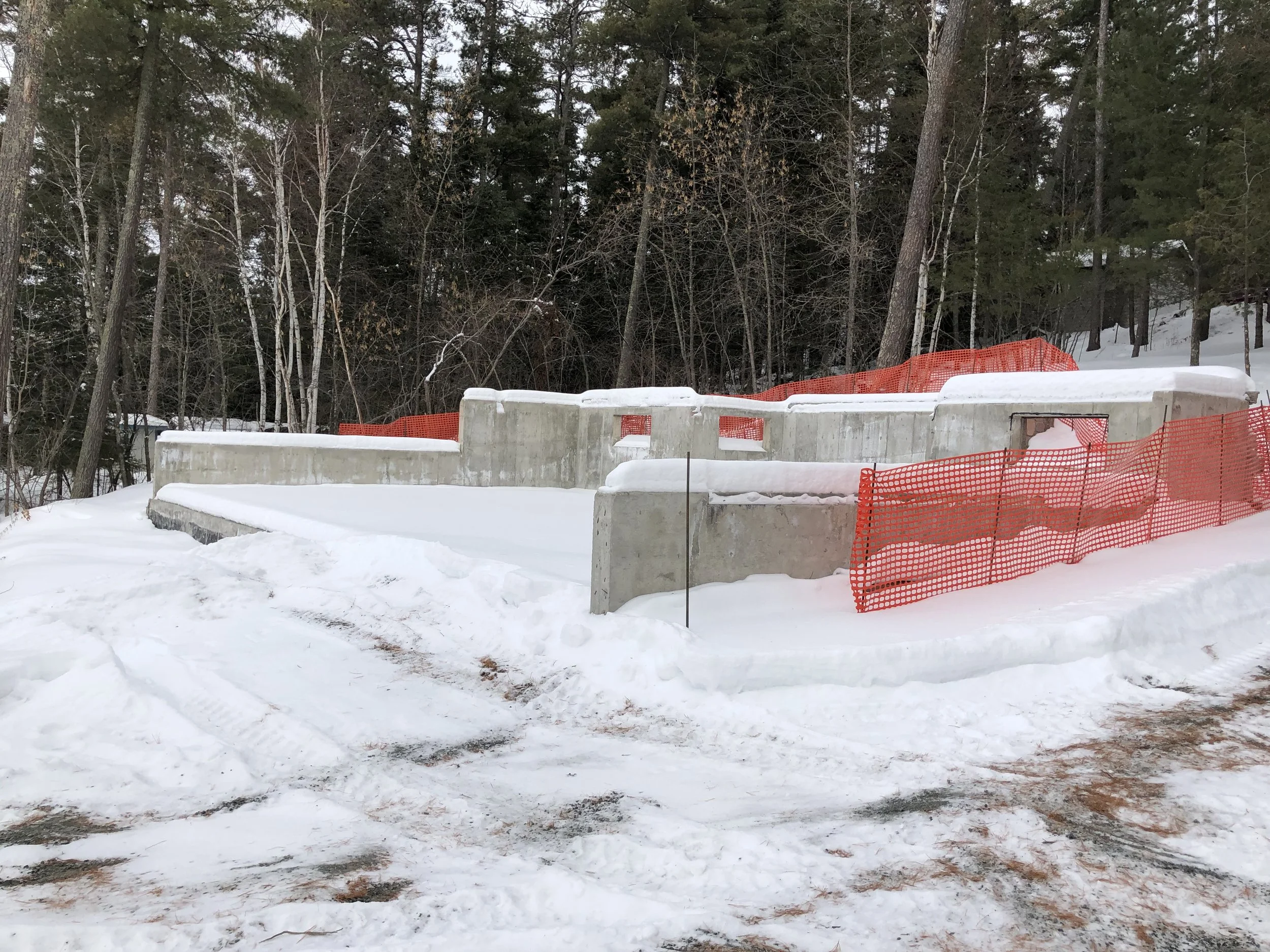
We were contacted by a builder who had a client looking for some help with their cabin design. We met with the client and found out they had a couple of plans already done by a drafter, but they just weren’t very happy with the outcome. There was a site restriction where they were going to be using an existing foundation, which limited the layout. The client figured this was the root of the problem! They wanted to hire us to take a look at what was done, provide some feedback and help take it to the next level. Above are the site photos showing the foundation we had to work with.
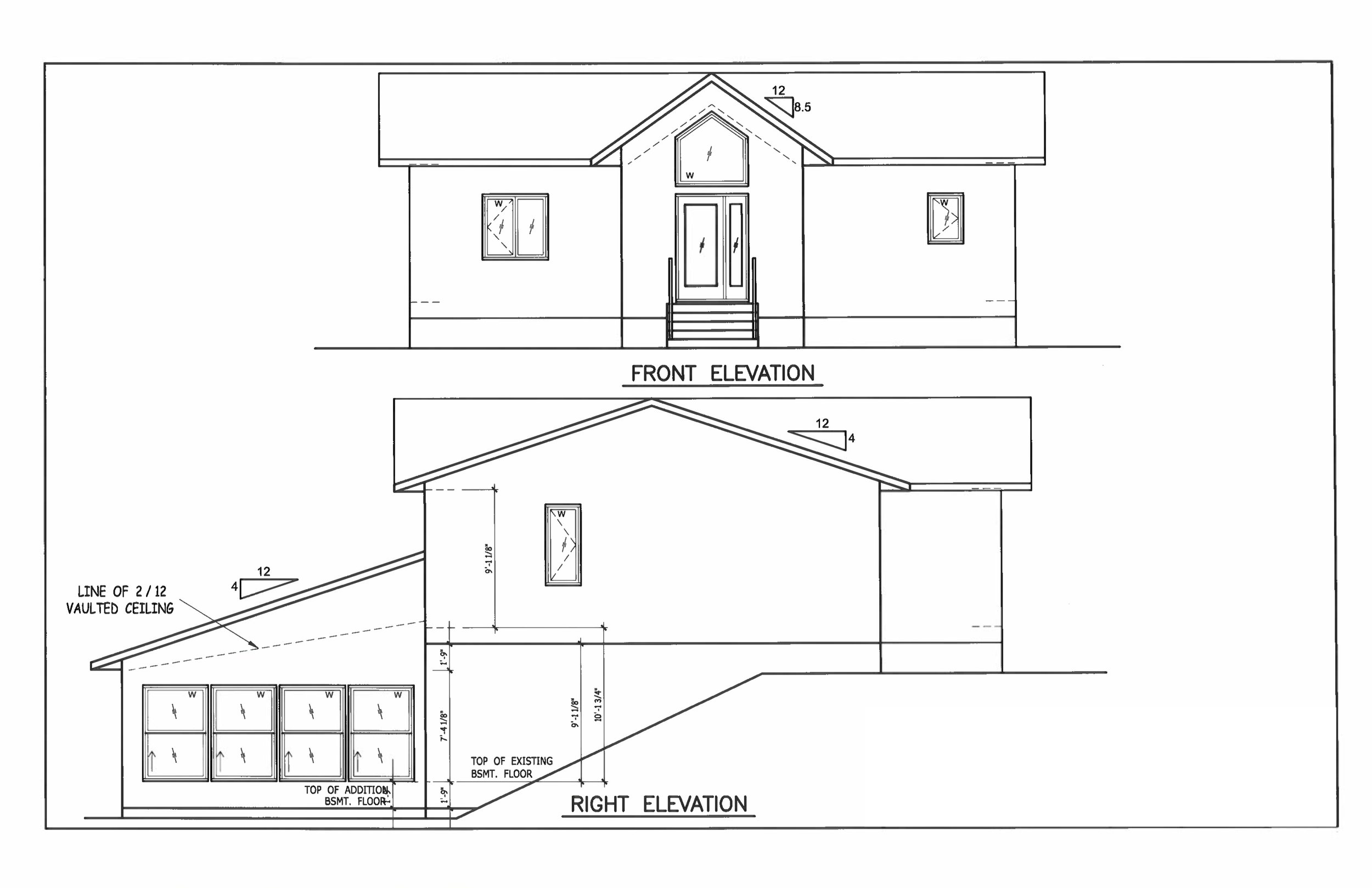
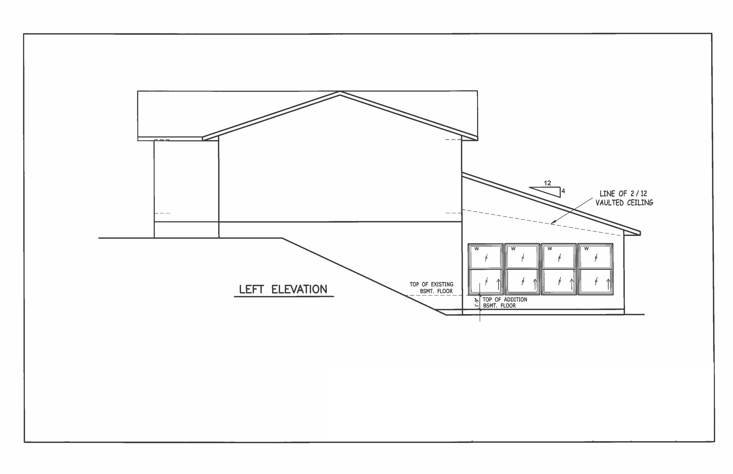
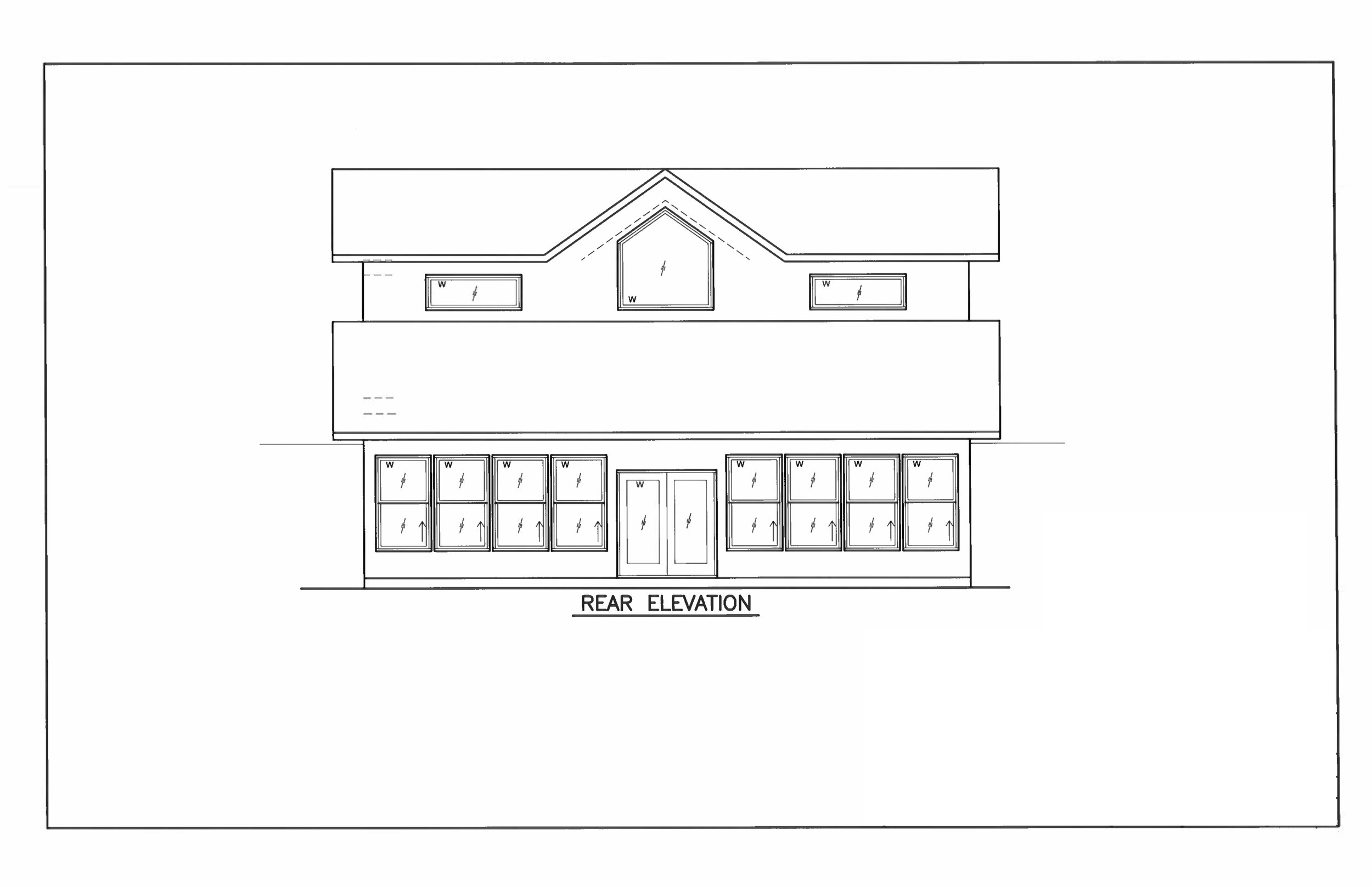
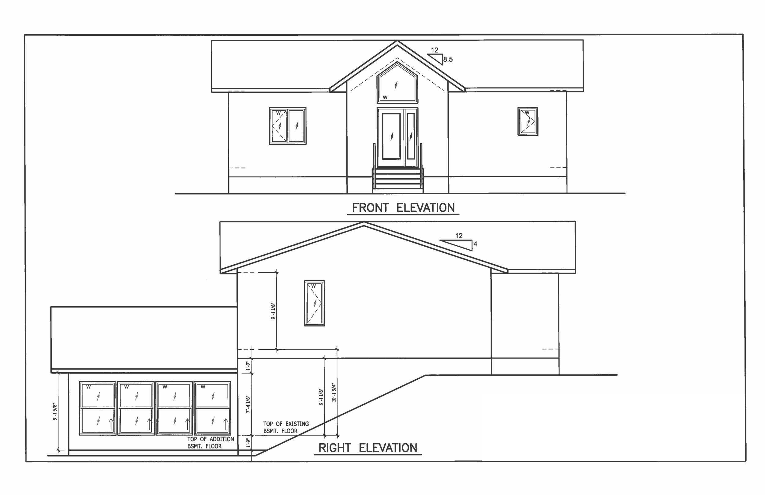
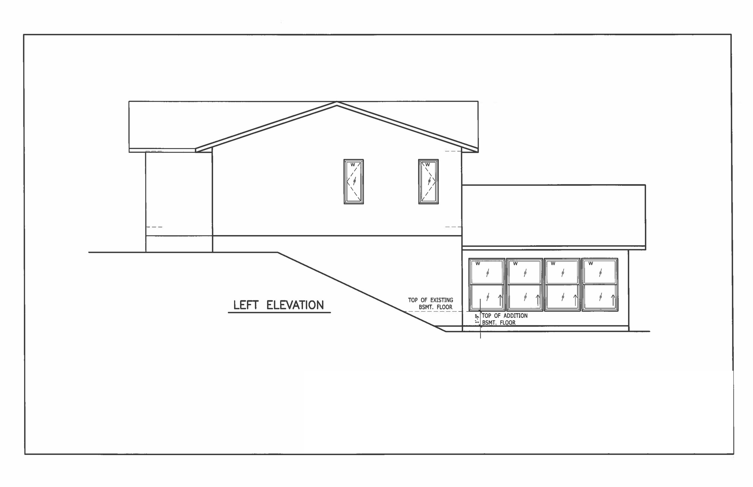
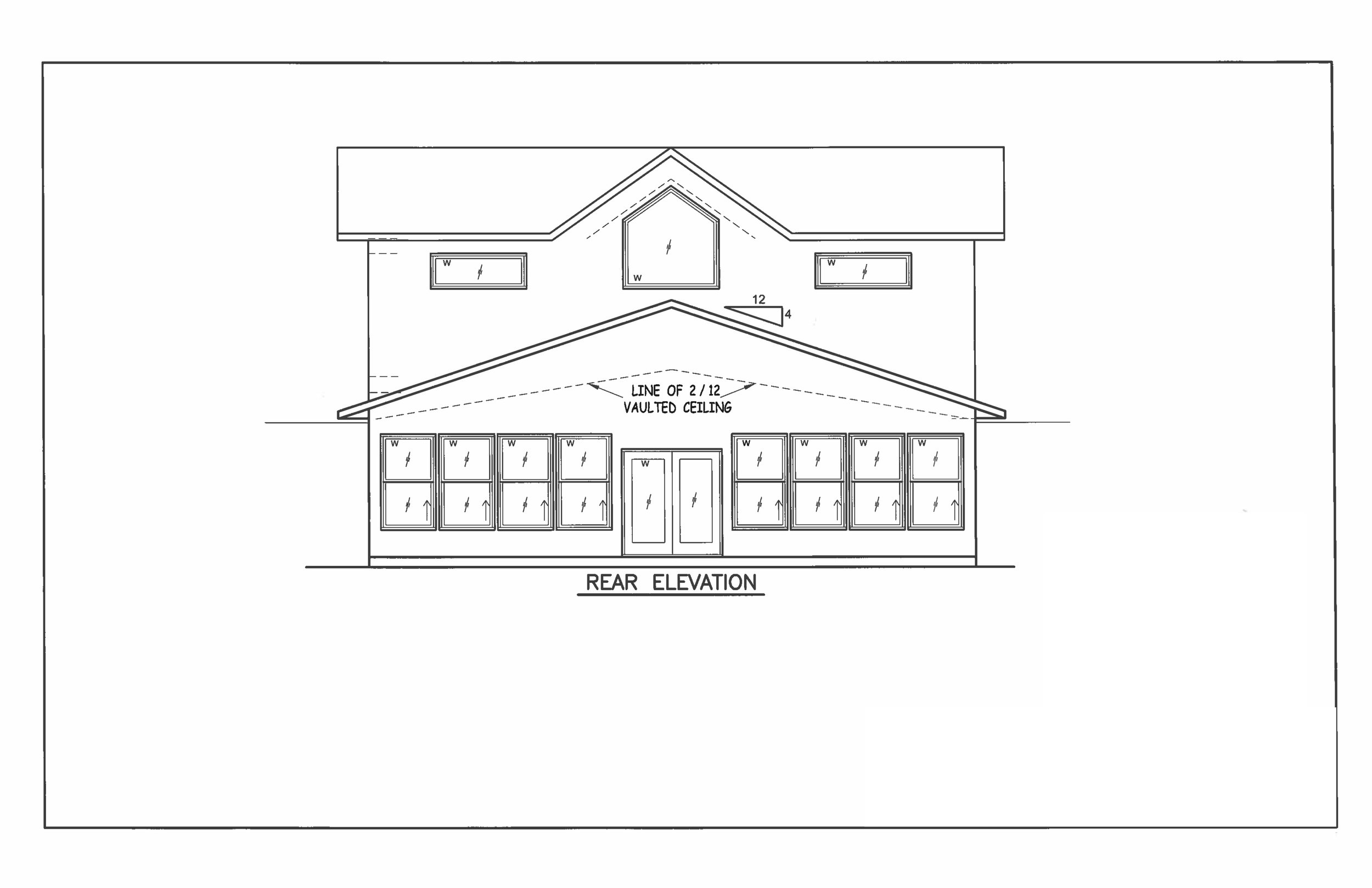
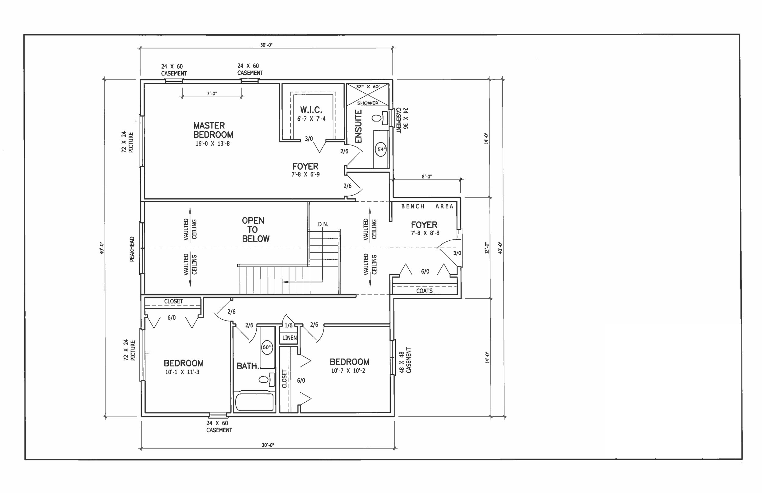
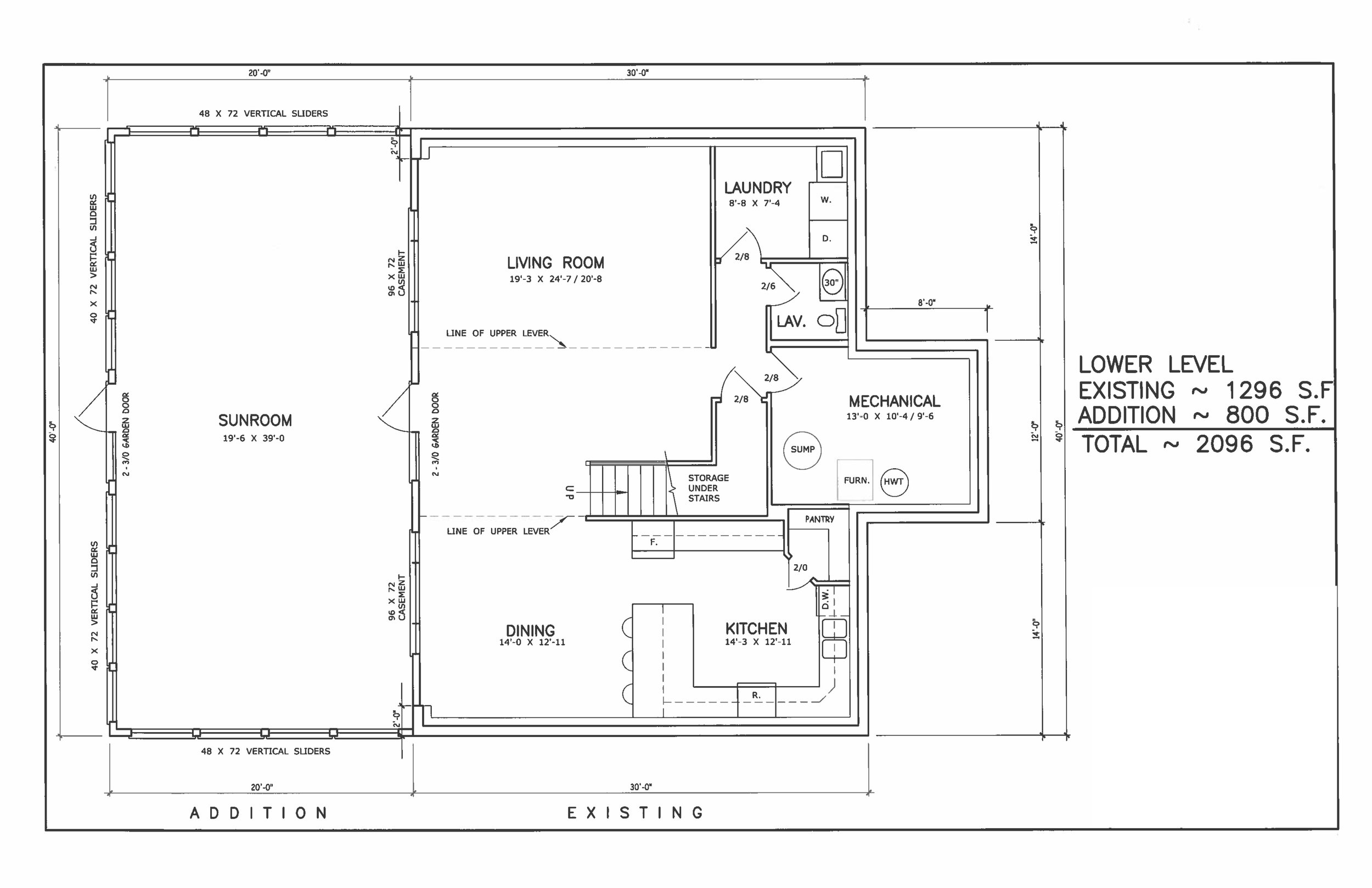
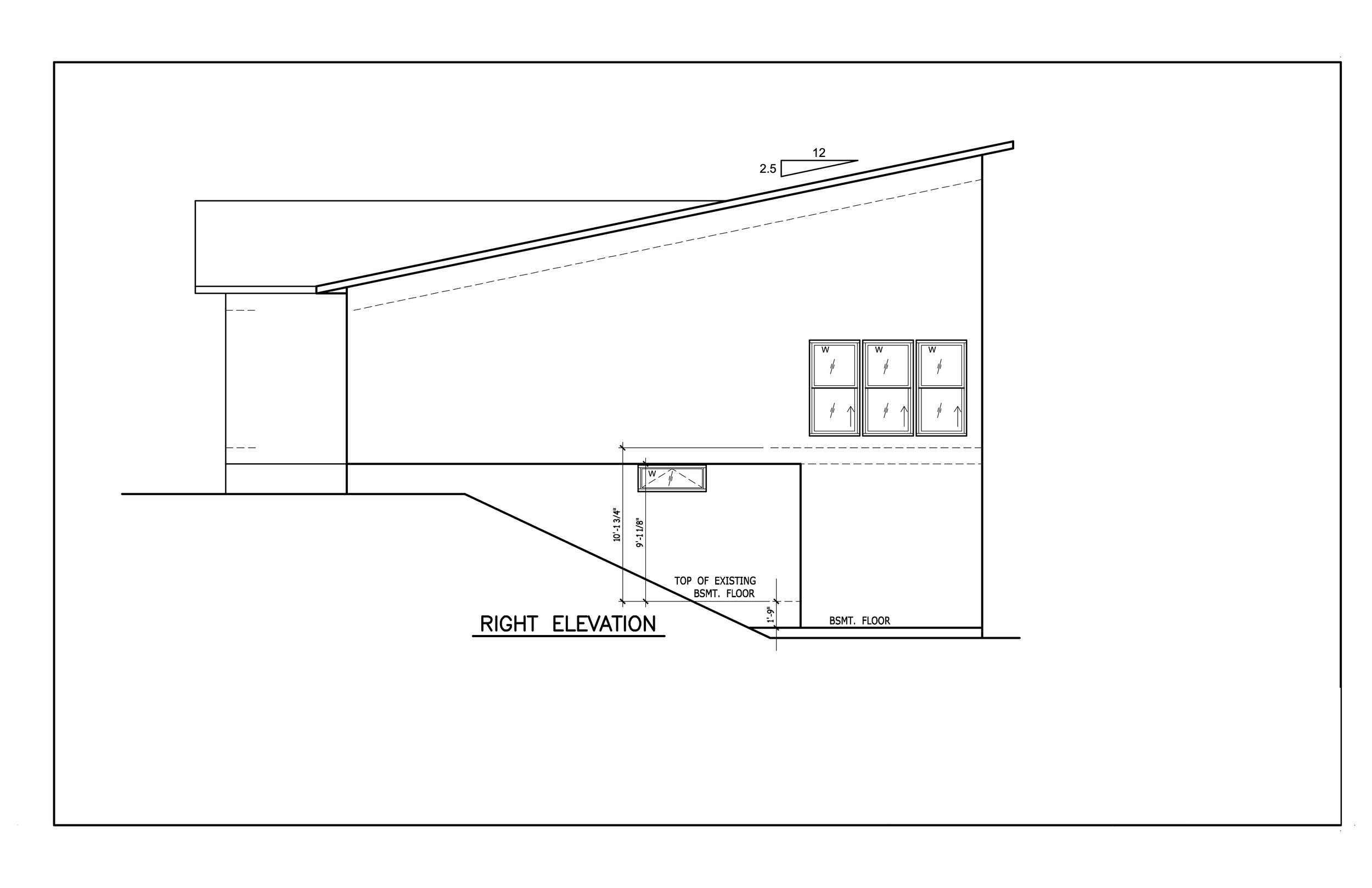
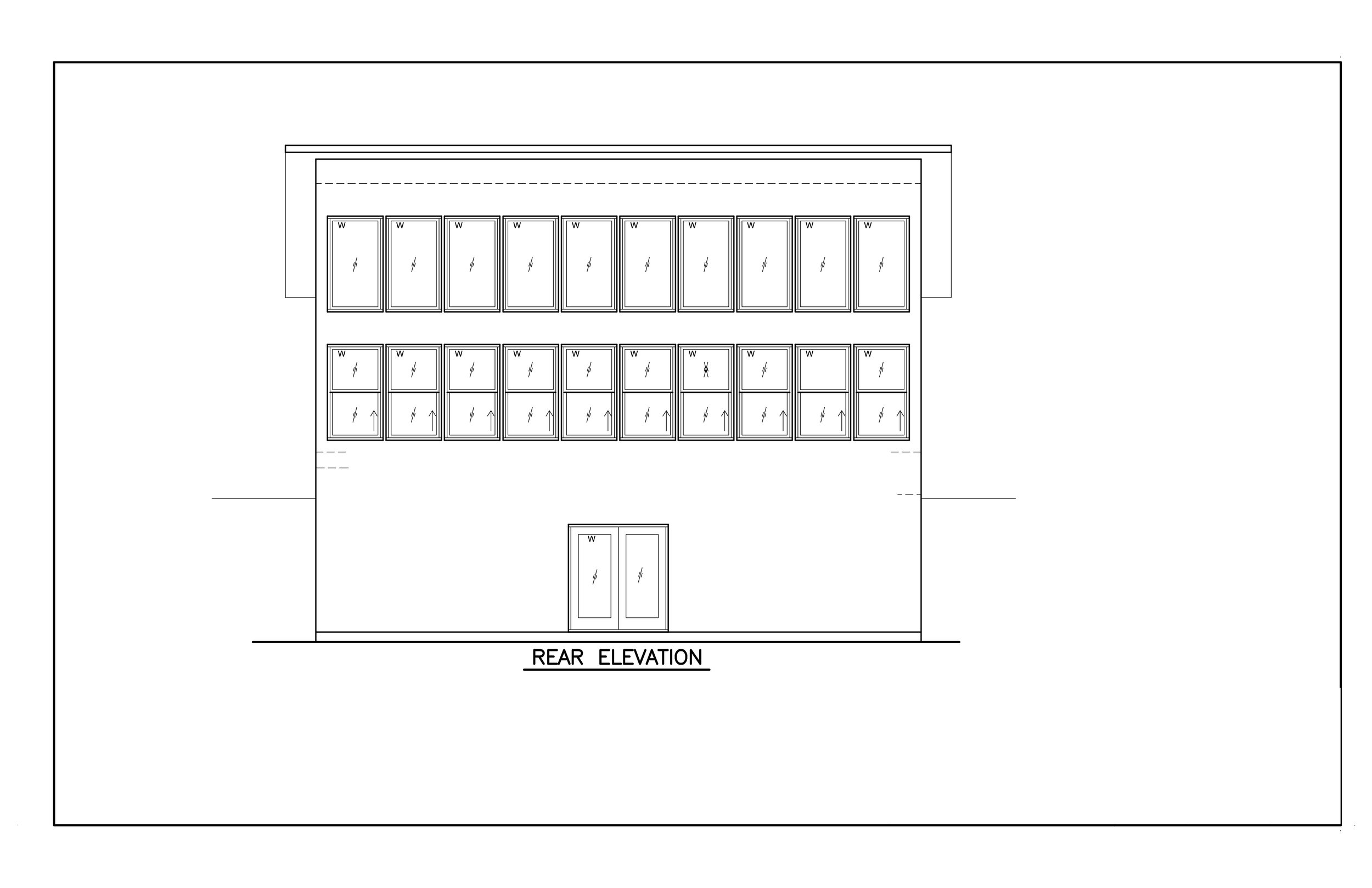
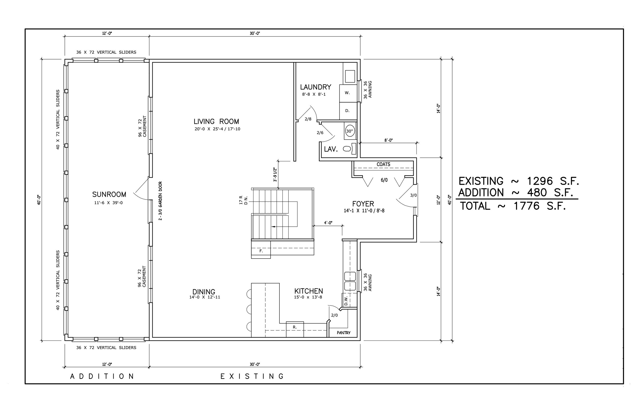
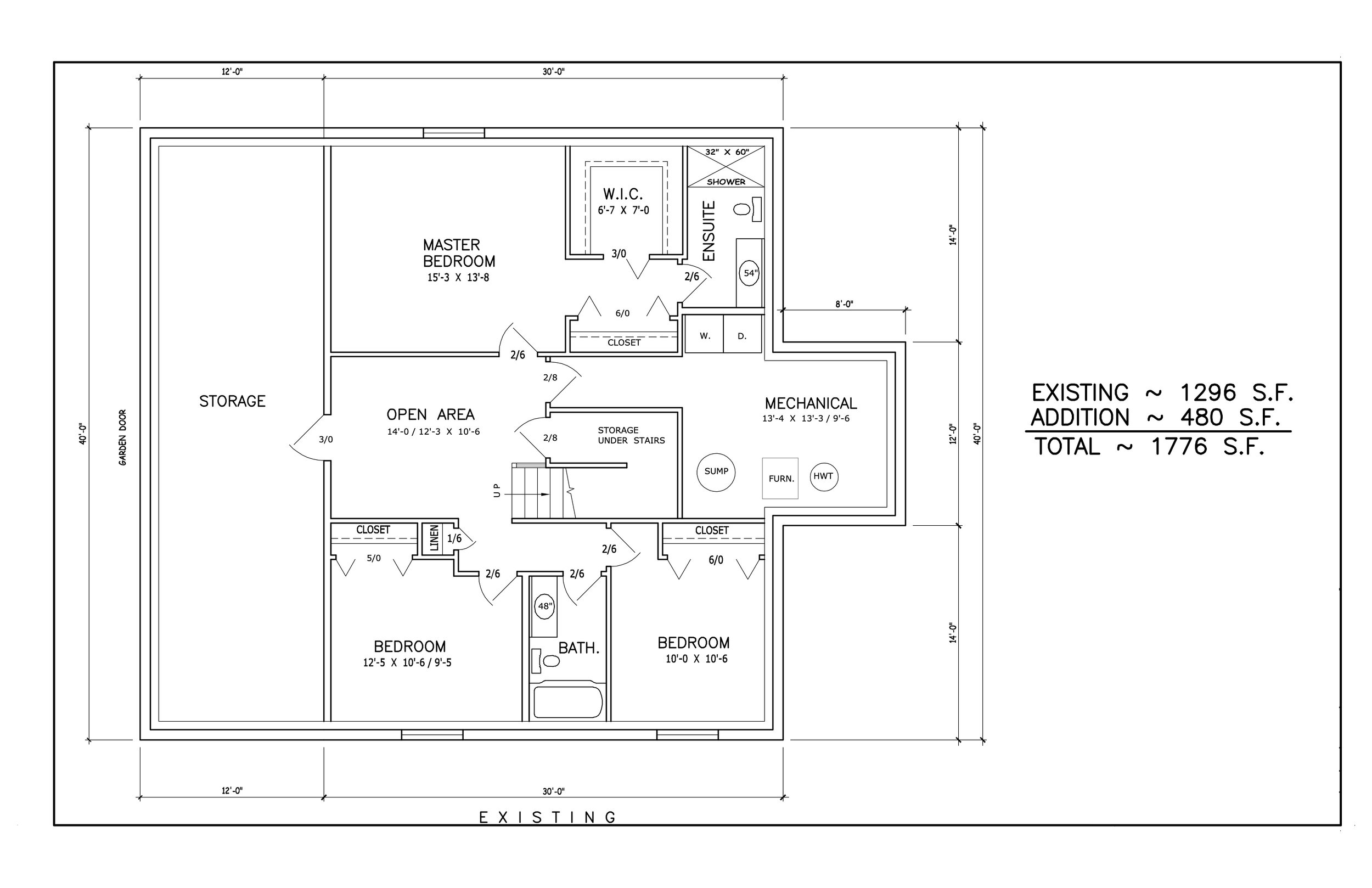
These plans are where it started when it came to us. Take a flip through and you can see for yourself. You might not think these are all that bad - and that’s okay! However, our client wanted to “take these to the next level”. They coined these plans “the shed” and “the chicken coop”. Not necessarily what you want to think about the designs of a new cabin you’re about to invest in. It’s important to us that our clients are excited about their designs and he just didn’t think it was going to be possible to build something he was going to like on the site he had to work with.
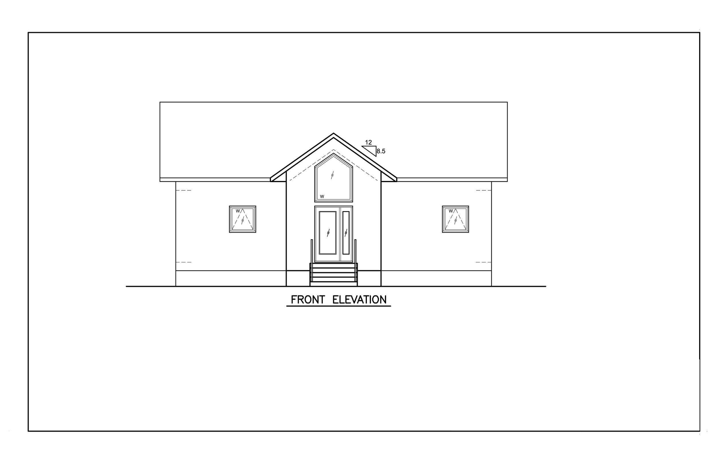
We saw an opportunity to flex our creativity and dive into what we thought was bothering our client about these designs. Our simplified summary was that they lacked depth and dimension. We did a quick elevation comparison to show the client that the foundation was not the issue, and that we had total faith that we could create something they loved. Here’s what that comparison looked like:
“THE CHICKEN COOP” ELEVATION
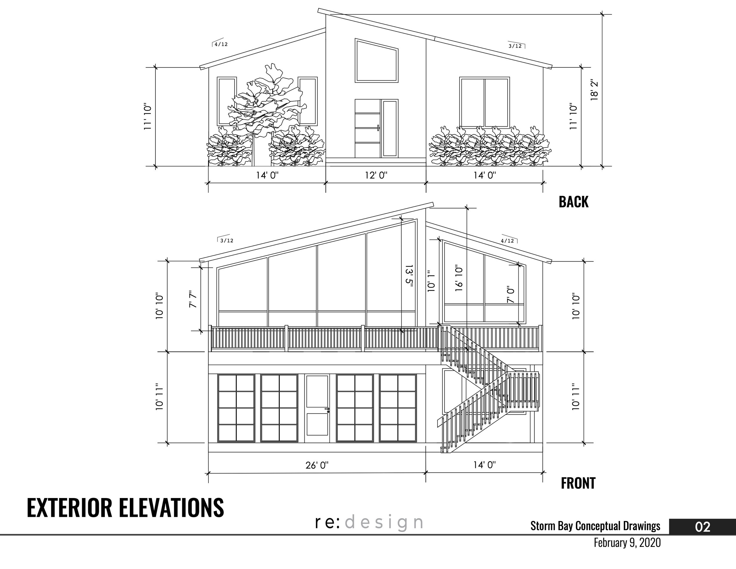
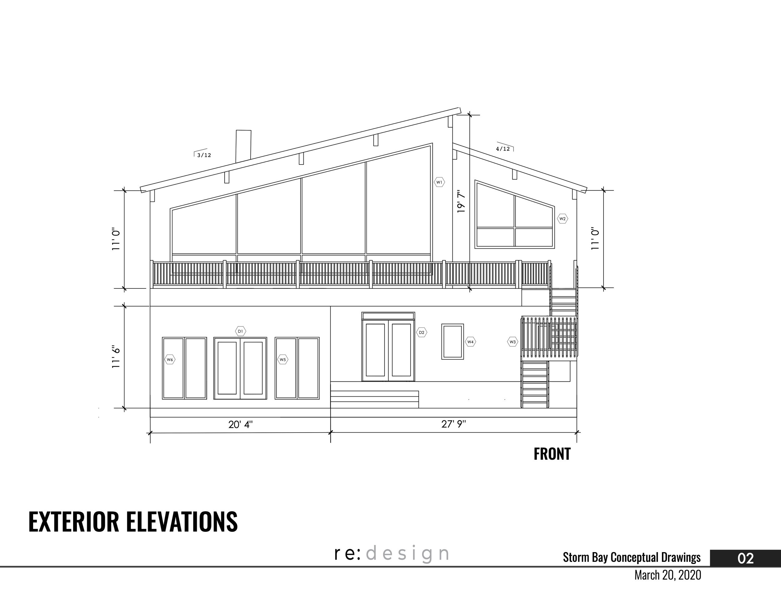
NEW FRONT ELEVATION
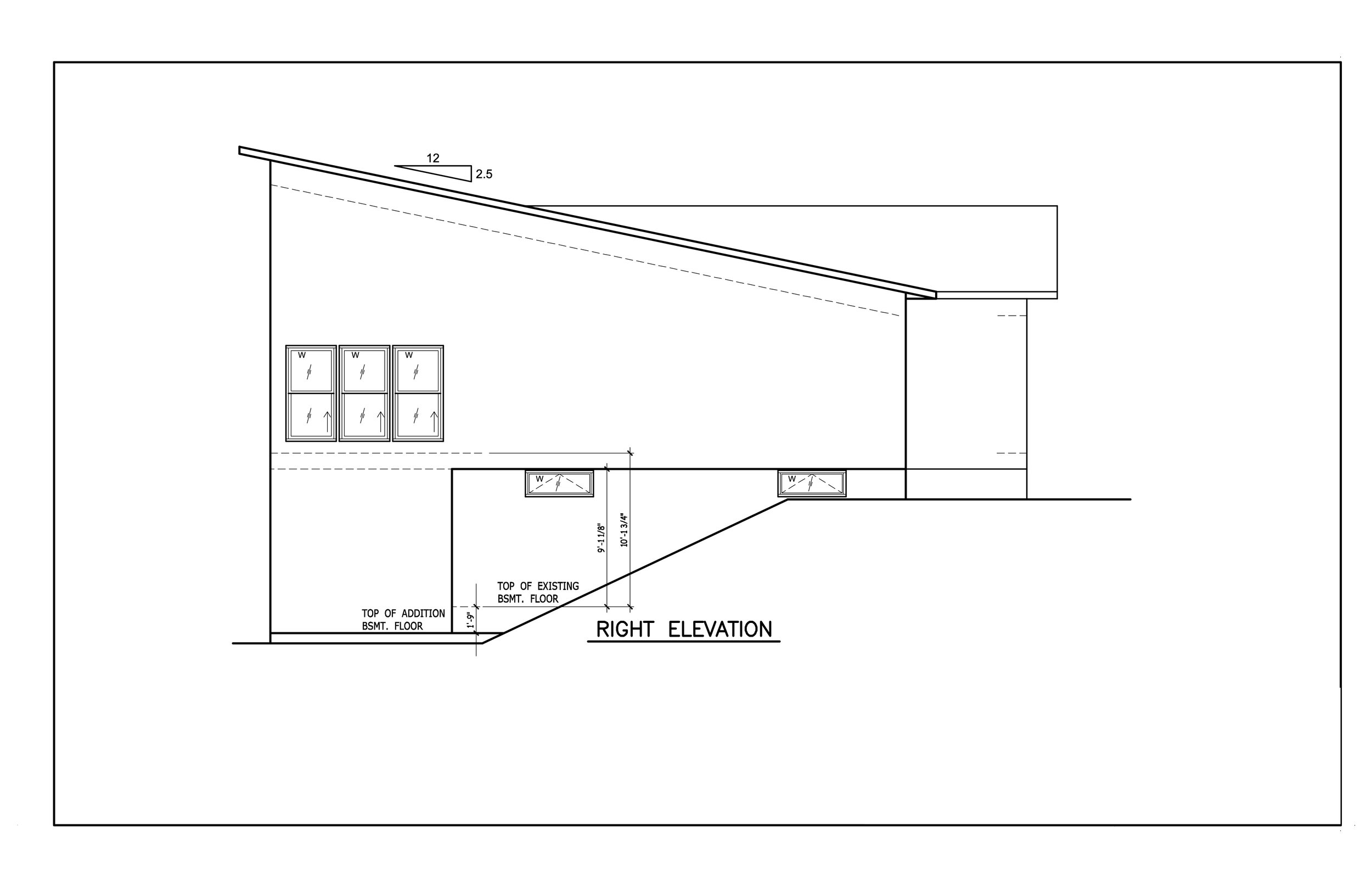
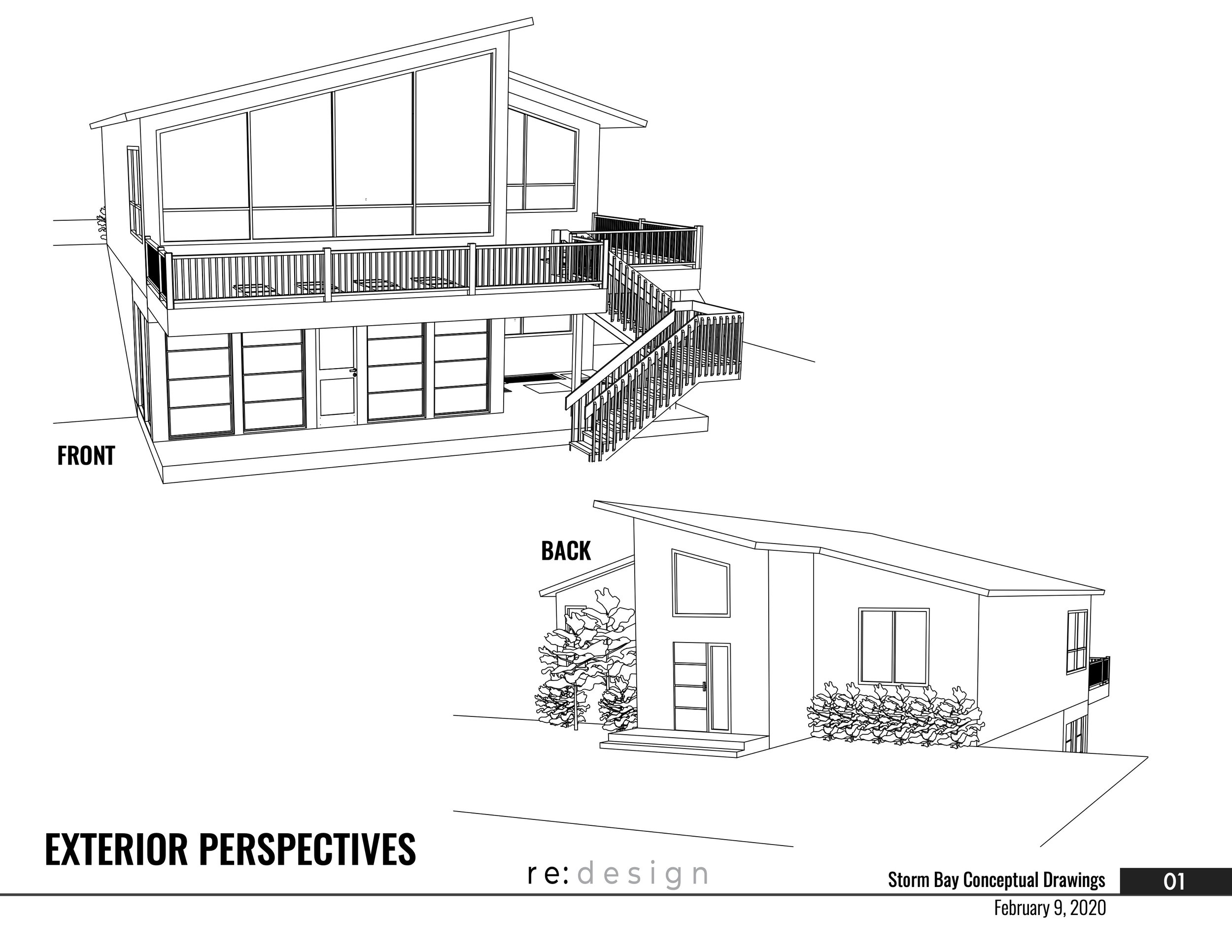
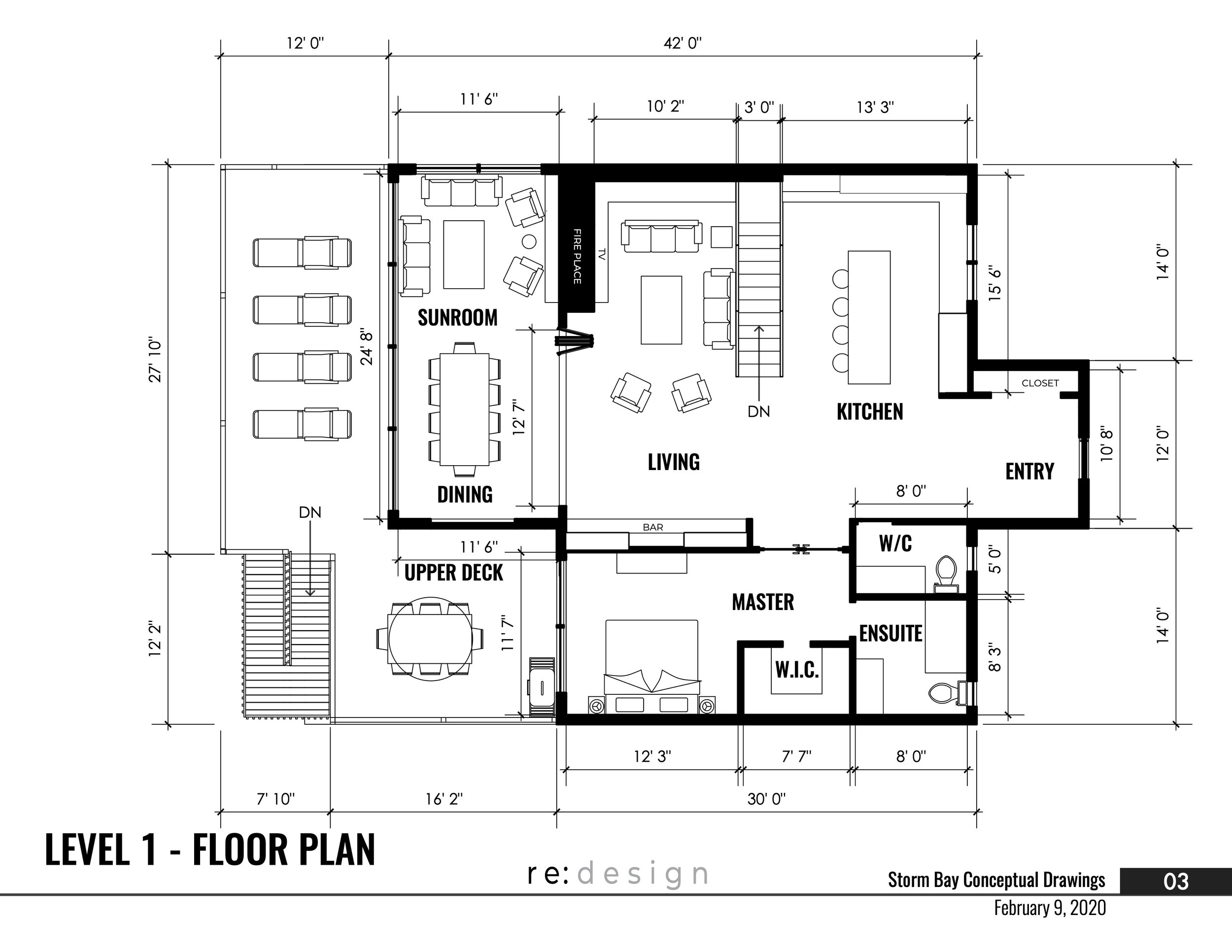
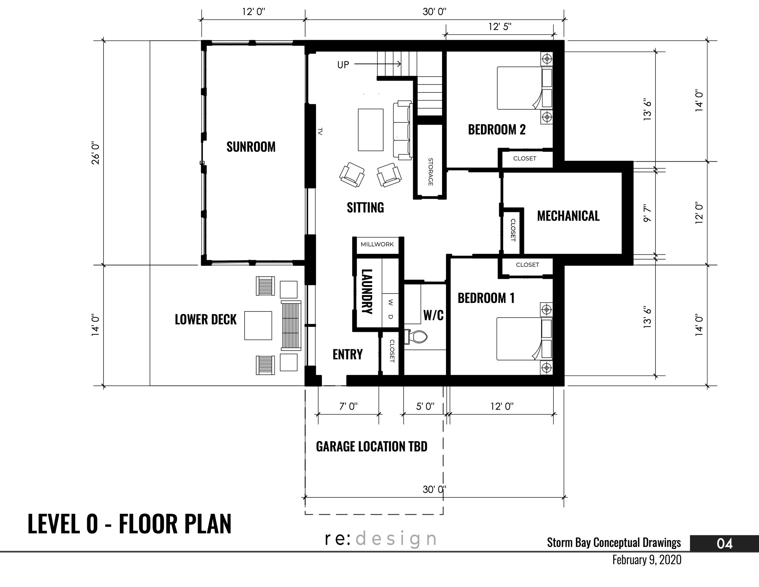
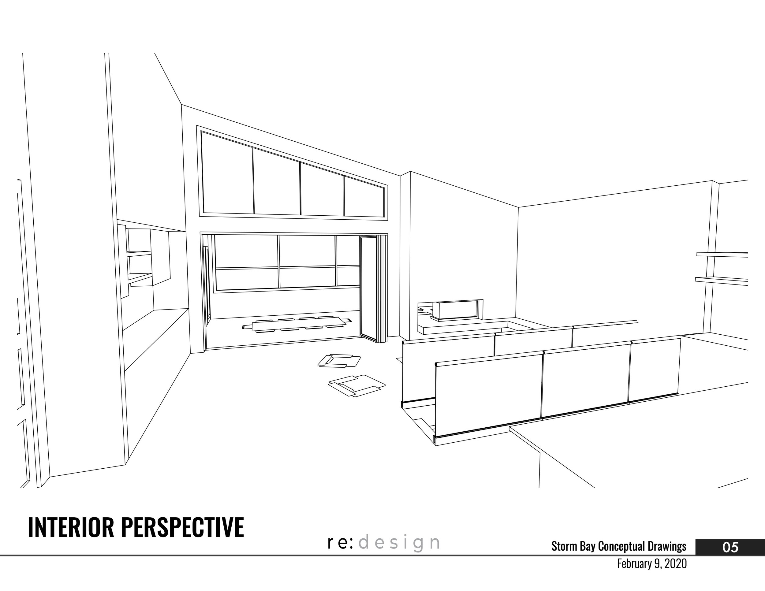
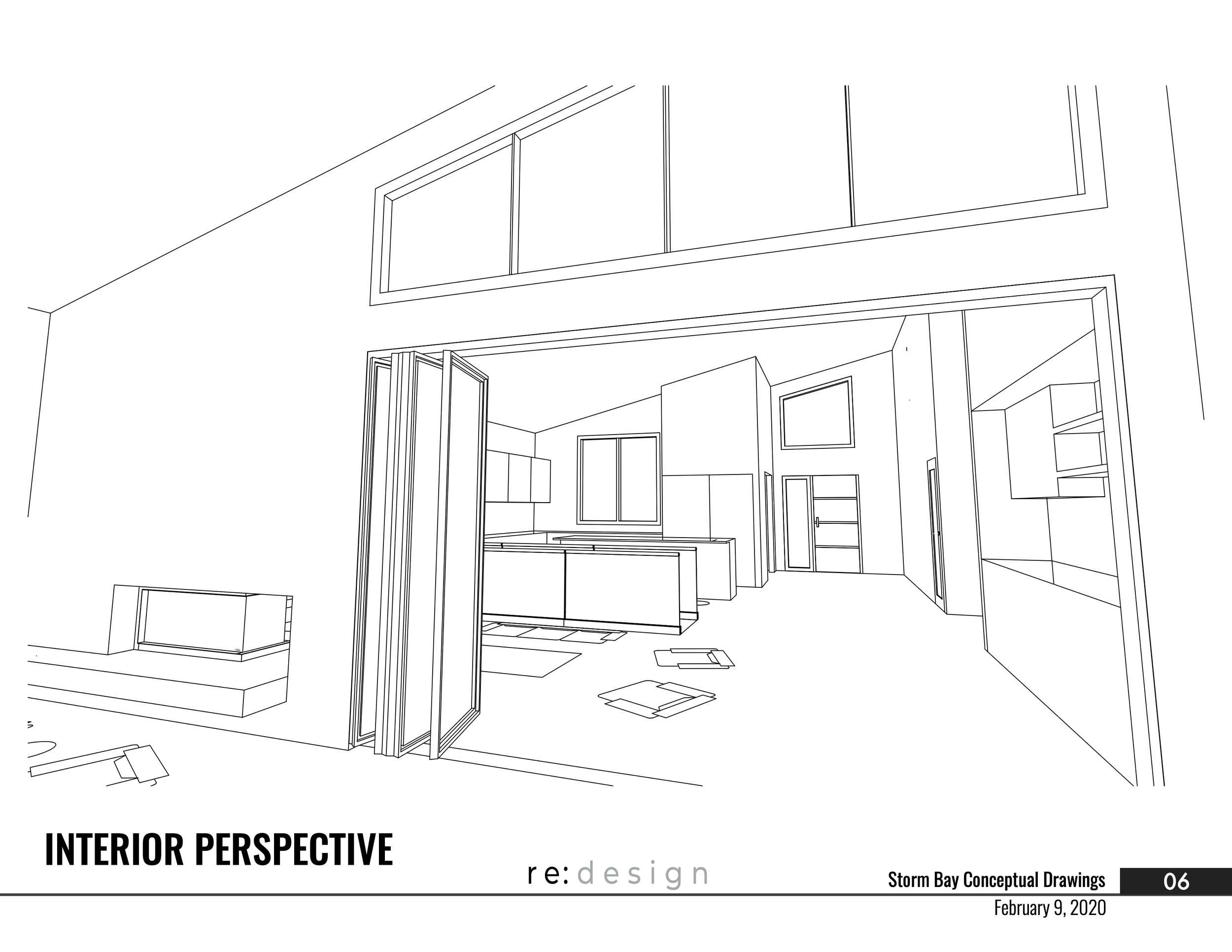
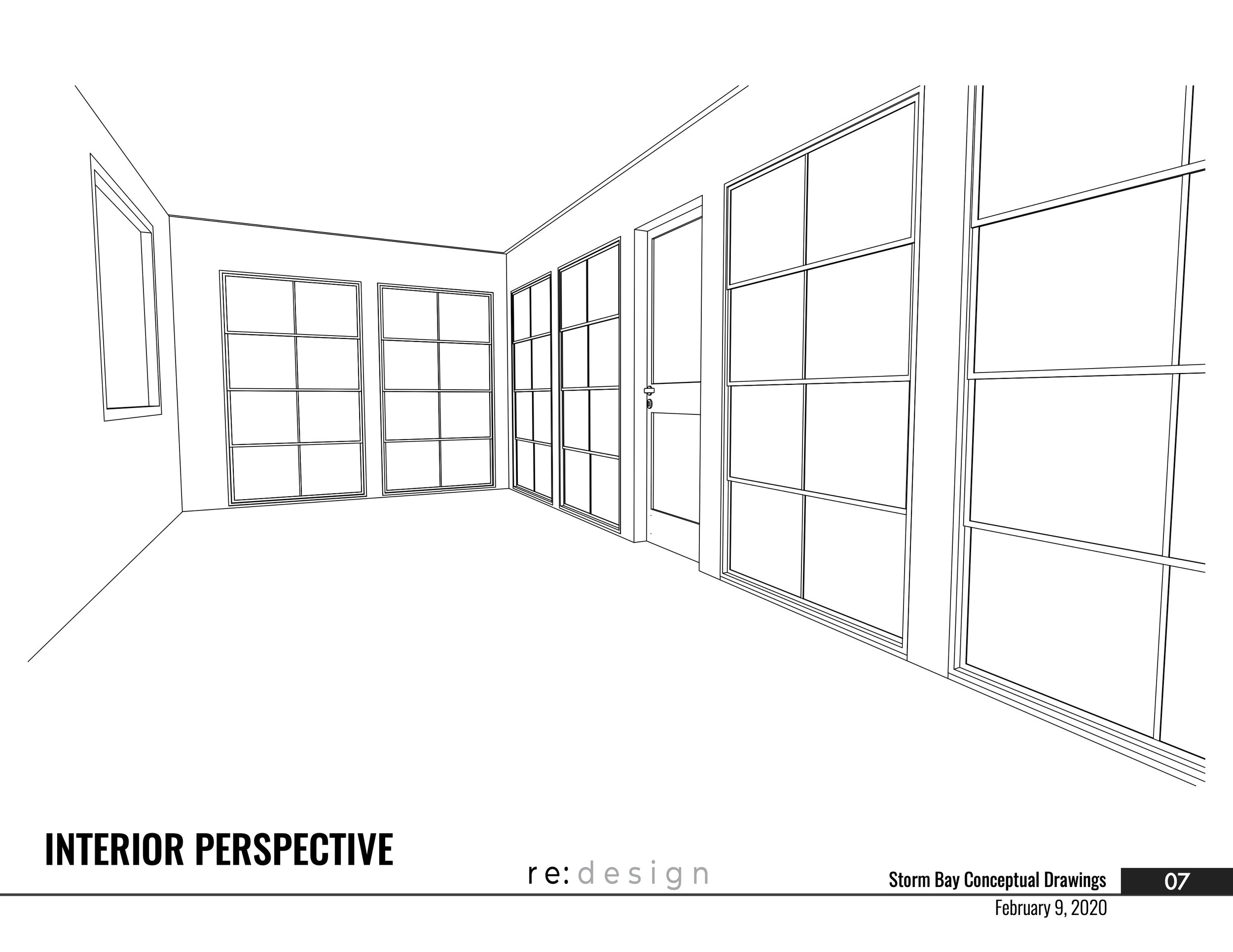
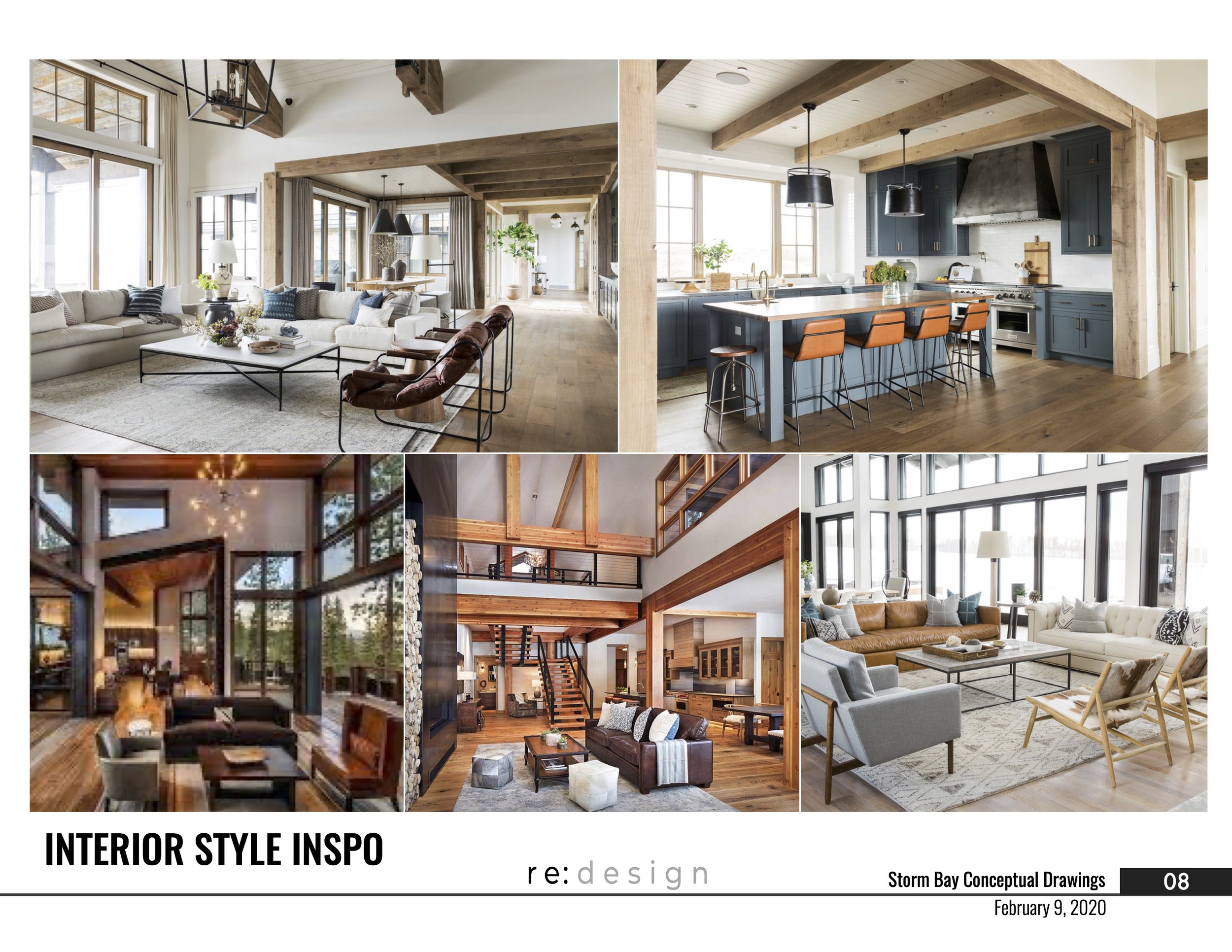
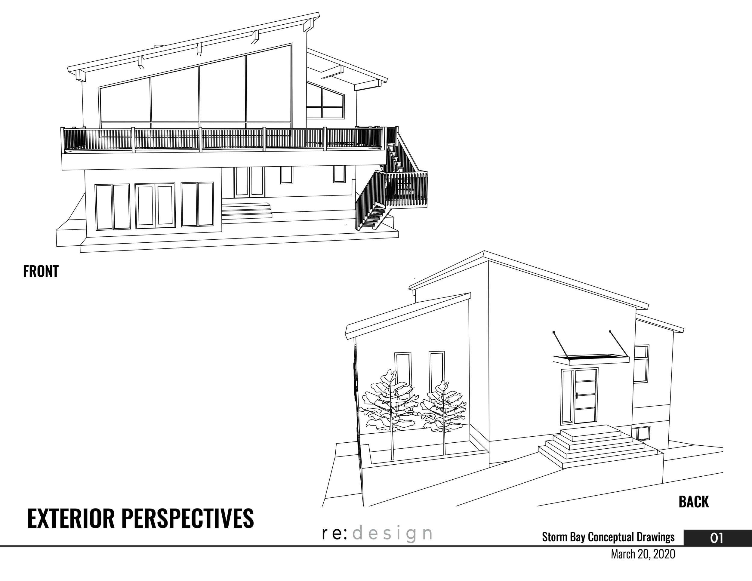
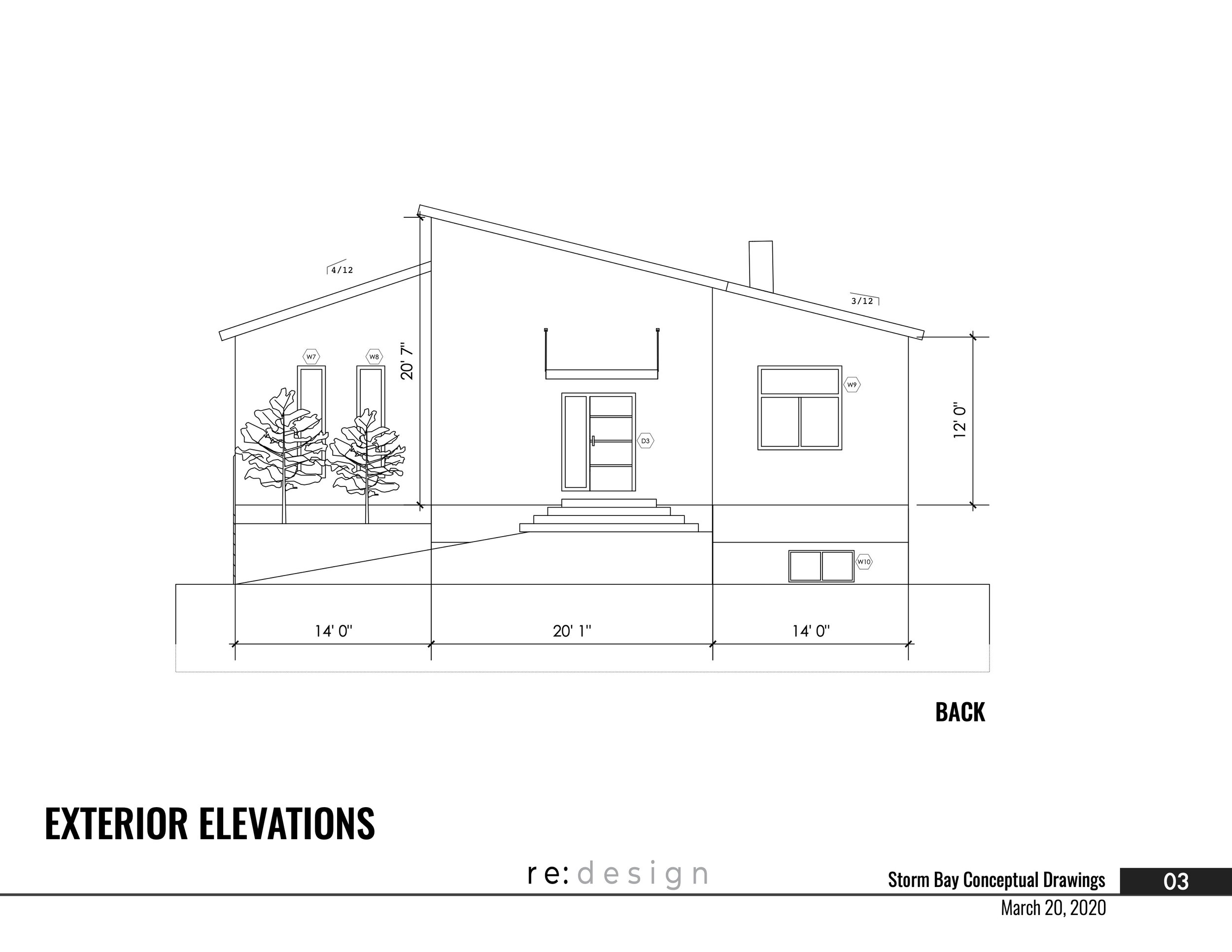
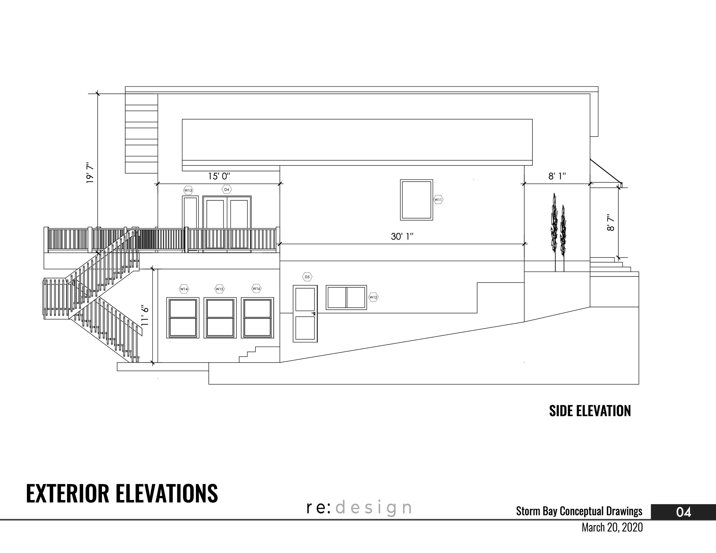
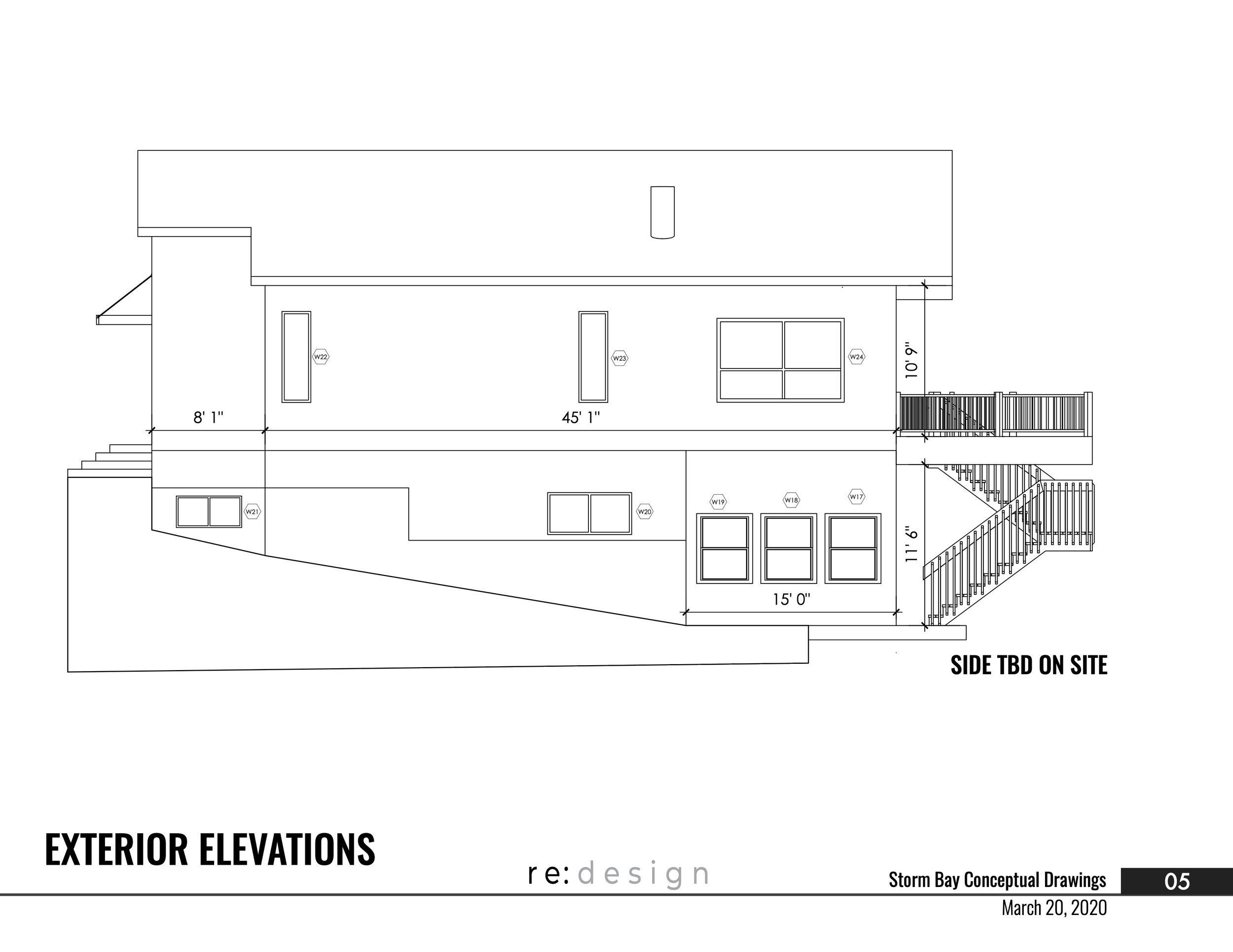
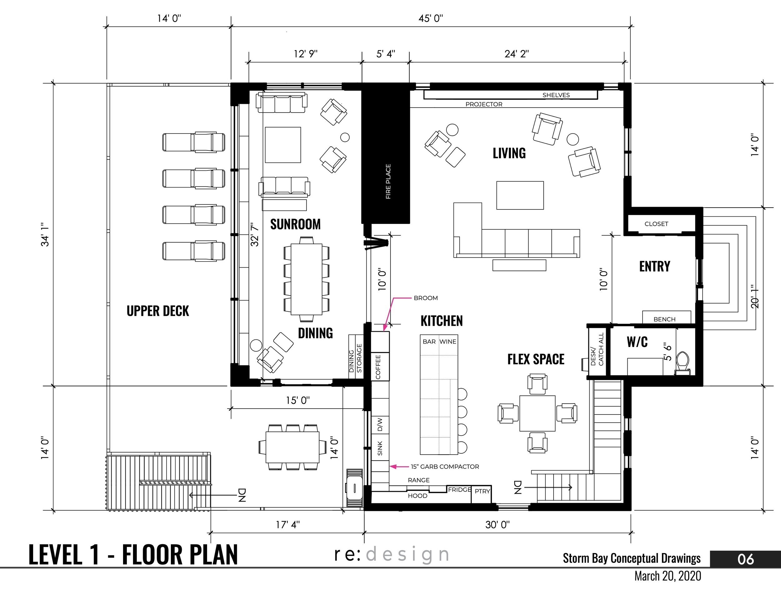
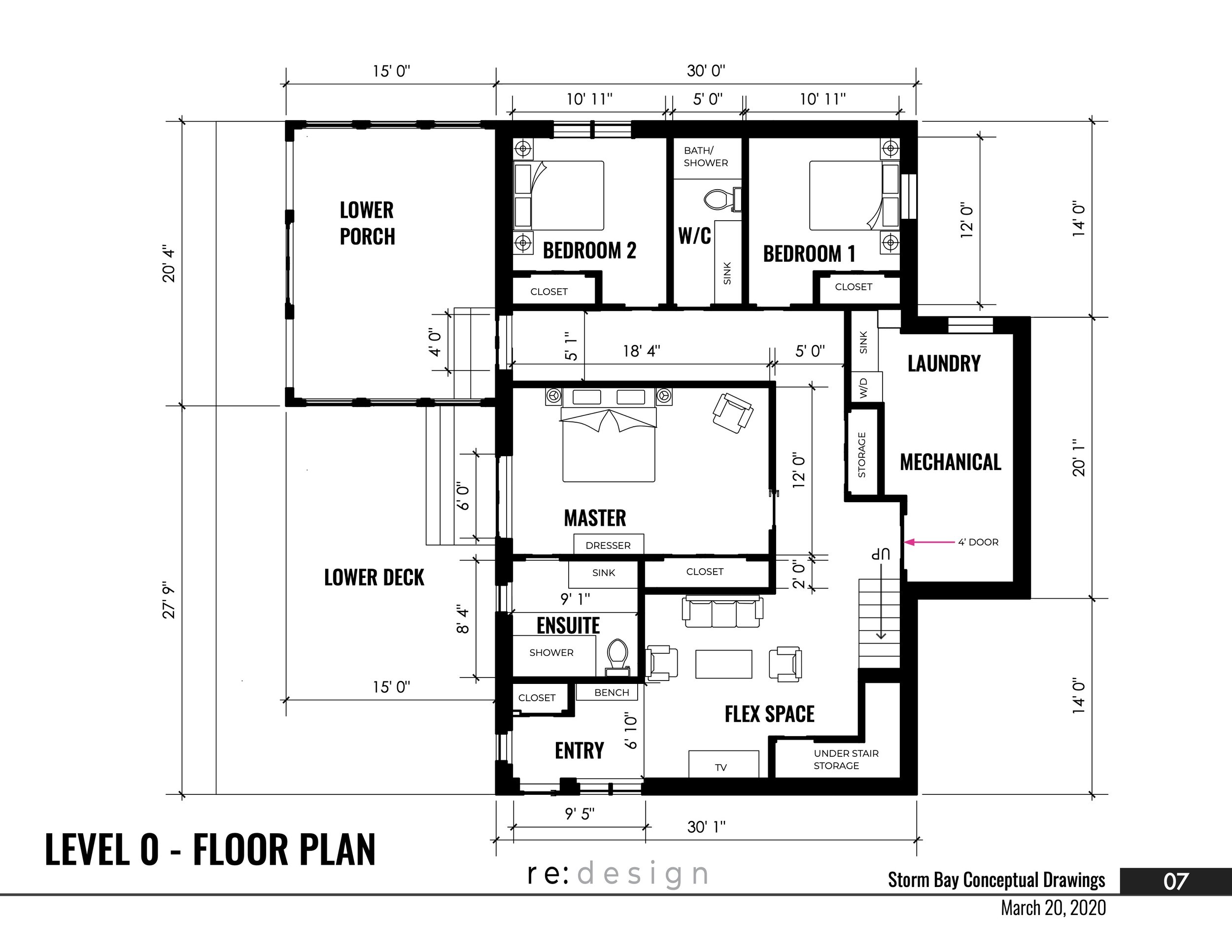
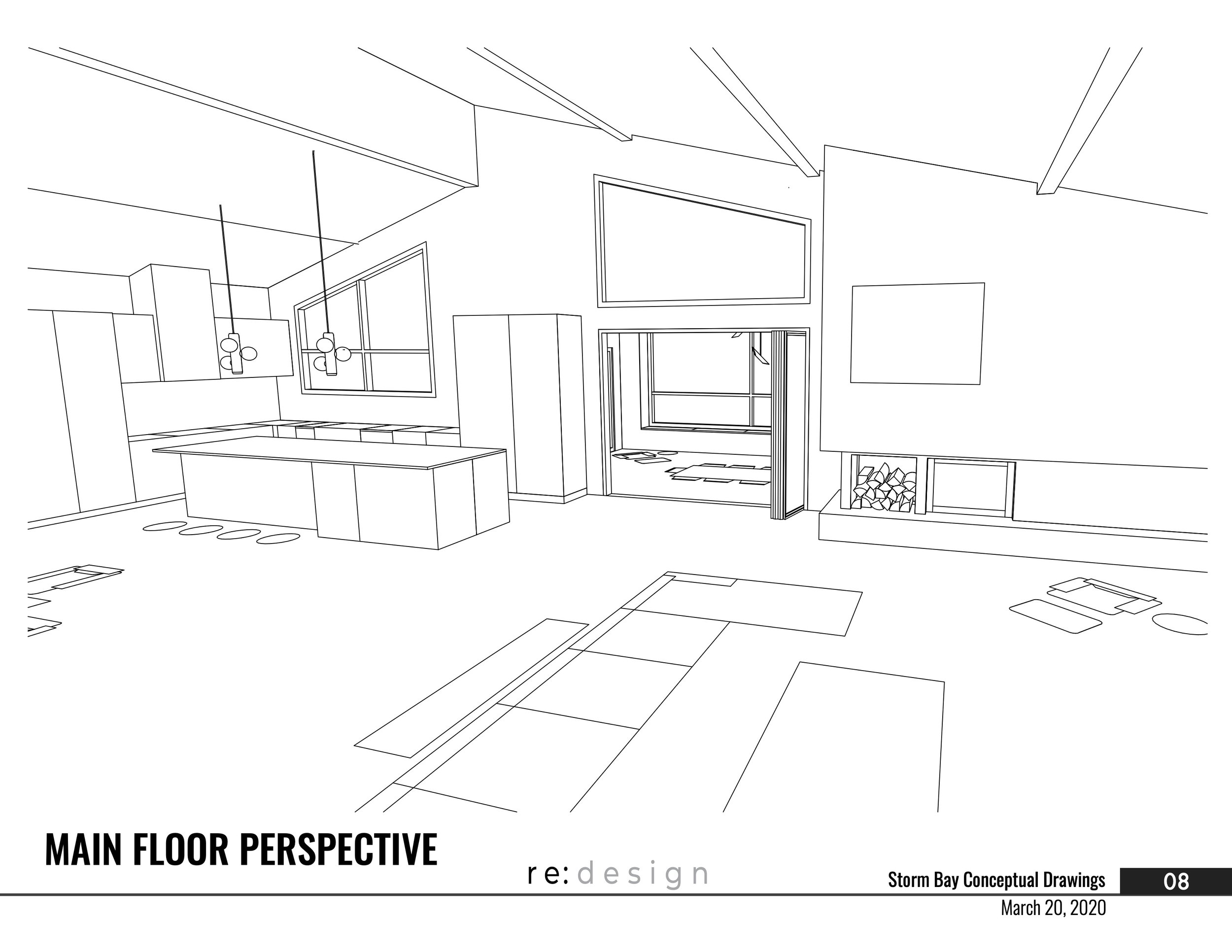
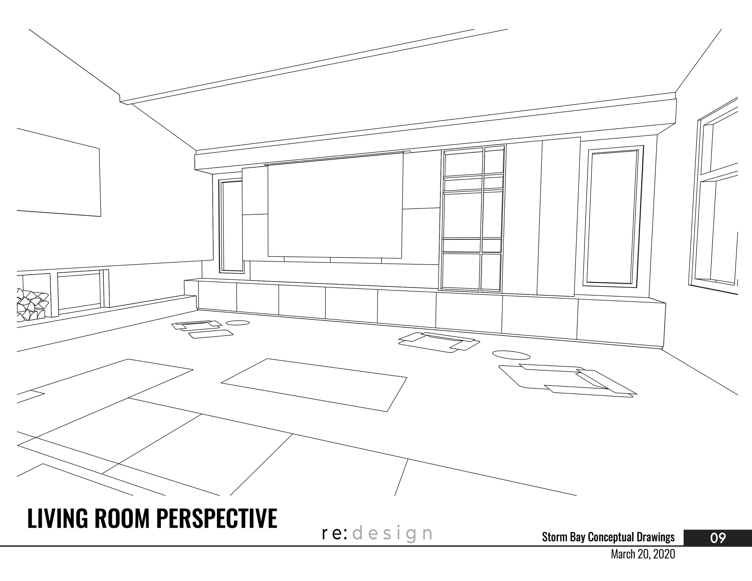
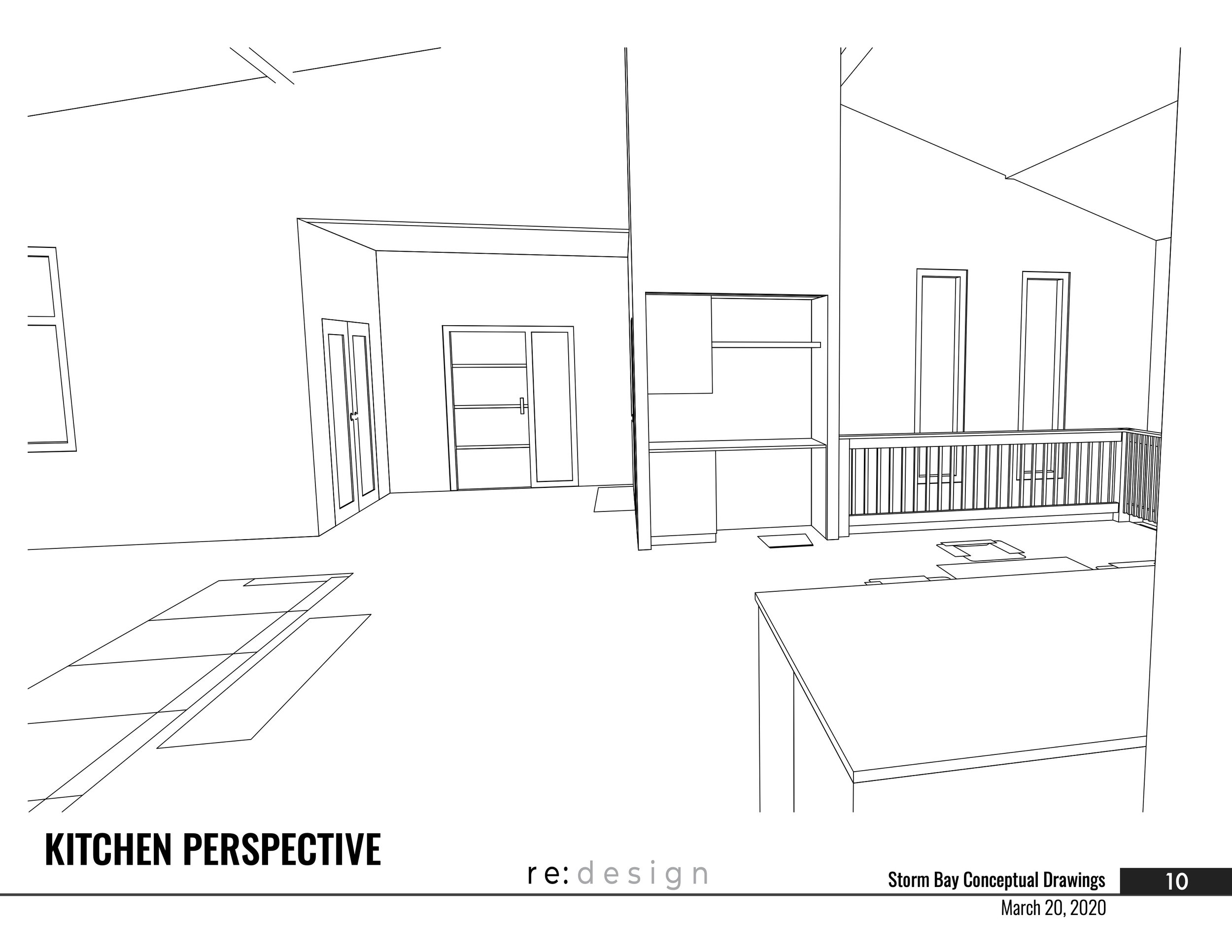
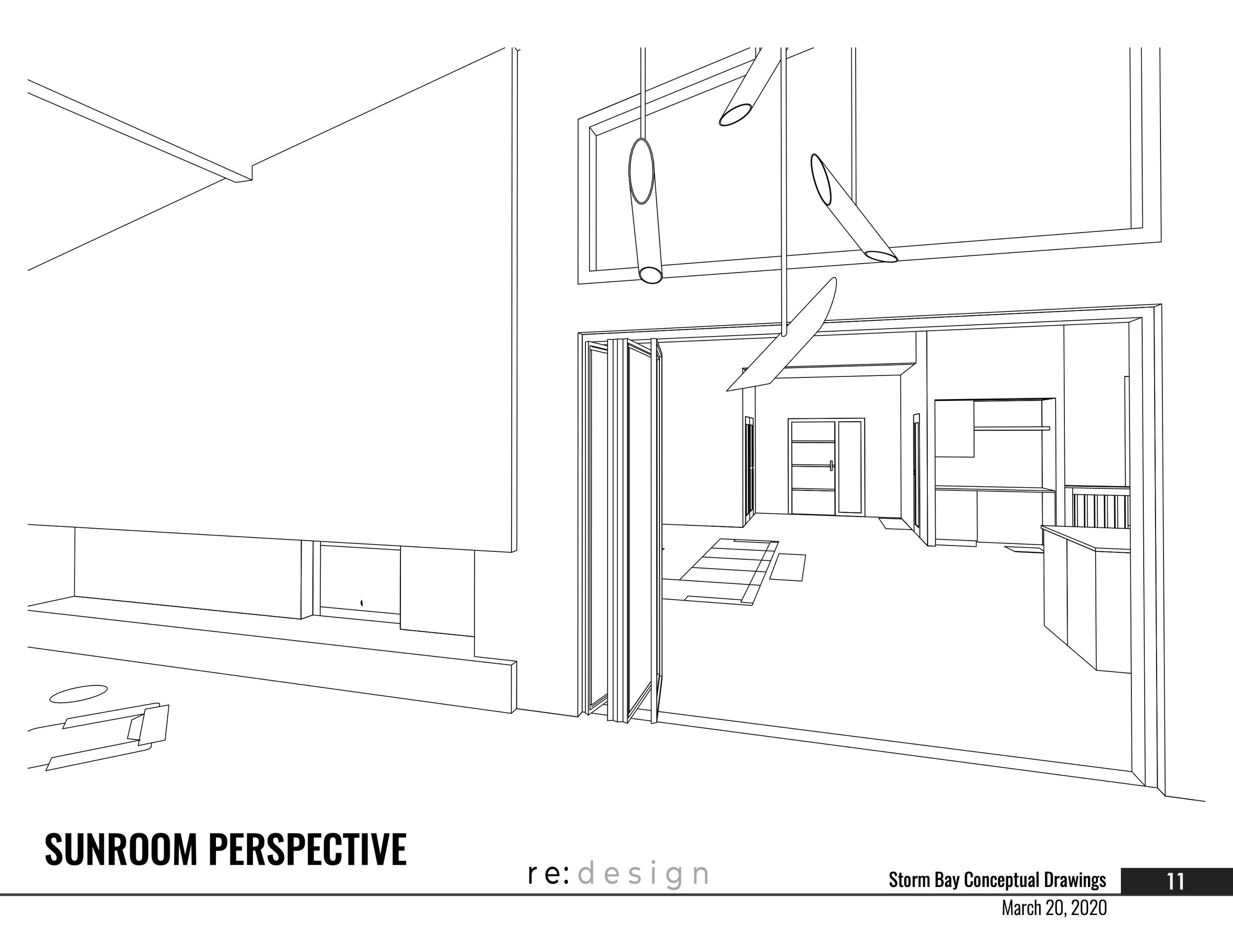
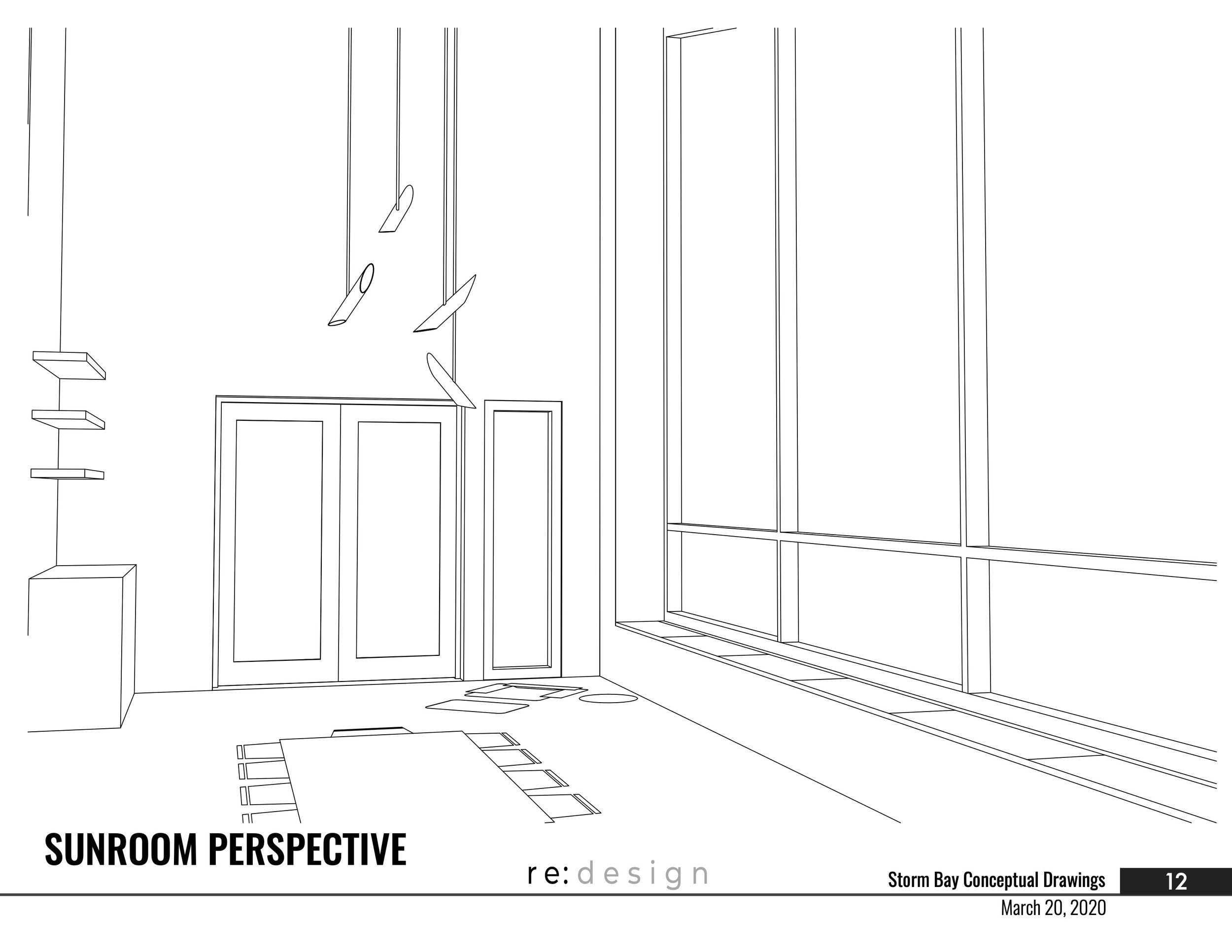
Can you see a difference? These are exactly the same sizes, but we added a more modern roof line and pushed and pulled the exterior walls differently to create a form that is a bit more diverse and complex. Not to simplify the design process - because its important to understand that this design went through 9 more versions before landing on the final - but we are going to show you the first and last design packages so you can see a snap shot of the progression:
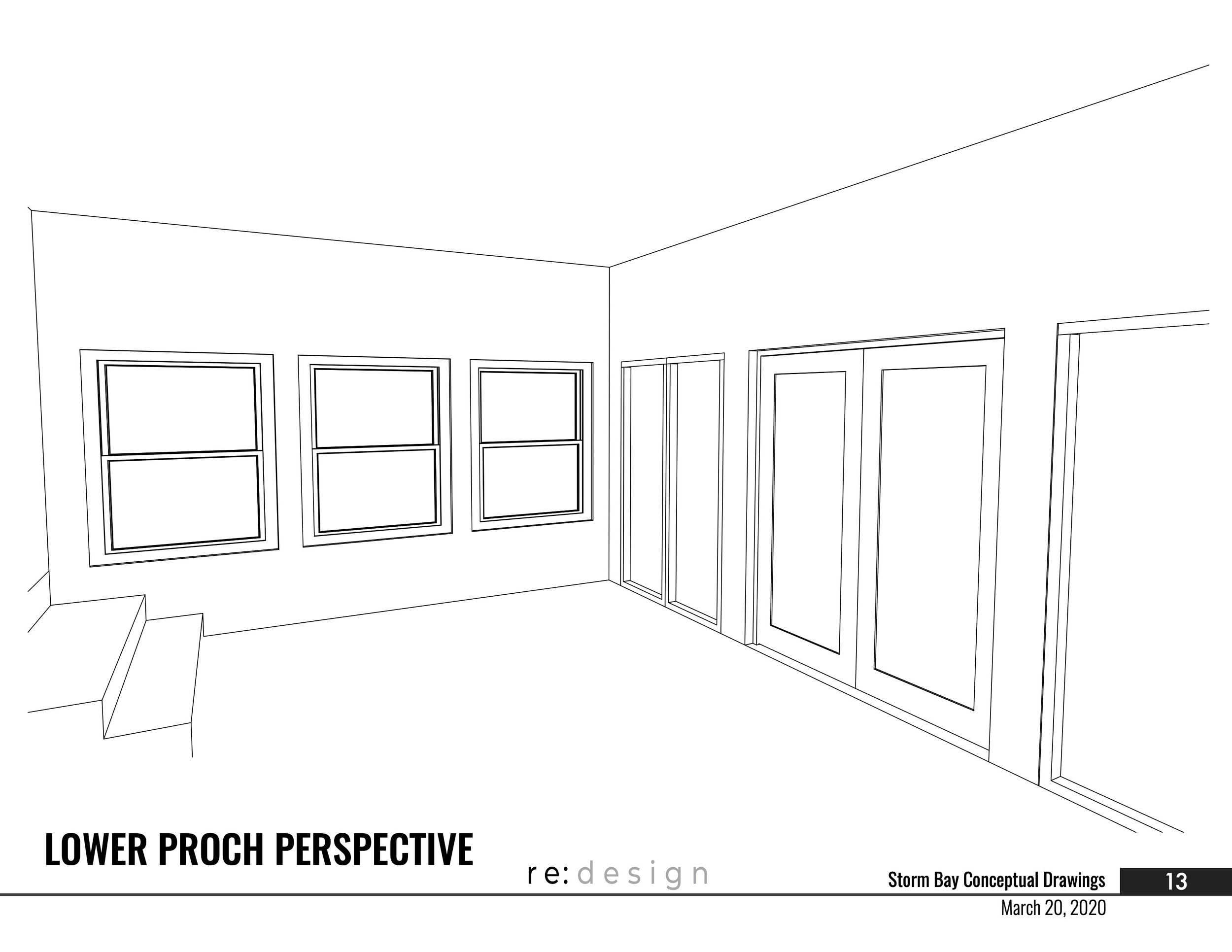
You can see the one thing that remained consistent from our first concept elevation is the big, beautiful windows at the front. When you have a stunning view of the water, you want to find a way to maximize it. This was something our client fell in love with from the start and we made sure to execute the vision! It’s important for us to note here that we take a lot of time up front getting to know our clients and things that are important to them. They had mentioned the view several times, so we knew this was going to be critical to work into the design.
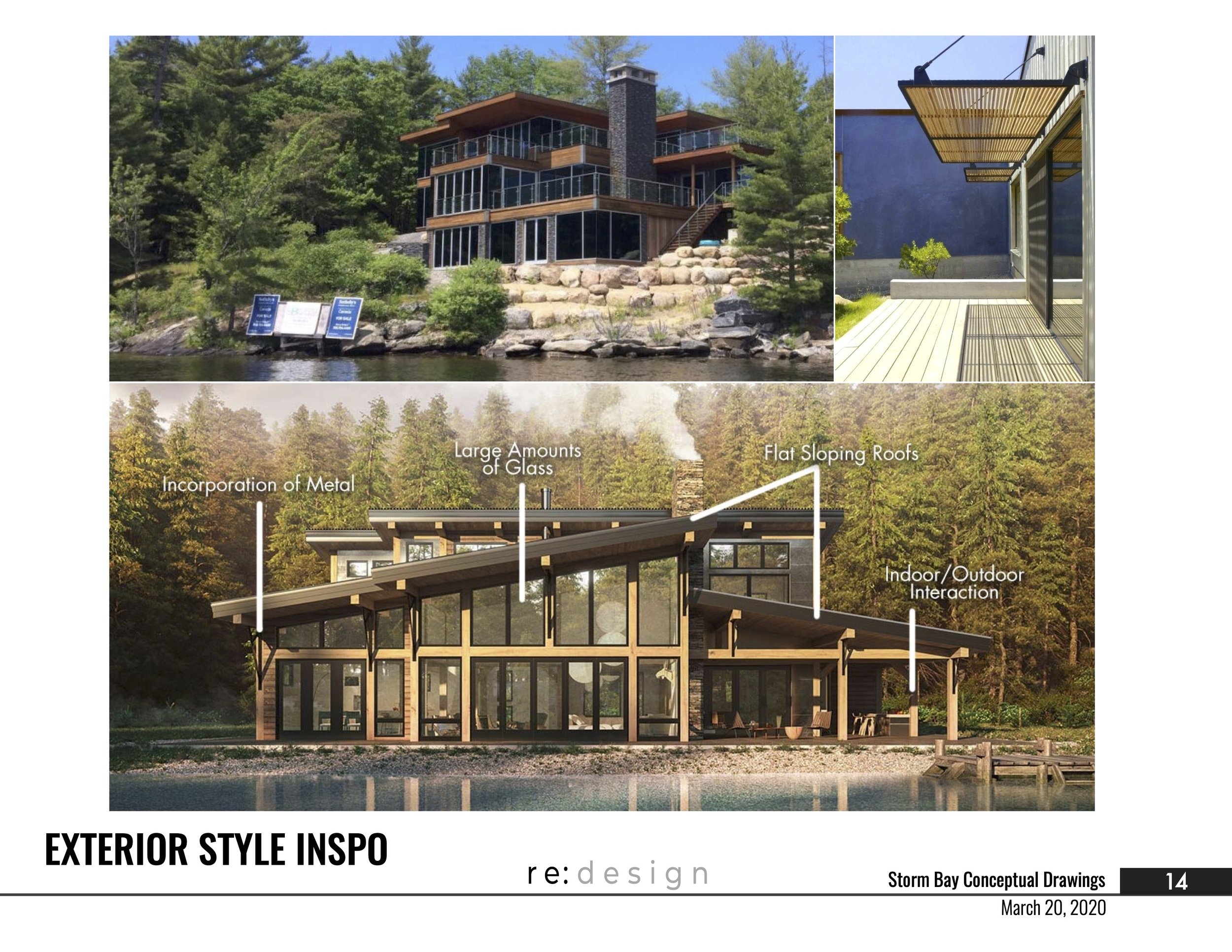
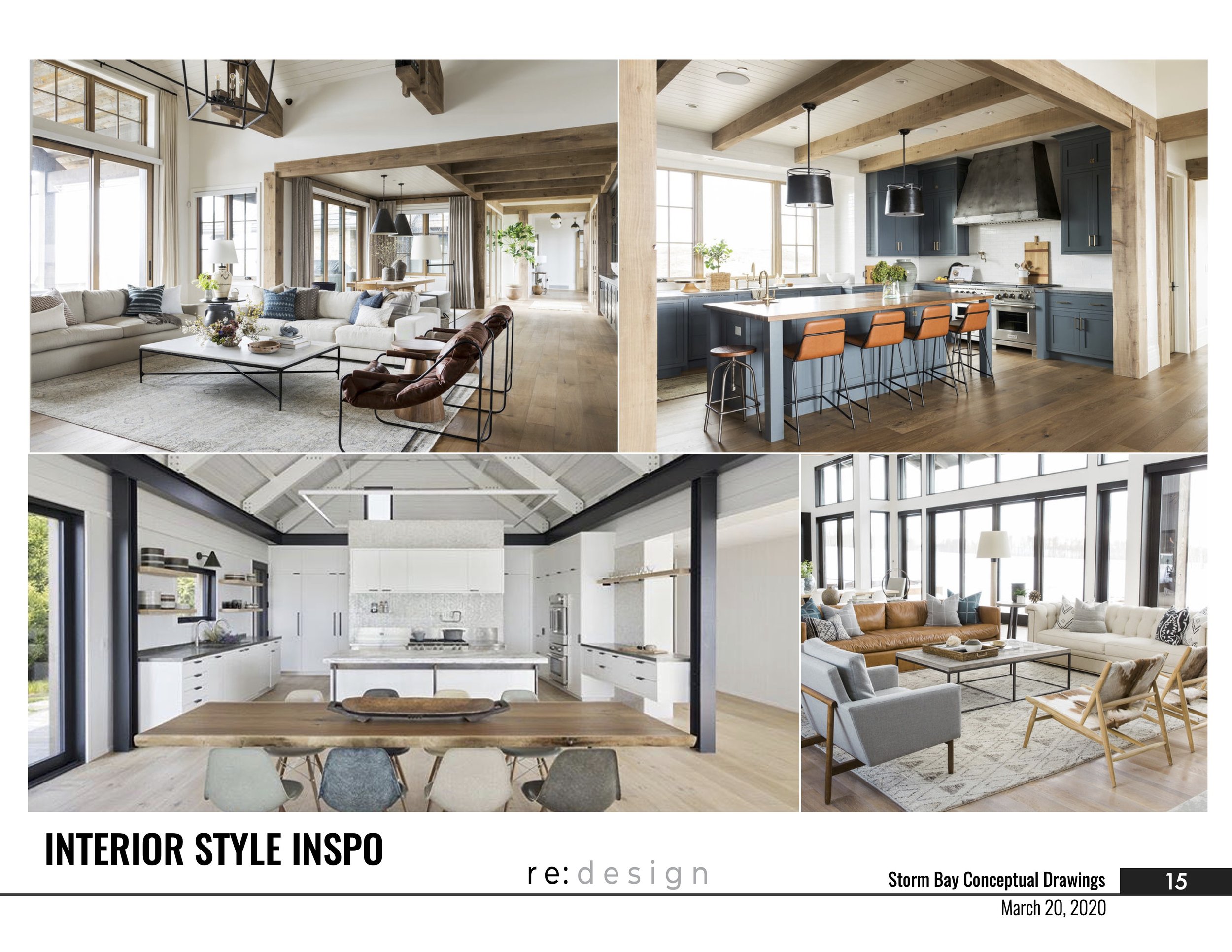
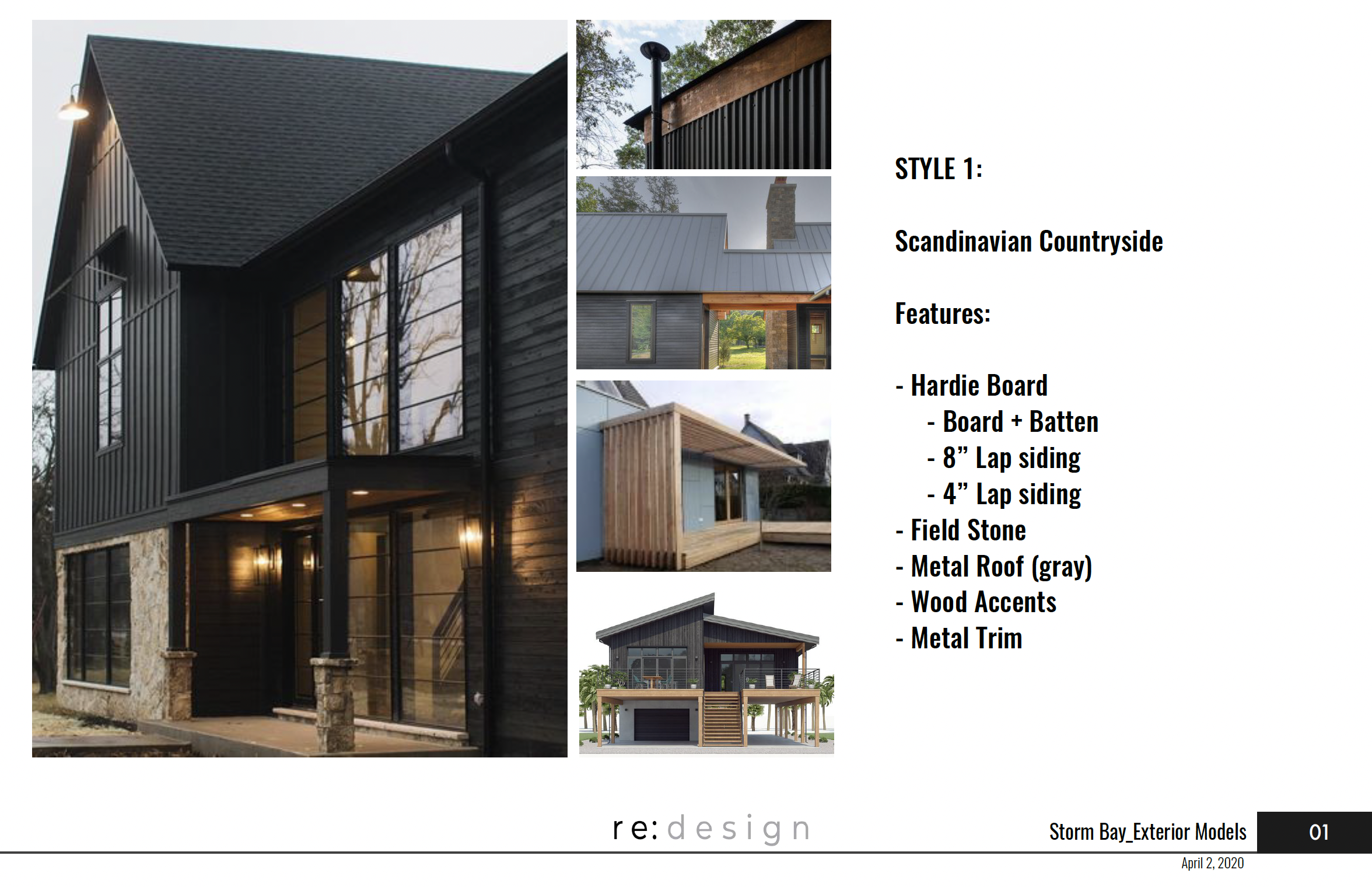
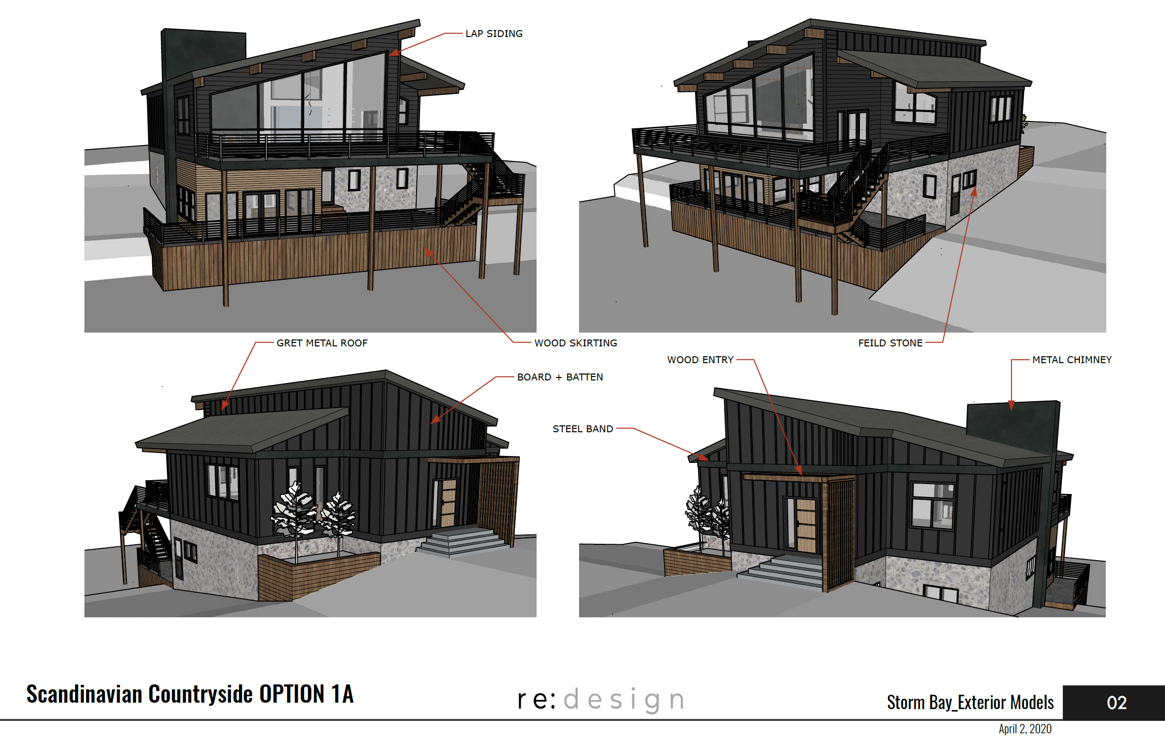
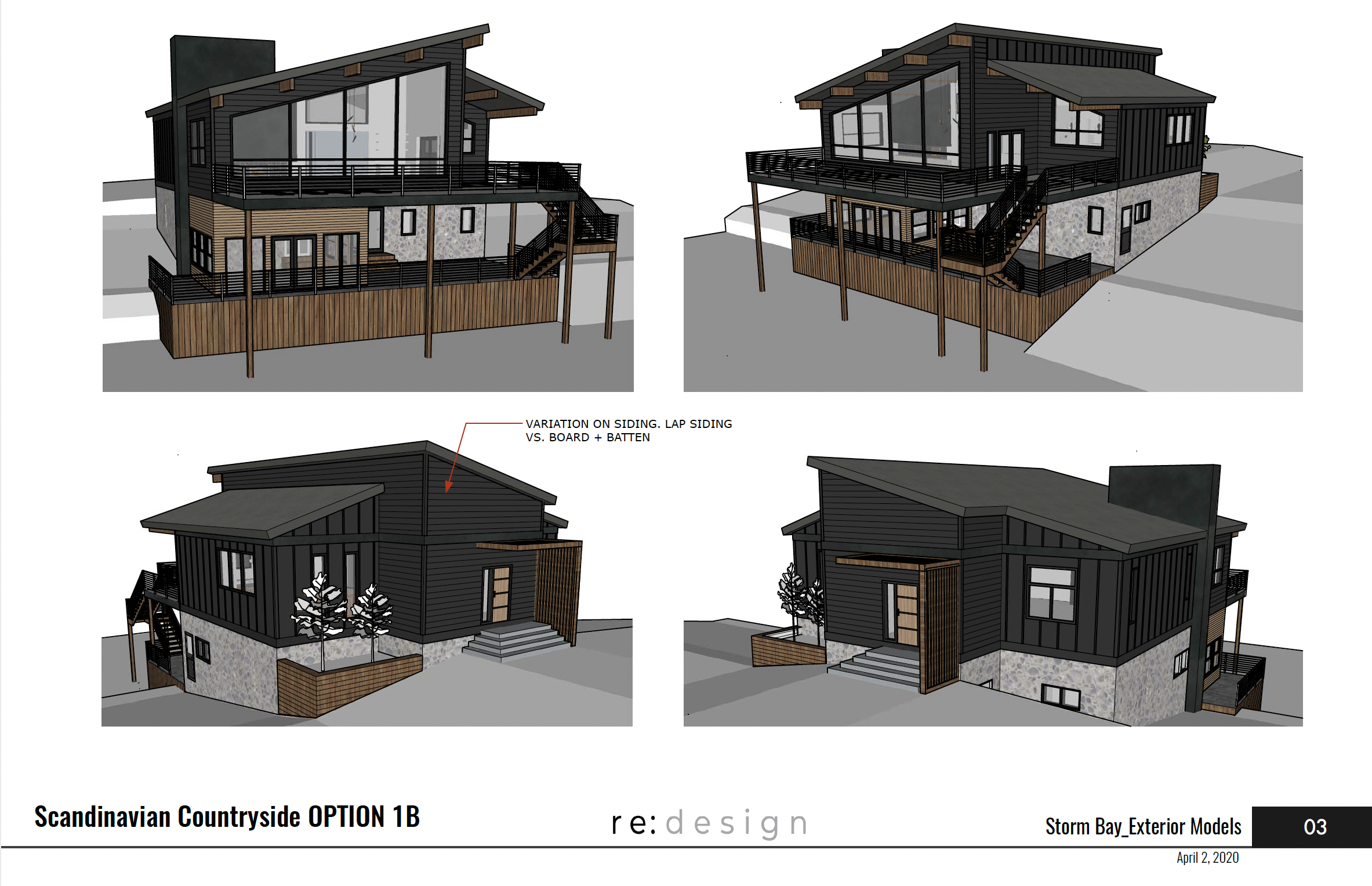
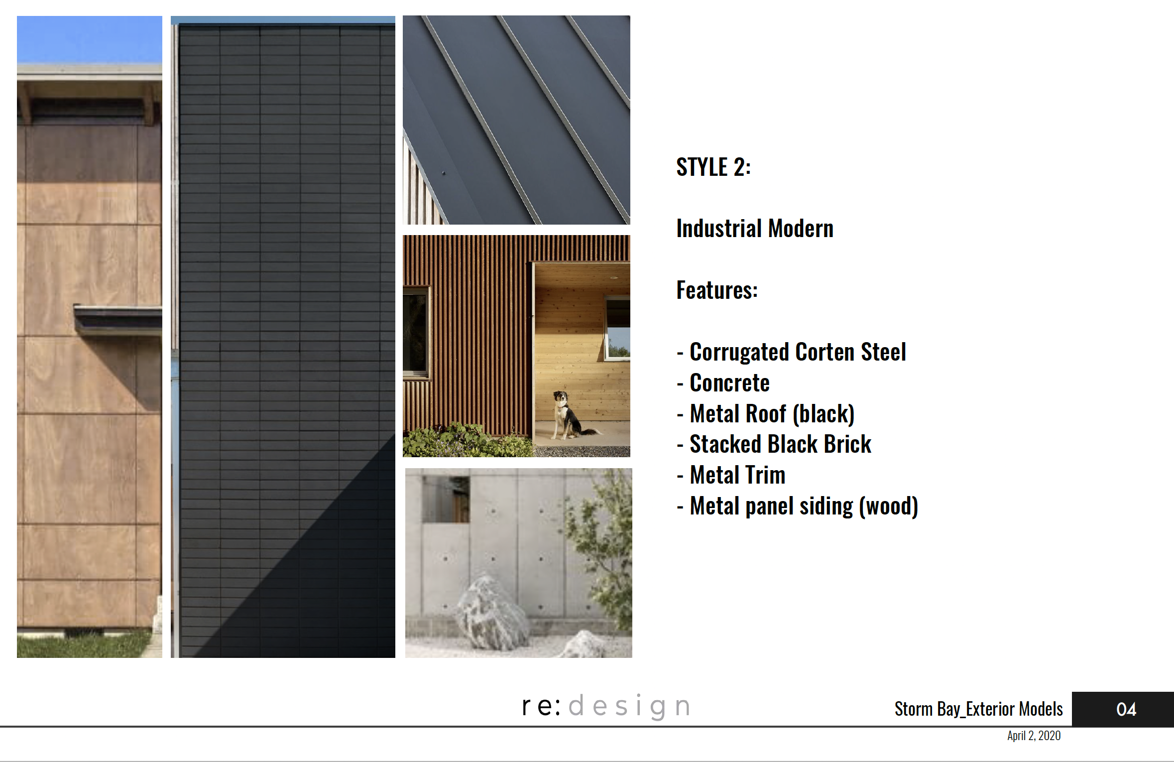
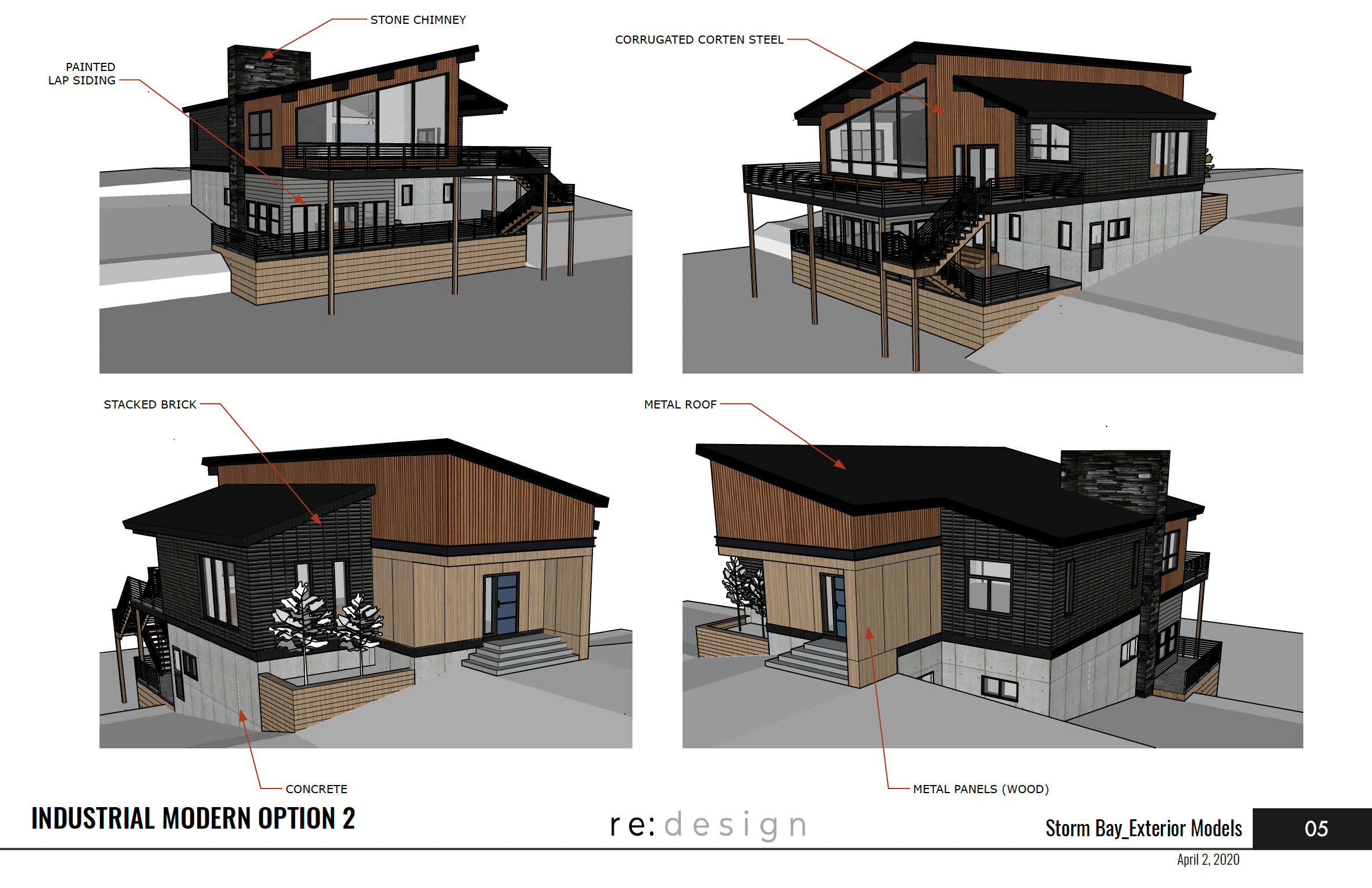
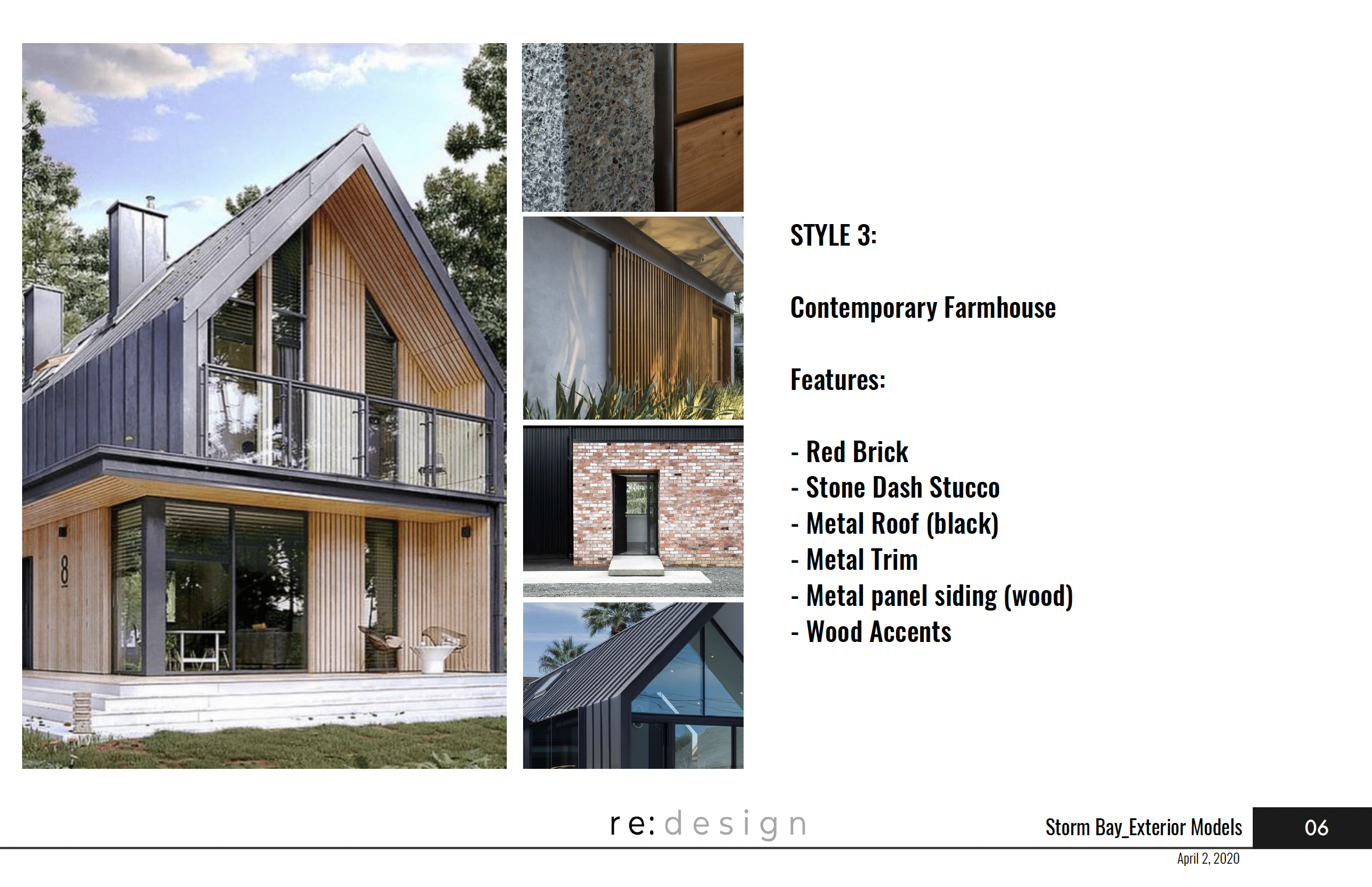
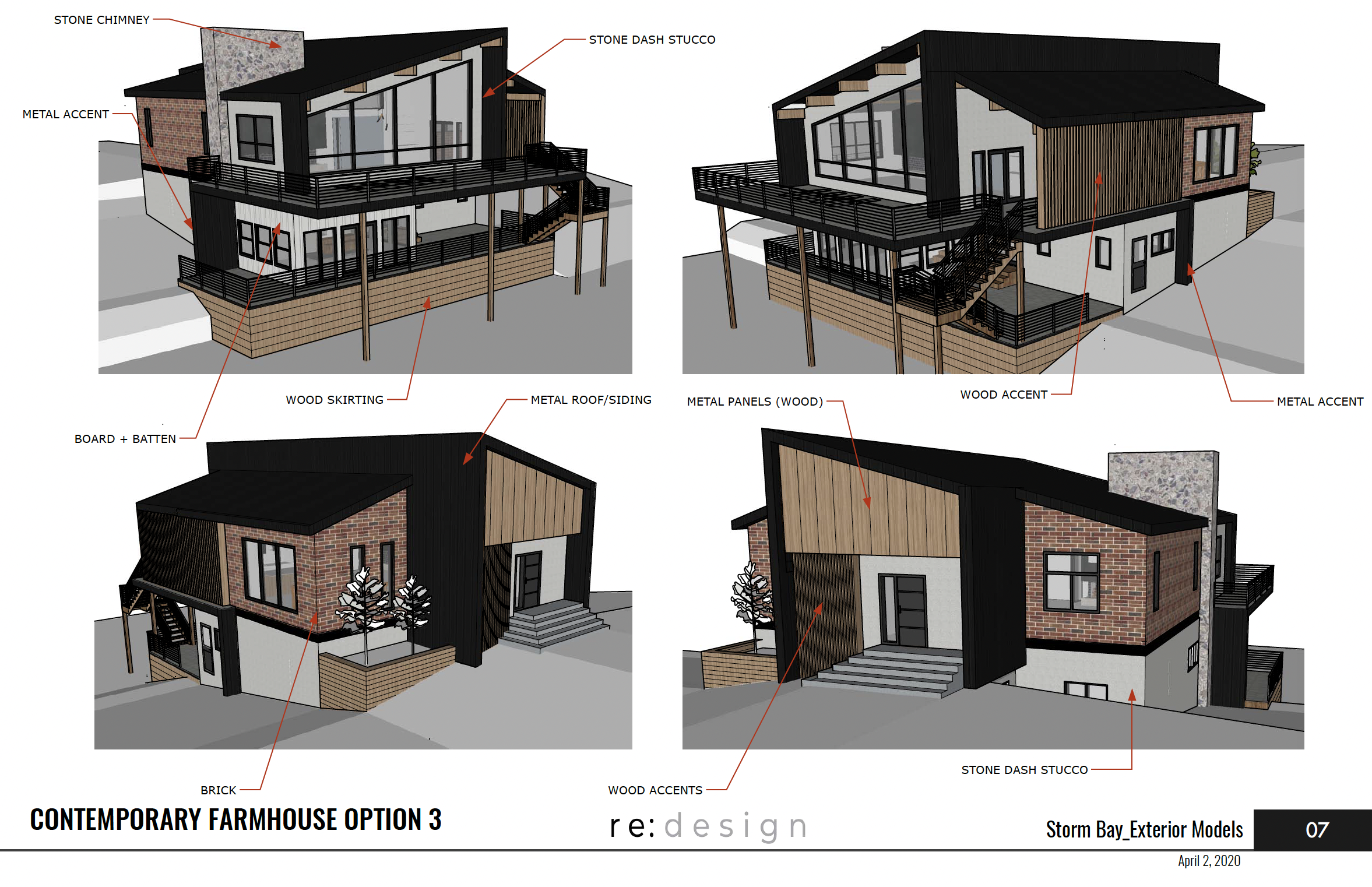
Once the form was signed off on, next came the finishes. What you’re about to see will show you how drastically finishes can change a form. We often talk that a little can go a long way and finishes are one way that you can transform a building without changing much else. All three of these options maintain the same overall form with minor tweaks and different materials and yet they look like 3 different designs.
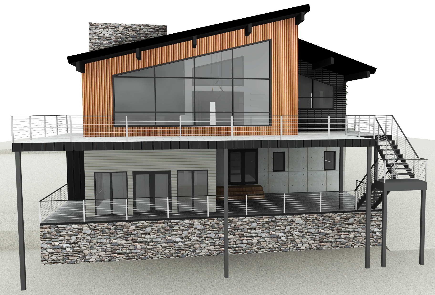
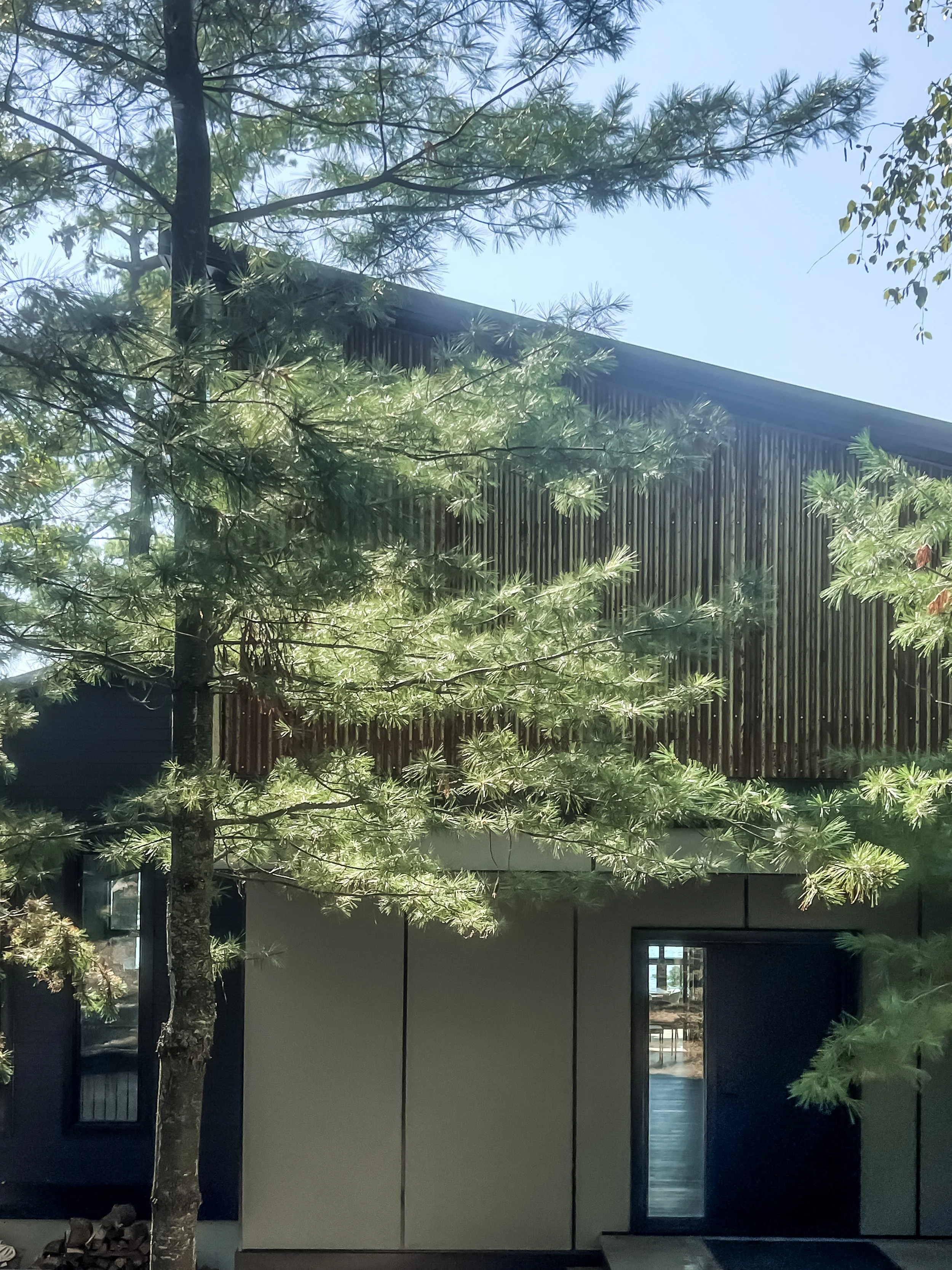
And below are the final renders of the front and back exterior of the completed design. We used various textures and scales to create the final design and we loved how it turned out. You’ll see in the final photos there are some deviations from the design, which is pretty typical in a build process. Pricing and availability play a large part in what is used on site and we were there to help the client choose alternates that still worked with the overall design intent!
FRONT OF CABIN
BACK OF CABIN
So now that you’ve read the SparkNote version of the design process of this project, you can hopefully see what value working with a designer can bring to the table! Maybe you preferred the original designs, and like we said before, that’s okay! Part of working with so many different people is that we’ve learned everyone has very different tastes and it’s our role to work within our client’s bubble - sometimes pushing them to think outside of it. We problem solve in a creative way no matter what scale or style a project is. We think it’s critical to have ‘a creative’ on a project team to add an important dynamic to the conversations. Builders and PMs are great for working out how to build and execute a project within a budget, engineers are great for figuring out how to make sure the design doesn’t fall apart and us creatives help with the vision and to help make sure our clients voice doesn’t get lost in the process.
Check out some of the finished photos below to see how this lovely cabin turned out!


