Designer’s Kitchen Reno
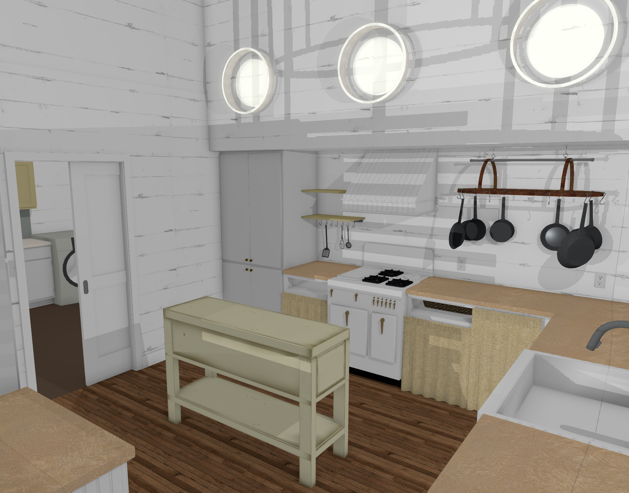
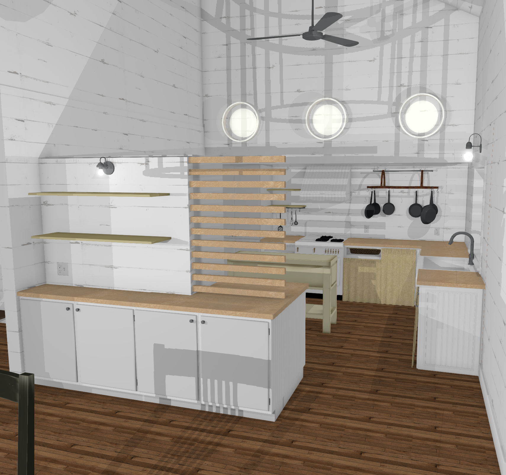
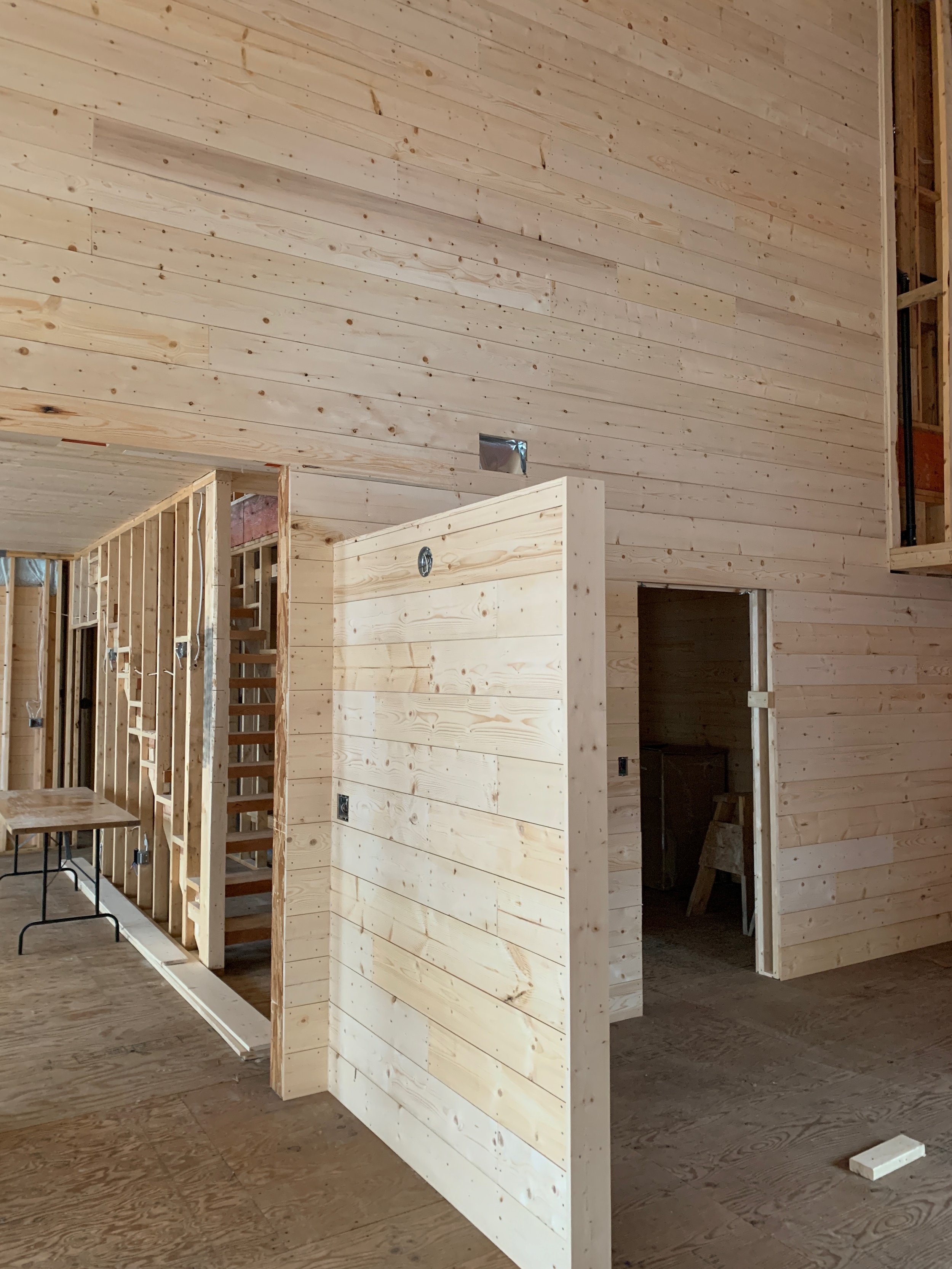
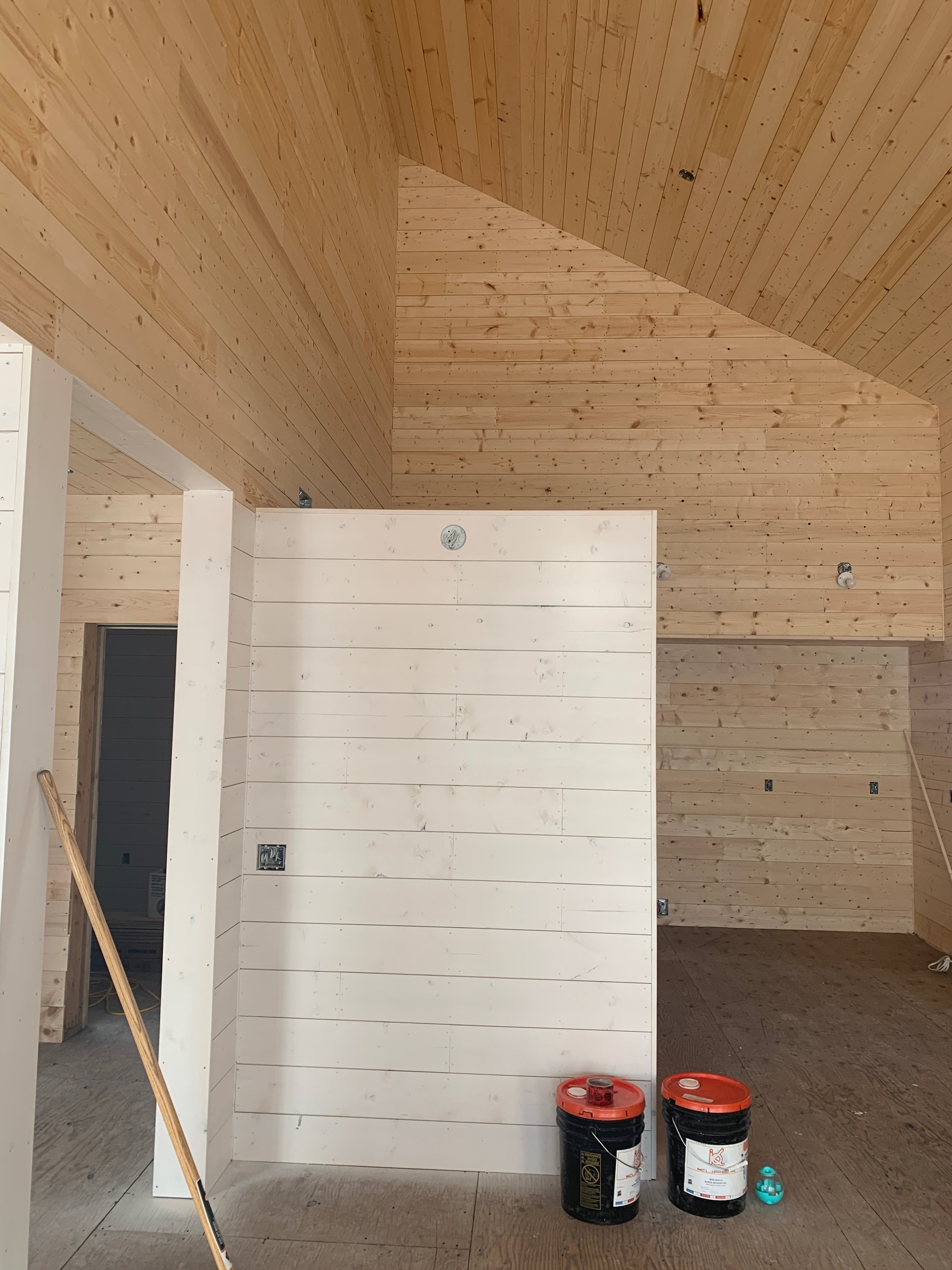
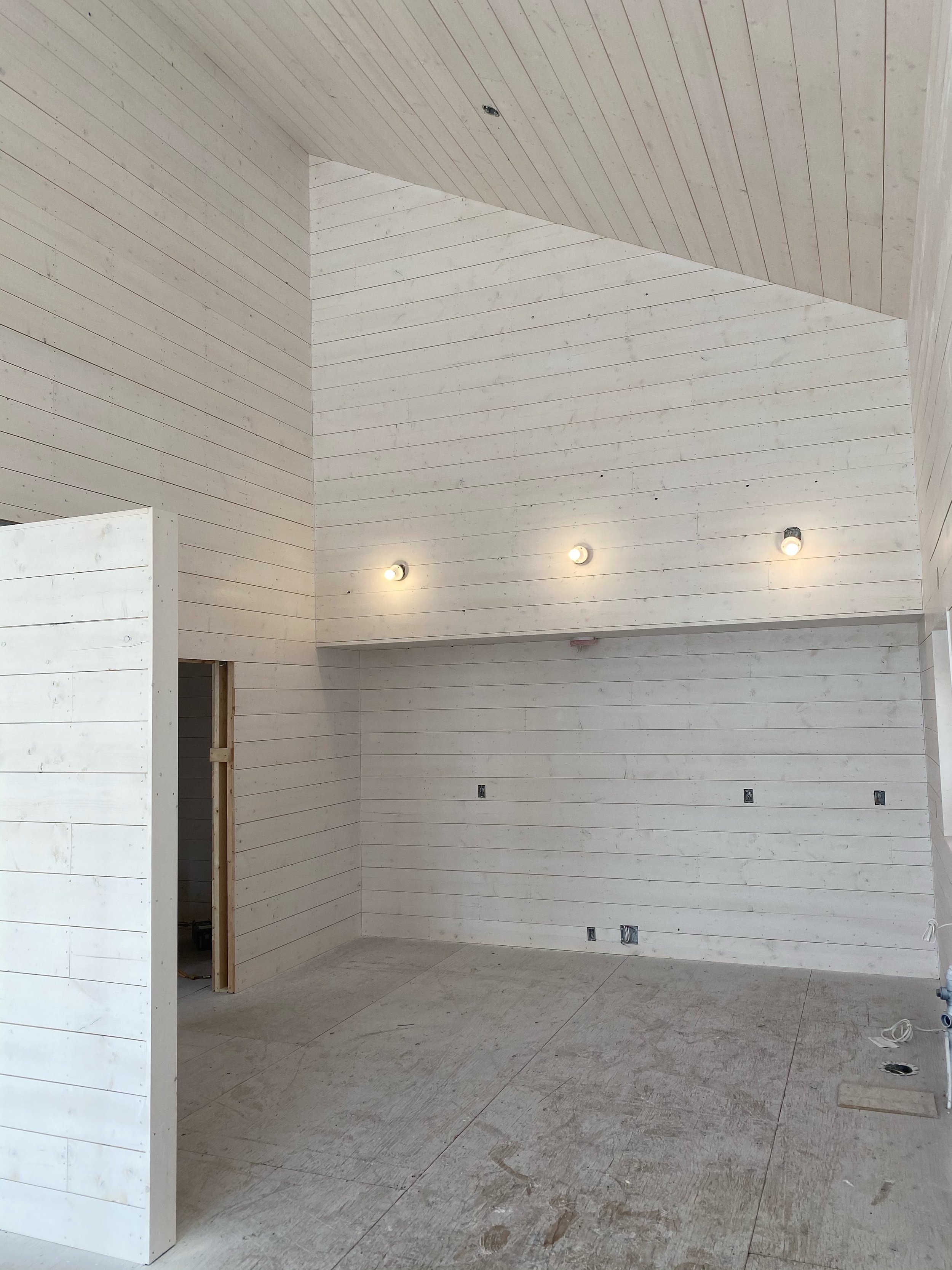
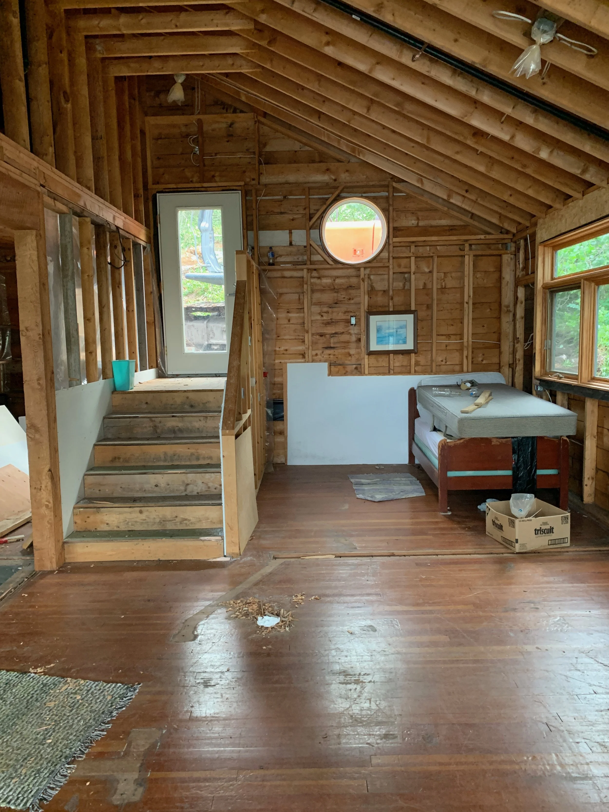
Up next in our look at our designer’s spaces, we’ll dive into Robyn’s cabin project in Kenora that she just completed this summer! What once was a rickety, abandoned cabin in need of some major TLC, is now a brand new cottage with tons of fun details and vintage vibes! We’ve picked one of our favourite and most used spaces in this cabin to share some of the design details with you! To start things off - a before and after for you to see where it started and where it’s ended!
The Space Planning:
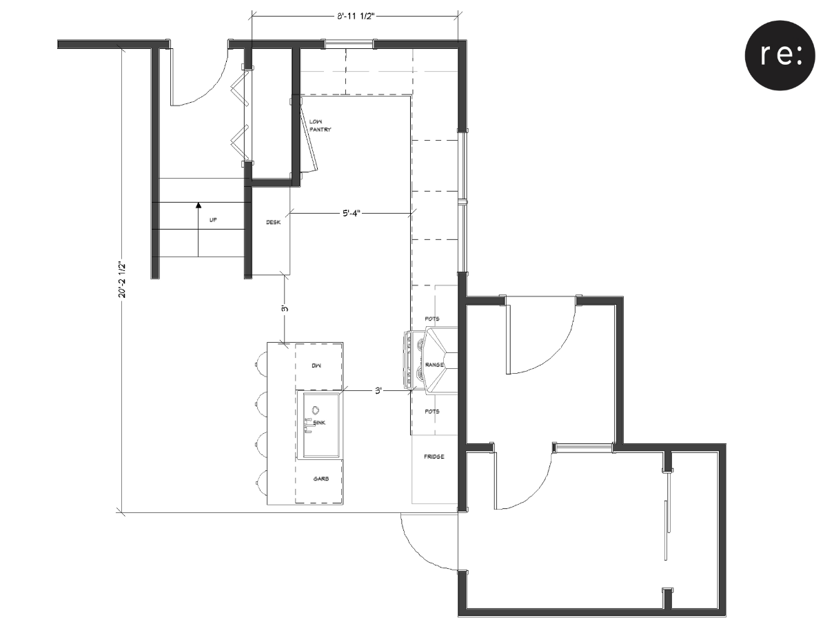
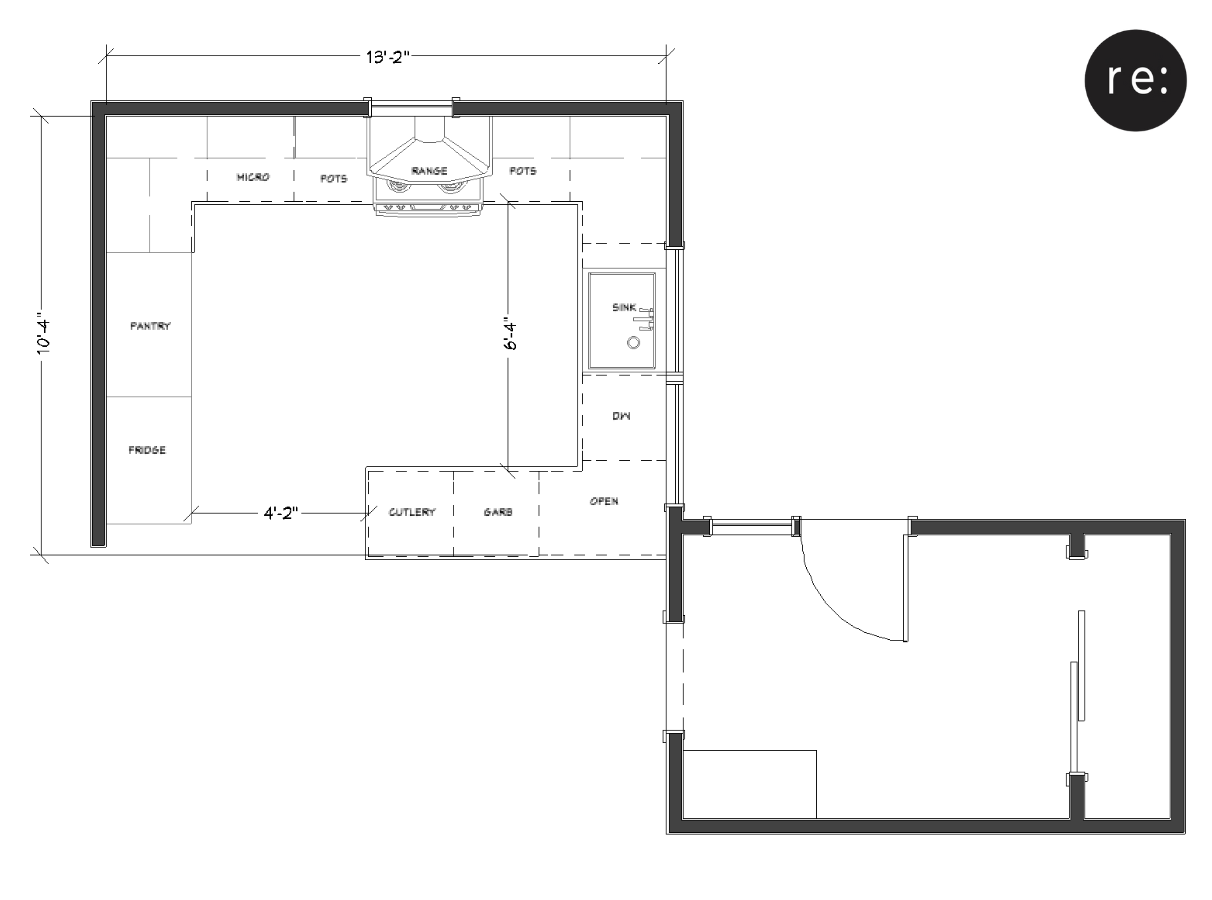
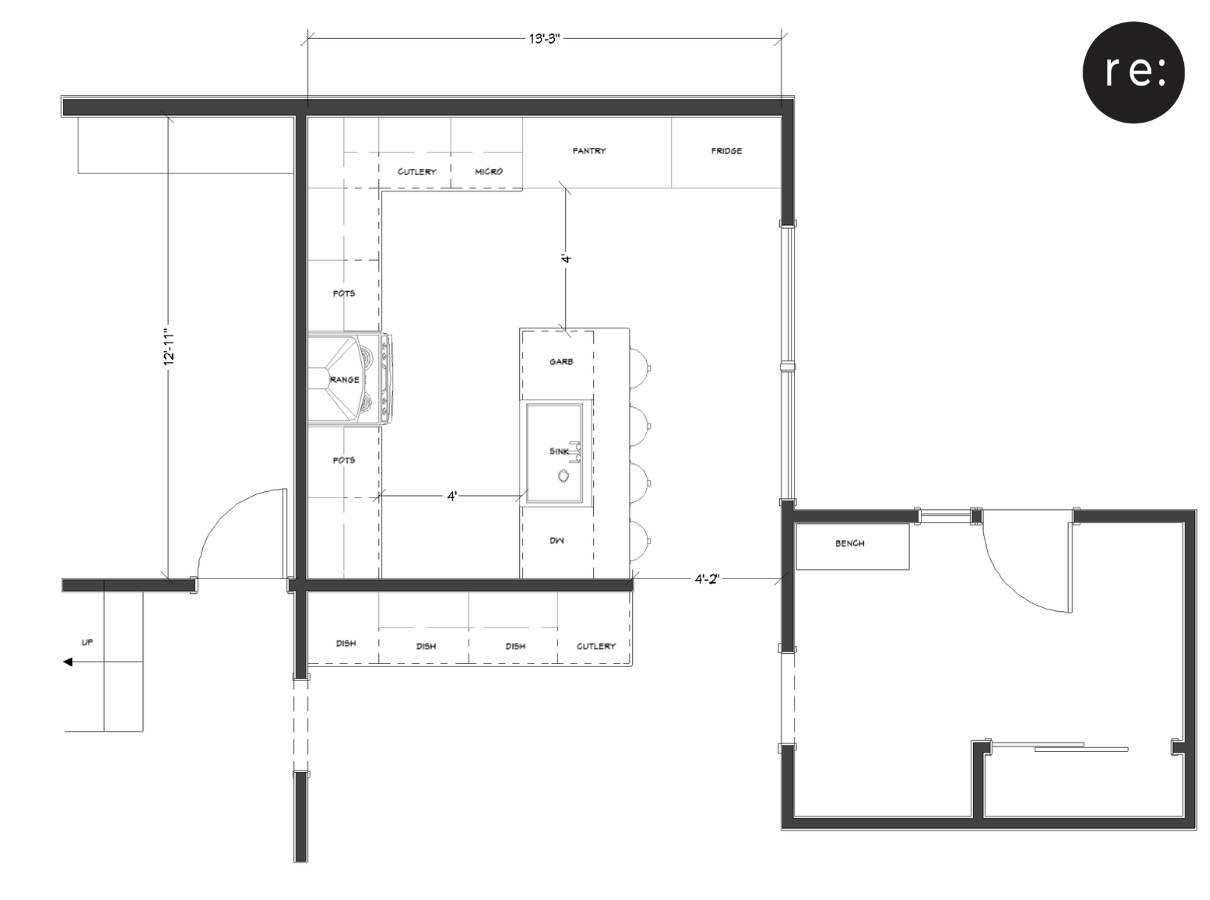
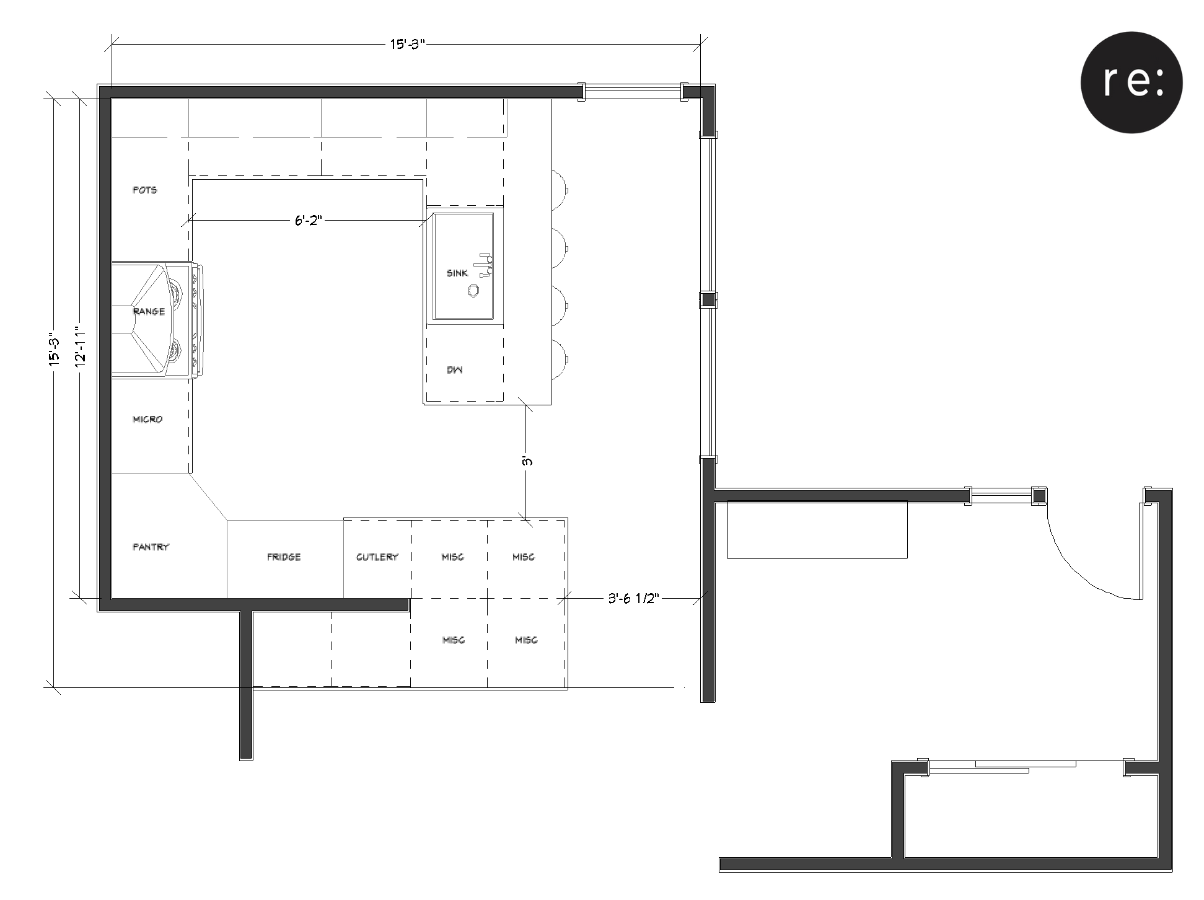
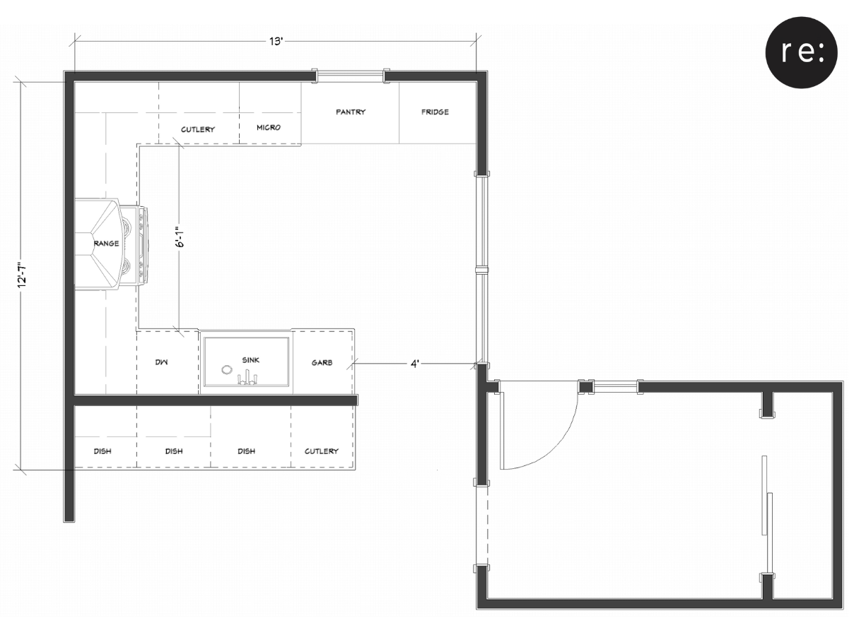
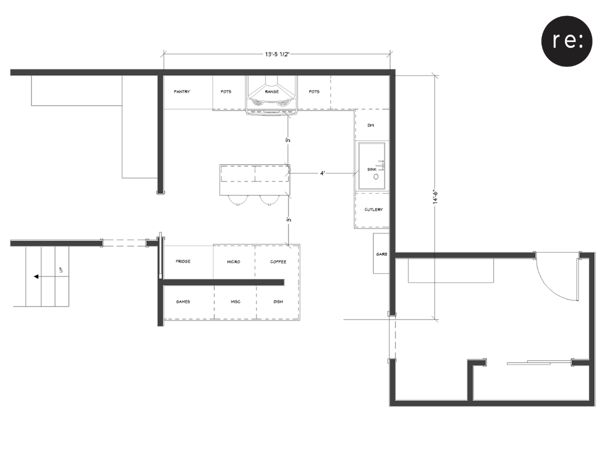
If you’ve ever designed your own space or been through a reno, you may already know the importance of space planning. This kitchen went through 6 different floor plans before we found one that made the most sense for how the space was going to be used!
To sum up this design progression quickly (it actually took a few months to sort out), we decided to reconfigure the exterior entryway and add a pass through from the laundry room to the kitchen. The pros of doing this eliminated the need for interior stairs and multiple corners in the kitchens layout, which makes for a more functional space plan. Corners in millwork often create dead space or need interior fittings to make them usable. The pass through also created a very functional path of travel and a kind of “shortcut” to the second floor!
Good design isn’t just about how things aesthetically look in the end, but also how well the space will function in your day to day life. You need to think about things like what traffic pathways make the most sense and what storage space will be the most suitable.
The Cabinets + Millwork:
Building new to have an old look is always a challenge. Builders don’t use the same methods today like they used to, so it’s extra tricky to mimic authentic vintage design.
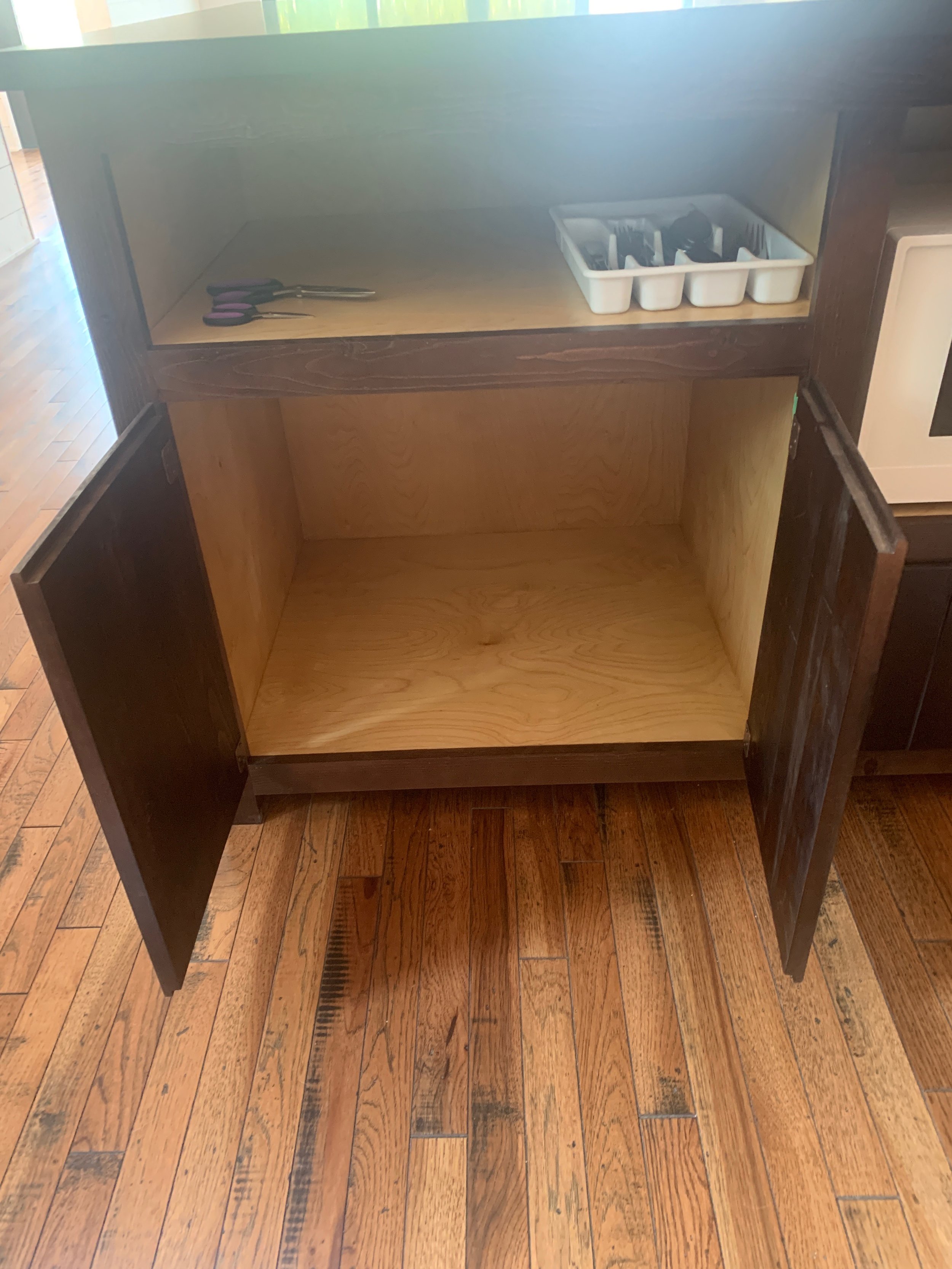
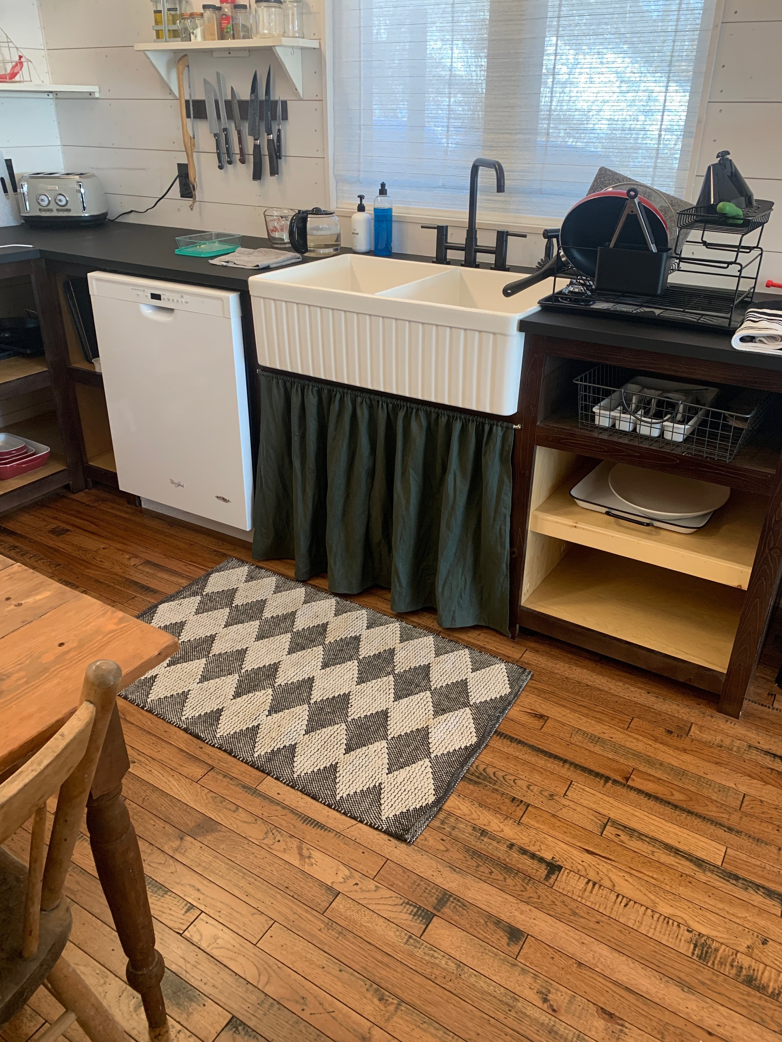
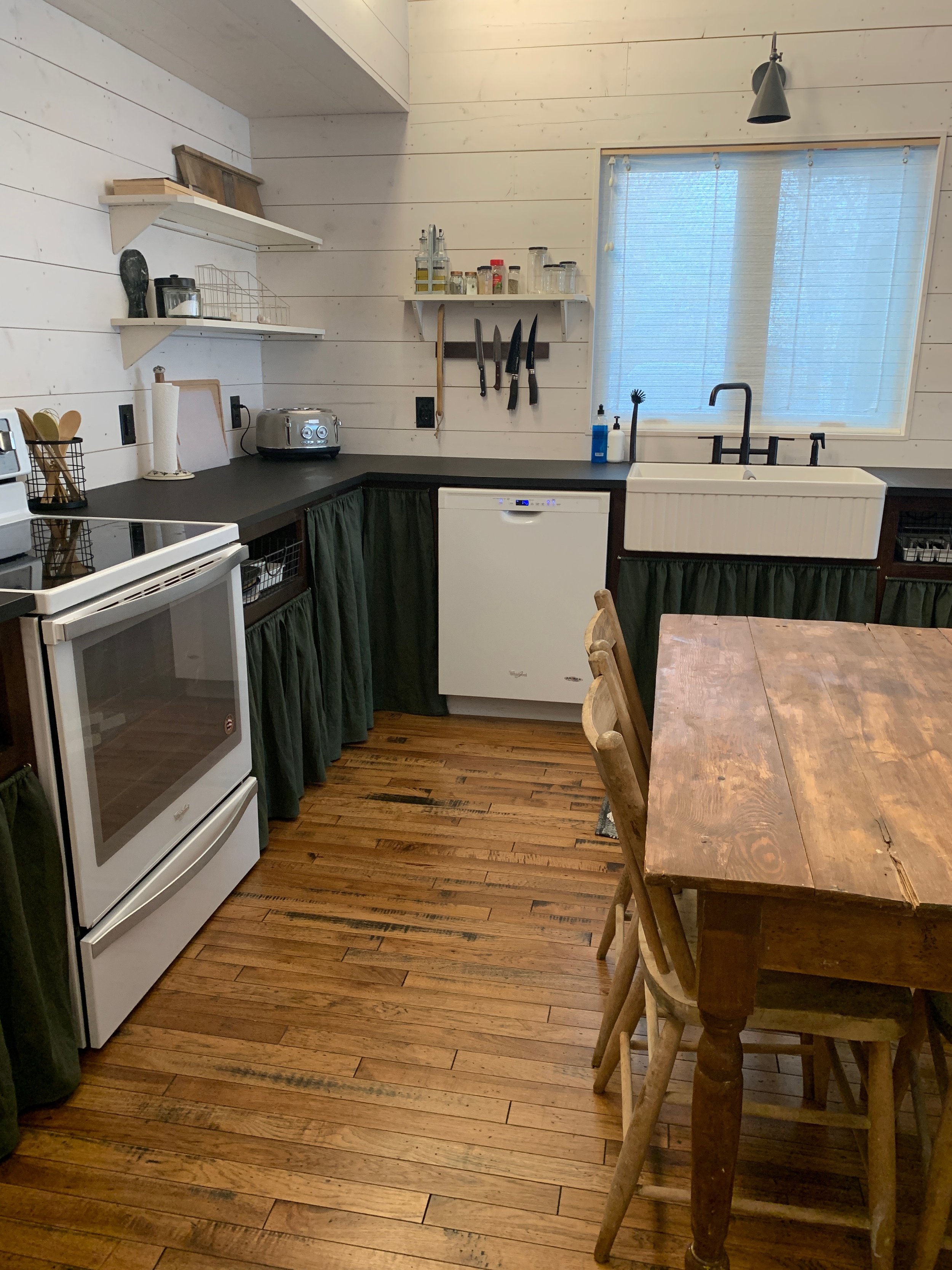
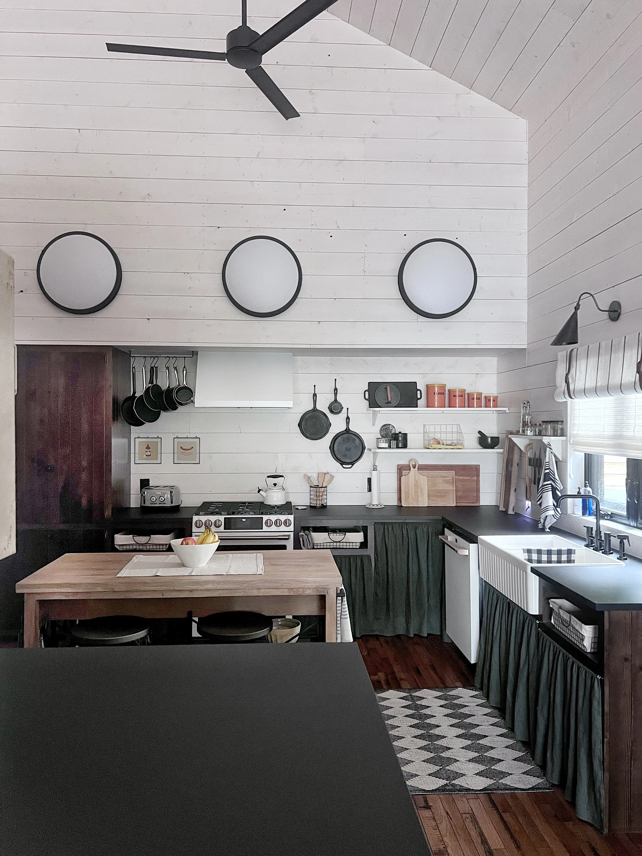
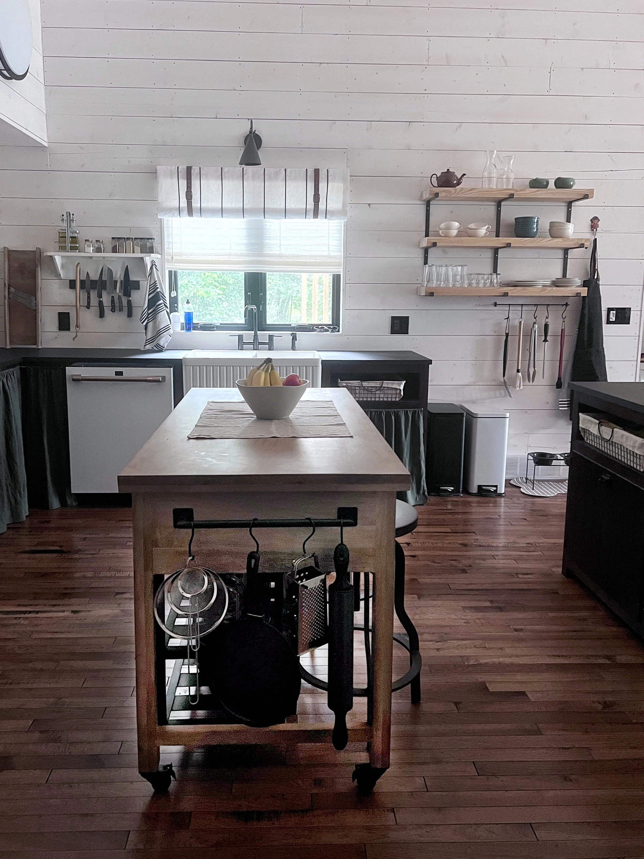
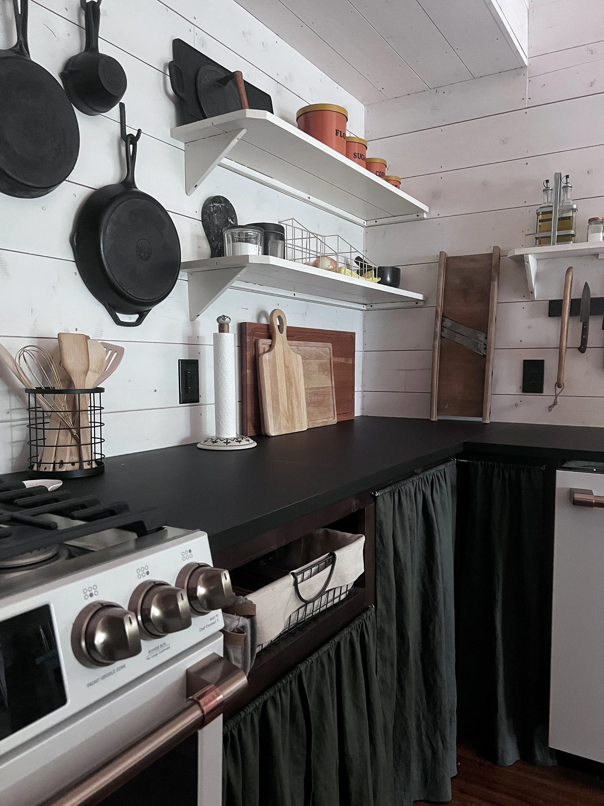
One of the design details we incorporated to help create the vintage look was the millwork construction! These cabinets were stick built on site as longer, single units just like how millwork used to be made. No modular units to be found in this kitchen!
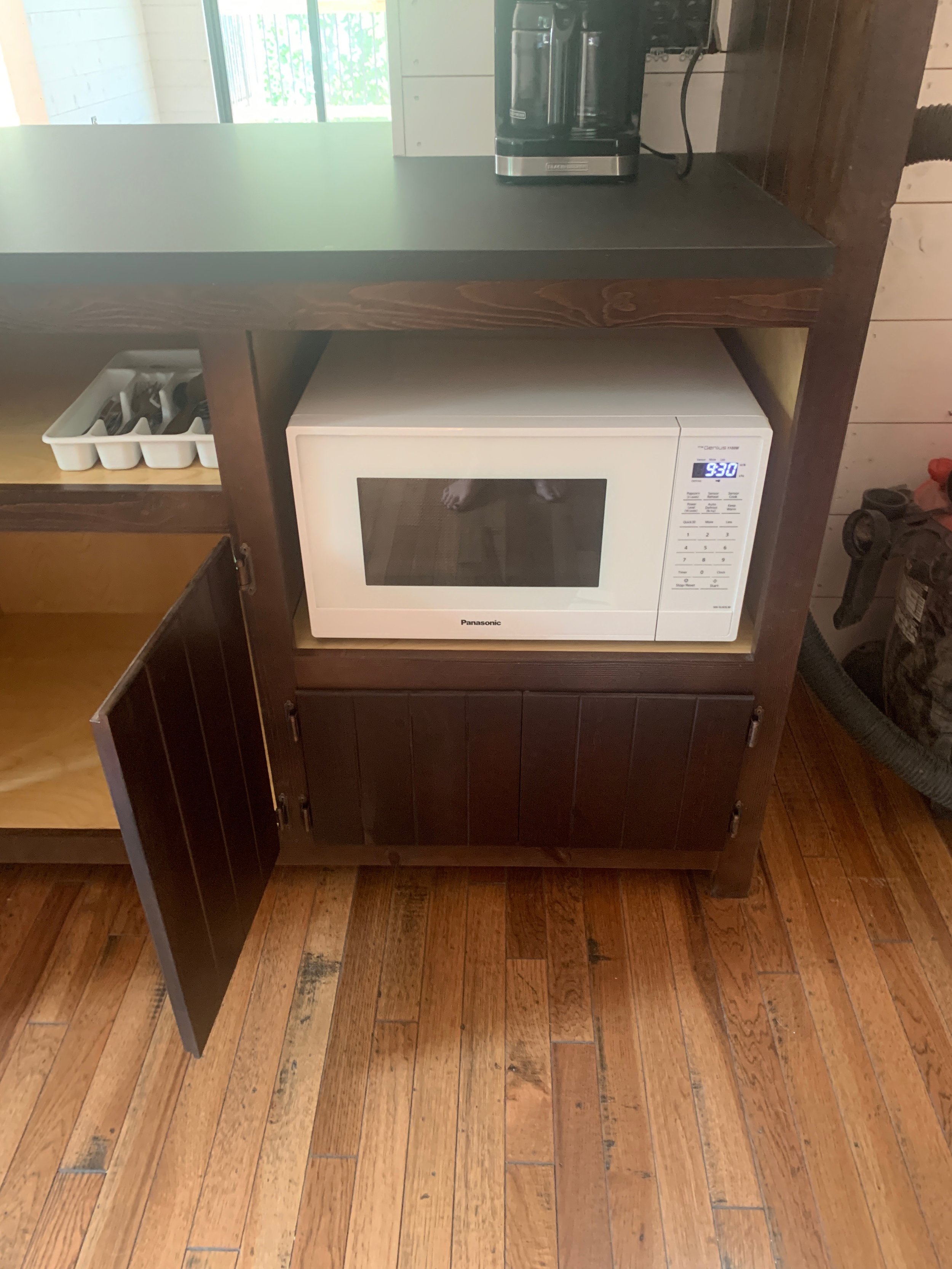
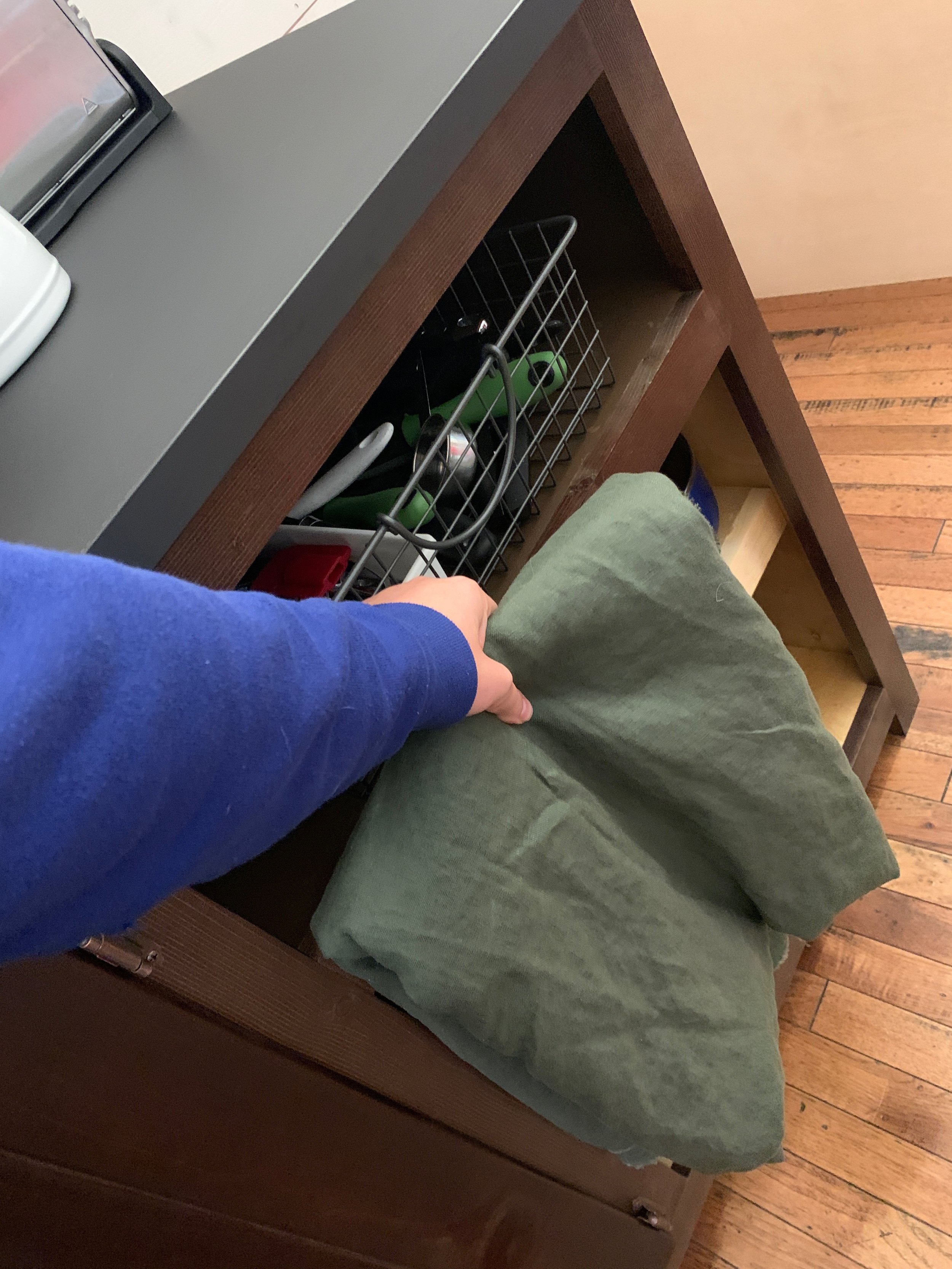
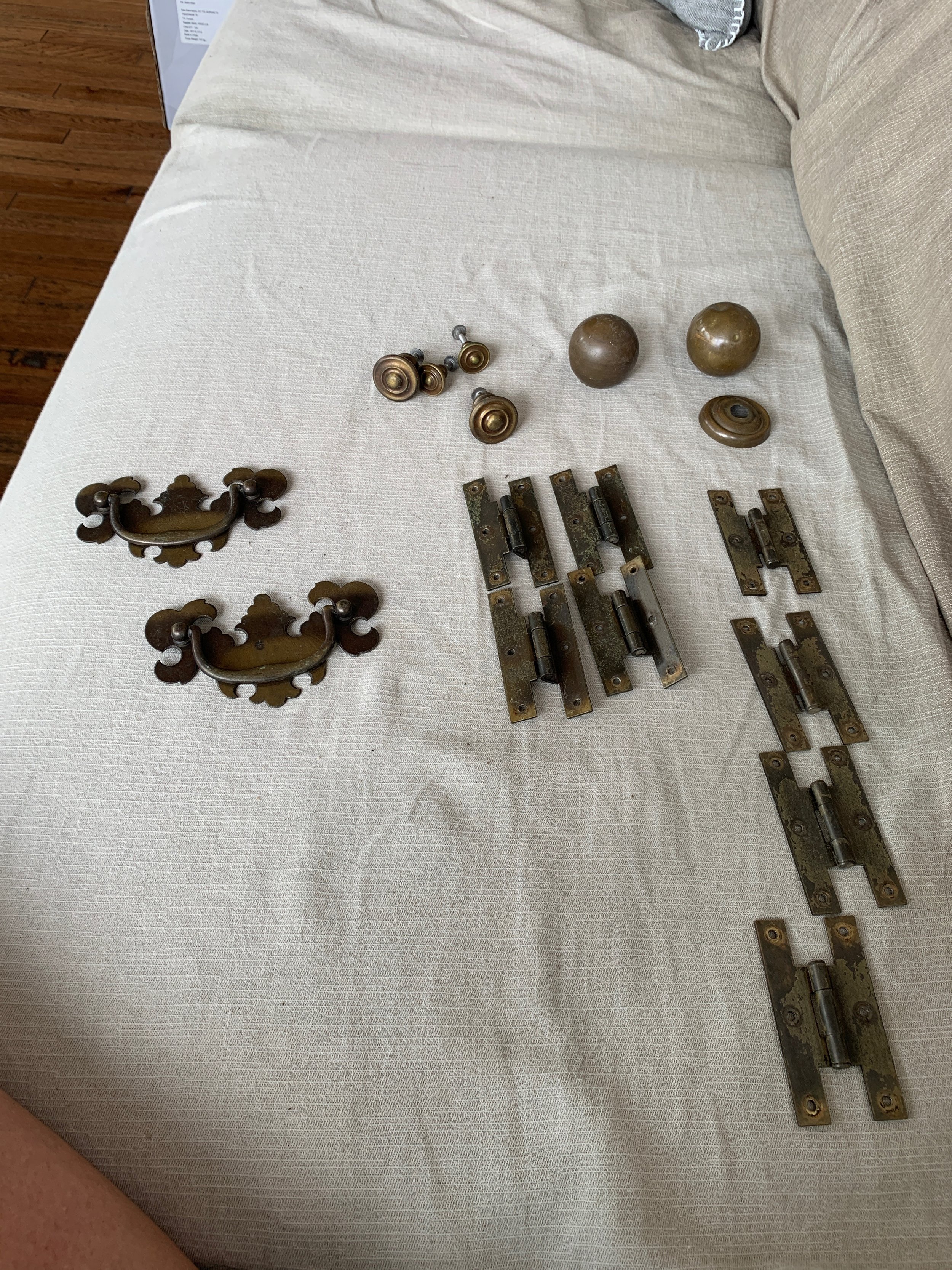
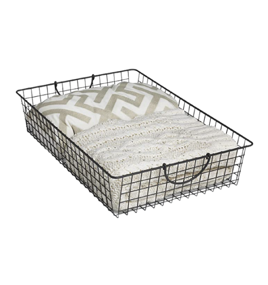
The doors were custom made and frame mounted with a partial overlay and exposed hinges. We opted for basket “drawers” and curtain “doors” to really give it that cabin look. Antique hardware was also incorporated for the cherry on top!
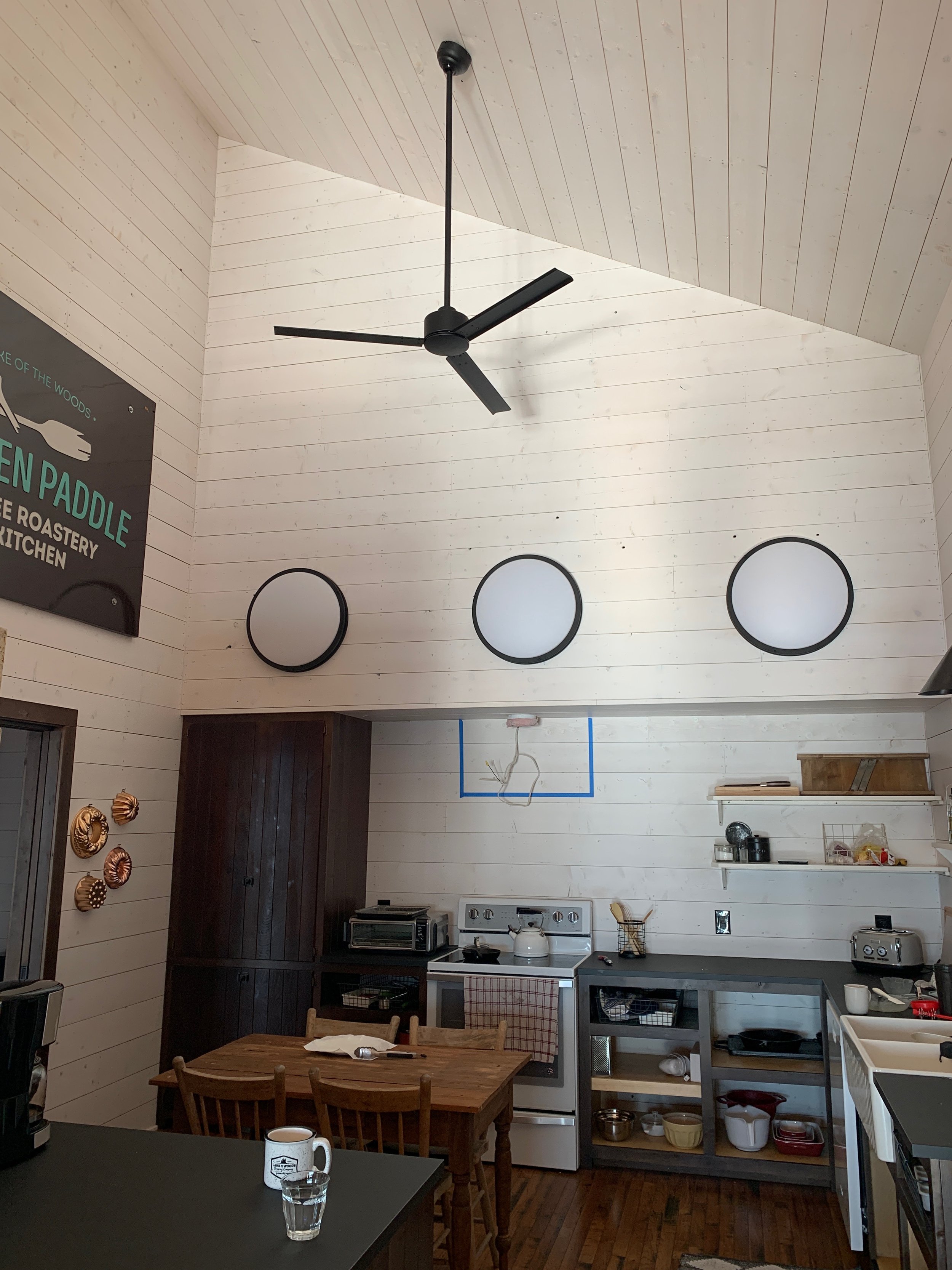
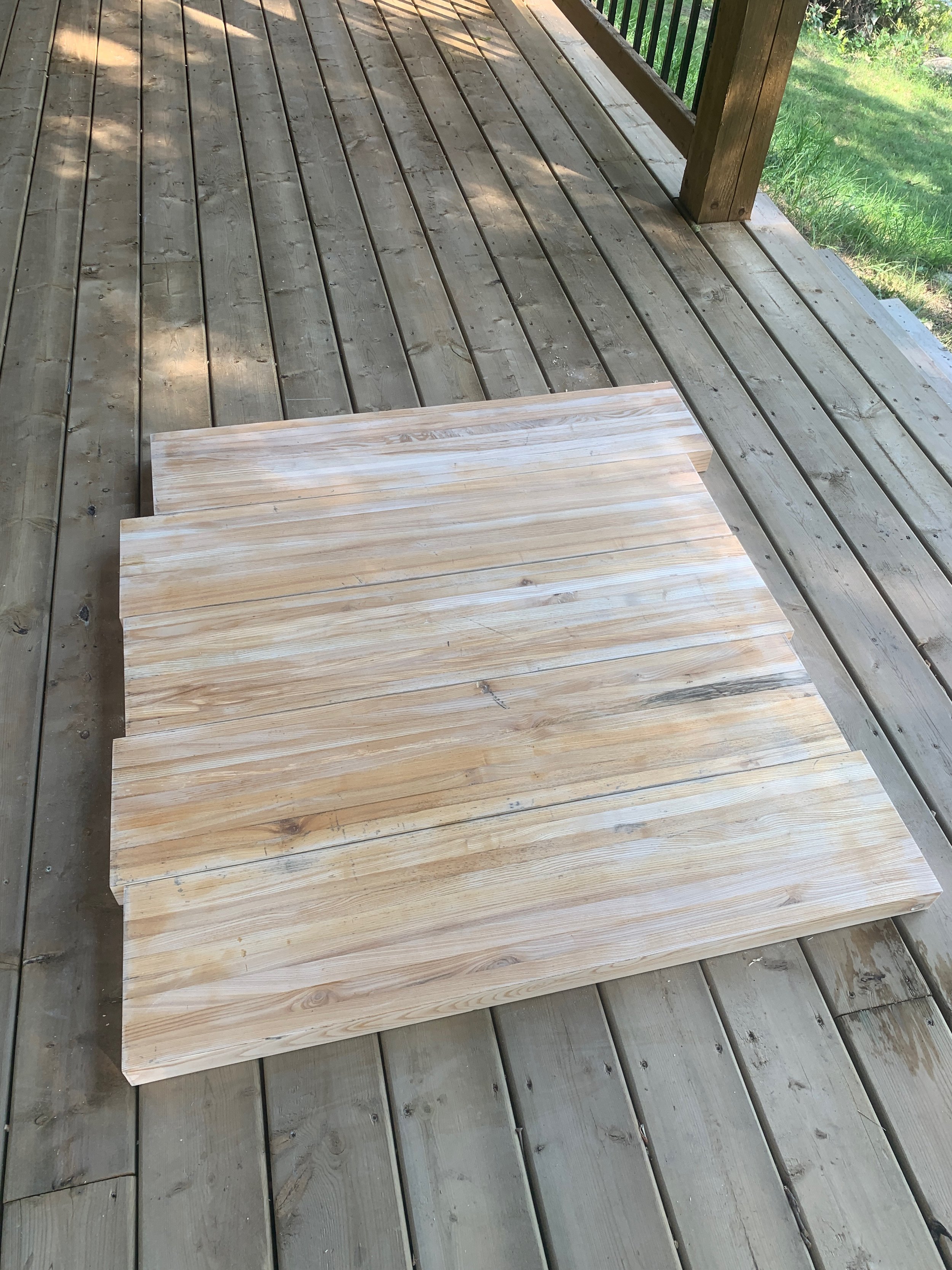
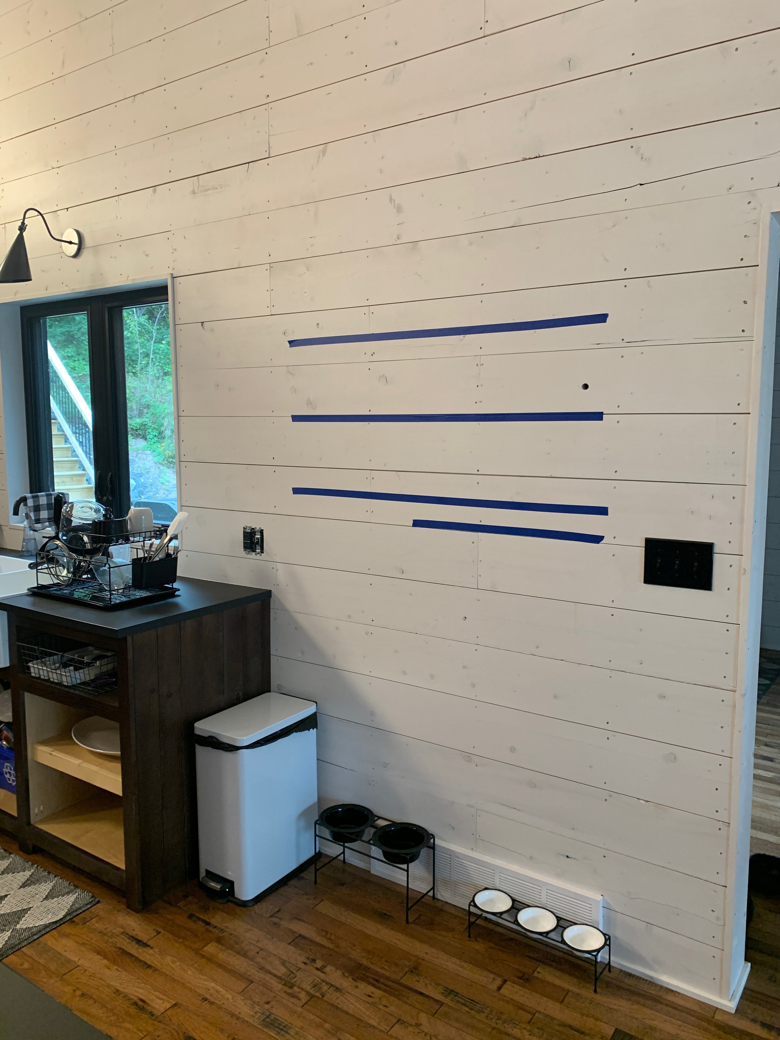
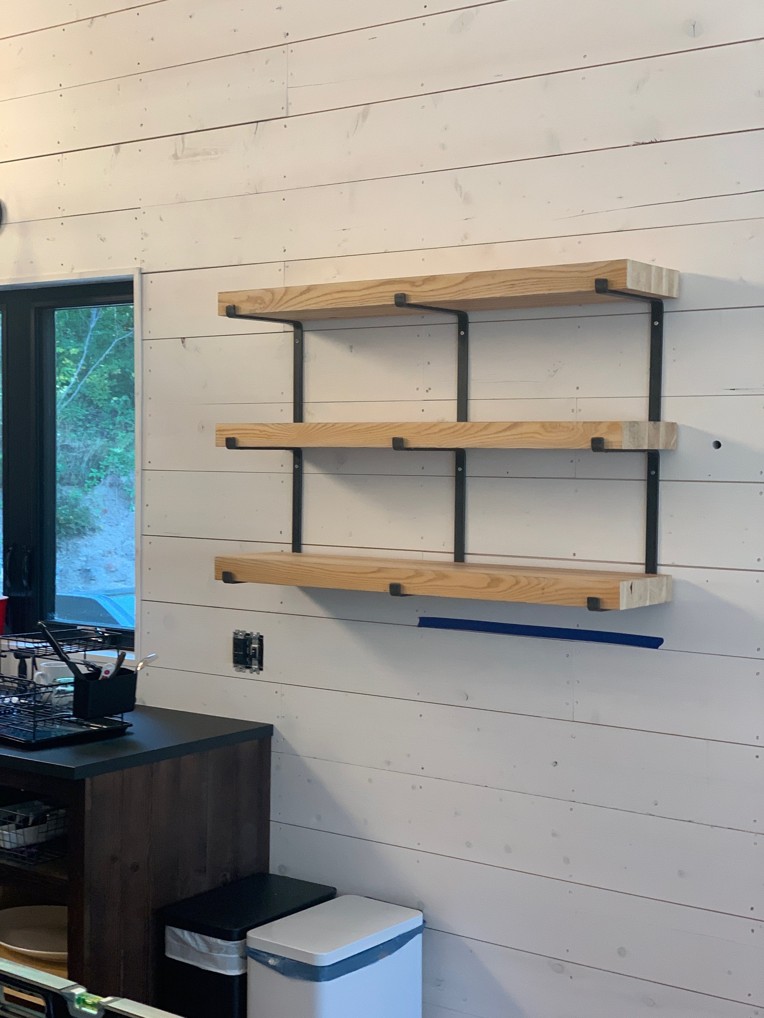
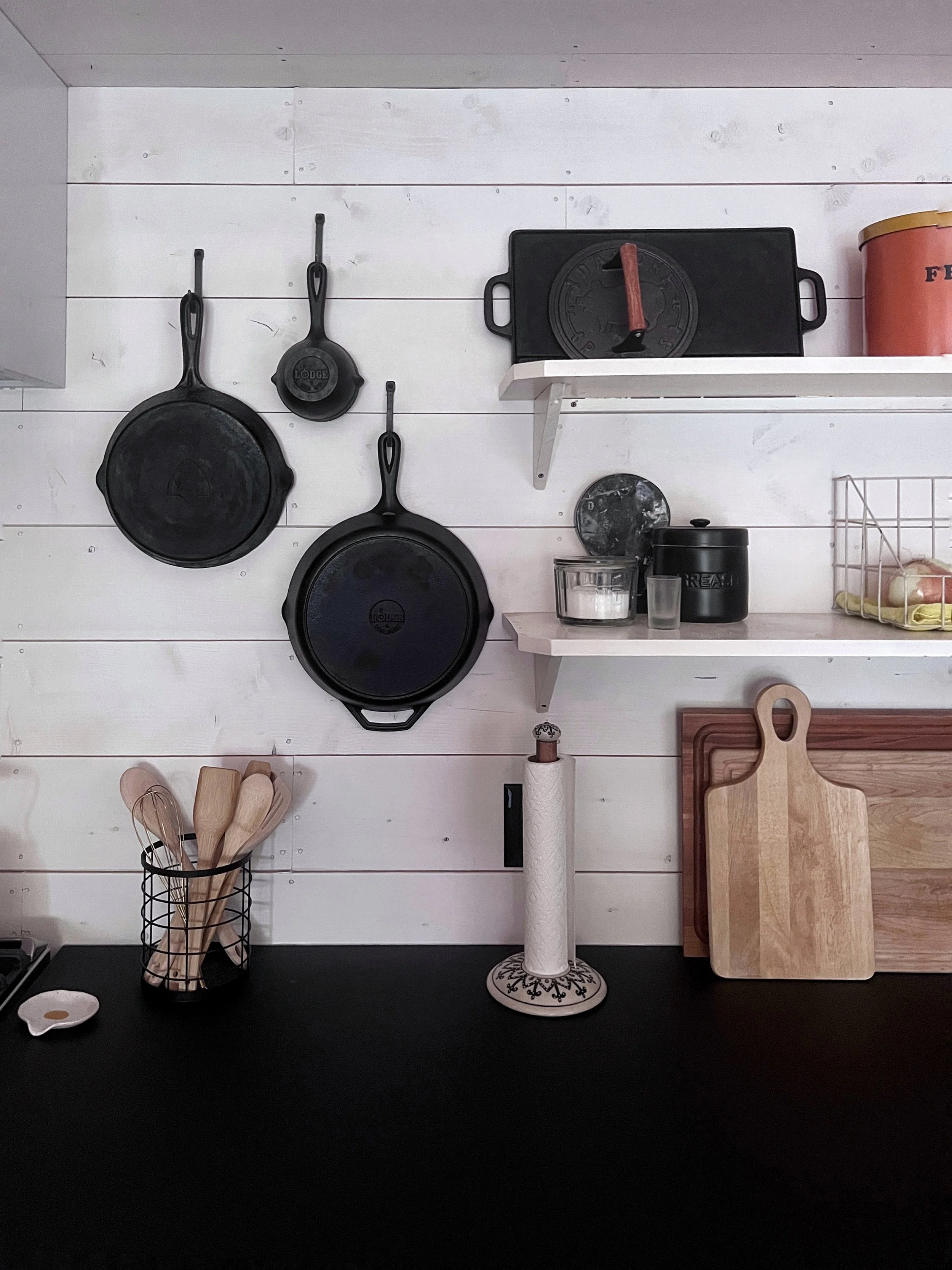
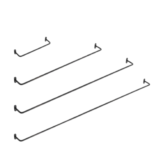
Due to the long lead times and the supply chain issues in the industry, we decided to make in stock Ikea countertops work to avoid any construction delays! We're surprised with how well these turned out and will likely keep them for few years before we upgrade to soapstone countertops! The open shelves are also a fun feature we love! We repurposed old stair treads that were saved in the demo to make the shelves and we used raw iron brackets to mount them! We love the look of open shelving and felt it lended to the cabin vibe we were going for!
The Appliances:
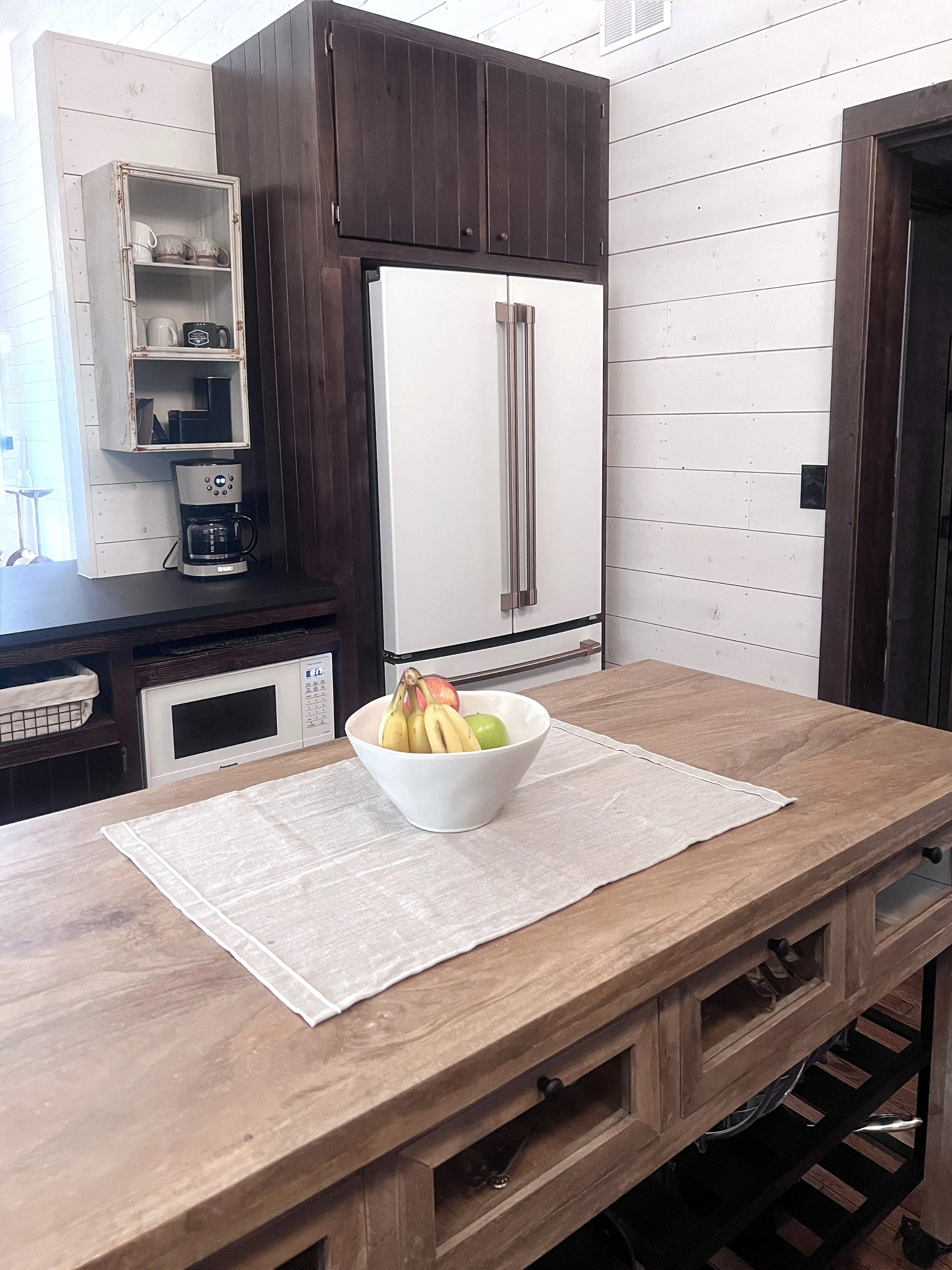
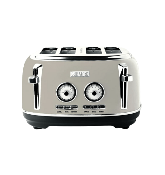
One pet peeve of ours as designers is often the importance of what kind of appliances used can be overlooked. Appliances can actually play a key part in the overall design. If she could have, Robyn would have decked out the kitchen in Elmira vintage appliances, but alas, that was not in the budget. Instead, we used GE Cafe white appliances because of their design. What makes these unique, is the brushed bronze hardware finish that lended a less modern look to the vintage kitchen design! They are also a softer and matte white, which really makes them stand out from the typical white appliances. We can’t forget to shout out the Haden coffee maker and toaster because they are just so gosh-darn cute! Counter top appliances are just as much a part of the design as the finishes!
The Plumbing + Lighting:
We say it over and over - design is in the details! Those little details all add up to create the overall design of a space! Let’s take a moment to talk about the fixtures in this kitchen.
The fluted fireclay apron front sink with the bronze bridge faucet is meant to be a throwback to a simpler time! Paired with the bronze wall scone, this charming combo sets the tone for the whole kitchen.
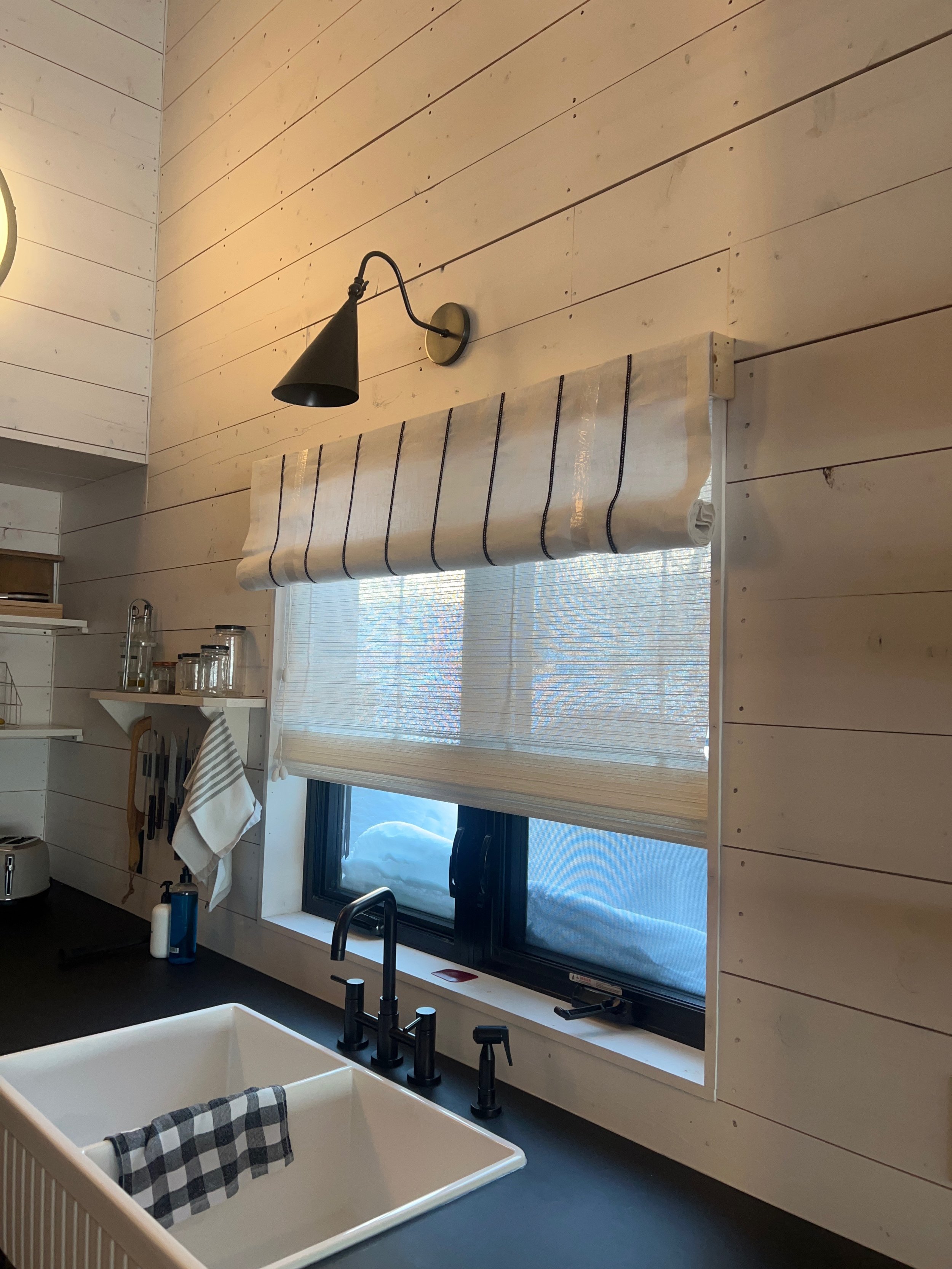
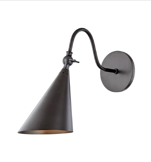
Because the ceilings are vaulted, lighting the space became challenging. We decided to bring the lighting lower with oversized wall sconces on the bulkhead. This gave us some great light without giving up the ceiling height or cluttering the ceiling with extra long pendants. It’s also a little tribute to the round port window that was removed from the original cabin.
The DIY:
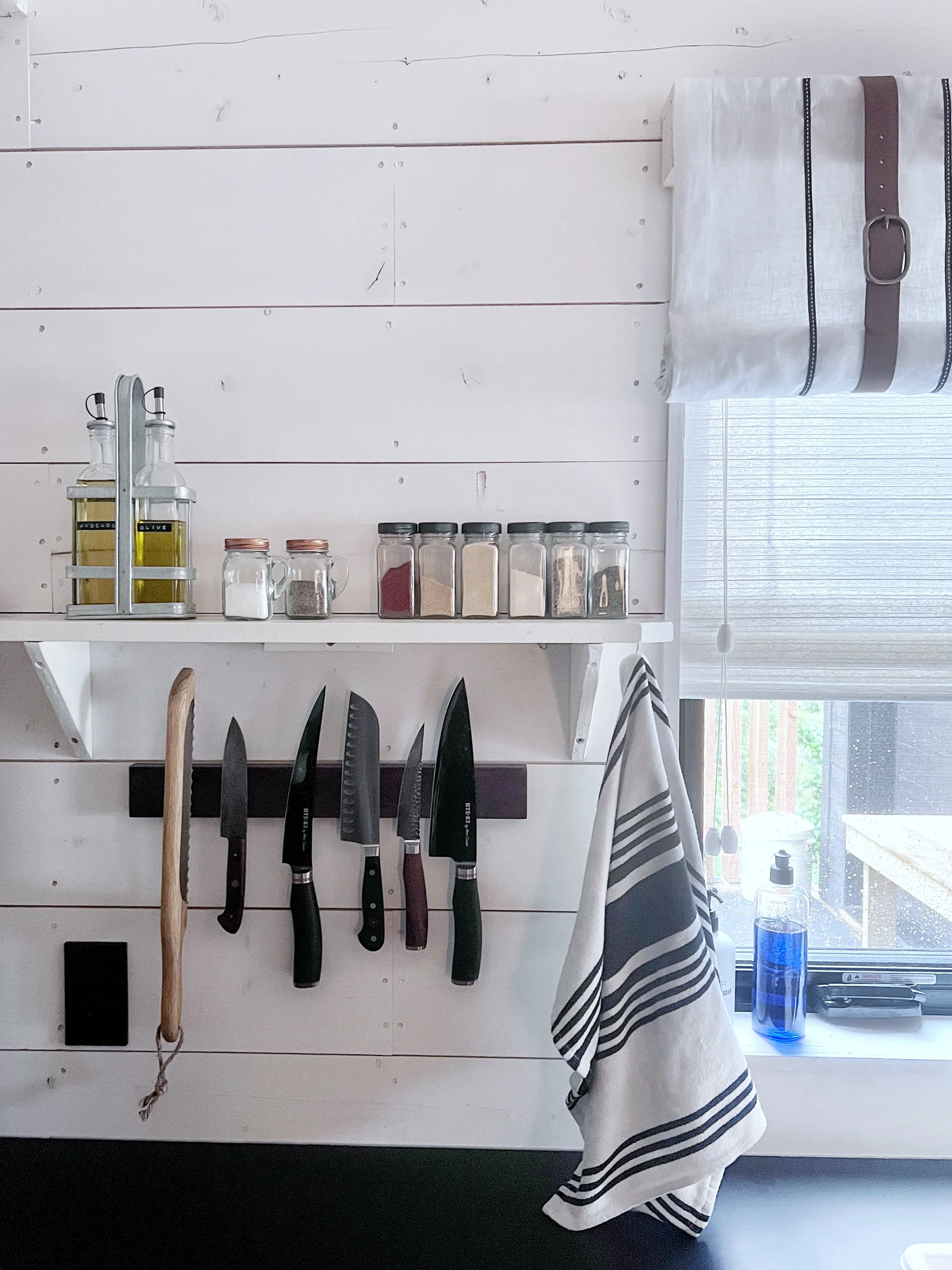
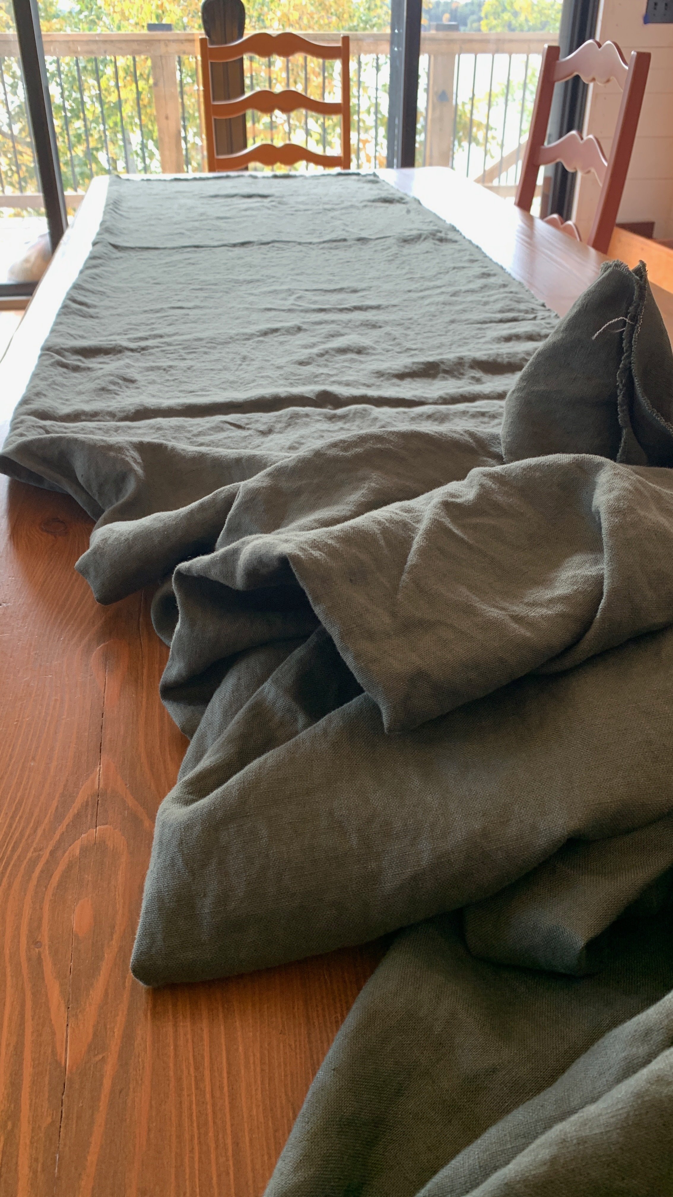
Now who doesn’t love a little DIY? We really believe it’s the personal touches that make a space stand out! Between the cafe curtains that Robyn and her mom sourced out from a fabric store and made, the basket liners made from painter’s drop cloth, the belt buckles used to add a little somethin’ extra to the window valence and the old stair treads repurposed into shelving… these little details created a major impact in the design. Always take the time to add something that is unique to you! If you can craft it yourself - even better!
The Decor:
Last, but not least is the finishing touches. It’s the decor that really brings a space together! There is a fine line between curated and cluttered and it takes A LOT of editing to get it right! You wouldn’t believe how long it took to curate this kitchen! There are some key pieces that are worth mentioning so let’s get into it!
Baskets:
Oh what a pain these baskets were to find! But, what a win in the end! We had no idea how challenging it was going to be to find basket’s that would, not only look good, but function as proper drawers AND fit the openings that were made! They unfortunately didn’t come with liners, so as mentioned, to hide the mess in the baskets - Robyn and her mom got crafty!
Cast Iron:
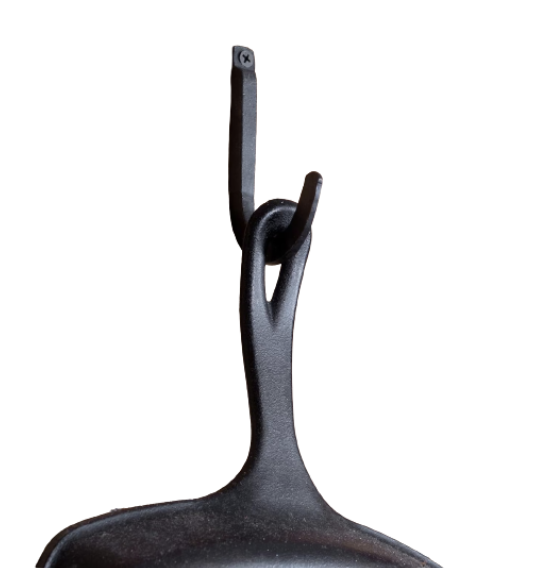
Functional and pretty! Robyn cooks with cast iron all the time so she needed a way to store the cookware so they were easily accessible! They became critical wall decor that helps to anchor the wall! We picked some beautiful hand forged iron wall hooks to compliment the cast iron pans. Heavy duty pans called for heavy duty hooks!
Glassware:
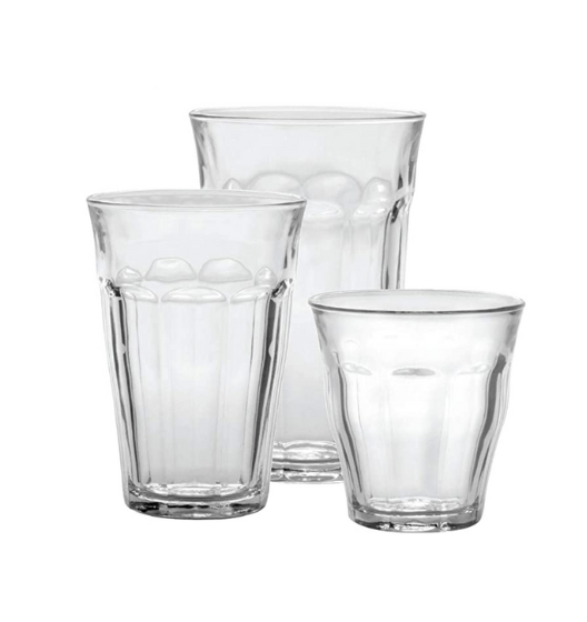
Let’s start by saying that we love open shelving. It’s not for everyone, but for this design we felt it was another opportunity to display the casual clutter of everyday stuff! Almost all of the dishes used were curated from what they already had saved or collected, but Robyn did get some glassware that they felt looked the part! Modern glasses just would not have fit the look!
Antiques:
Probably the most important element in this design was the actual antiques. Between items that were salvaged from the original cottage, family collectibles that were passed down and items that were found along the way, we wanted to make sure to incorporate pieces of history that really make this vintage cabin feel like it’s been around for a long, long time!
The Transformation
Take a flip through the photos to check out the progression of this transformed space from the concept to Robyn’s dream cabin kitchen! We can’t wait to show you the rest of this cabin once it’s all done!
